Website Navigation Update/Testing 2023
 DAZ_ann0314
Posts: 2,861
DAZ_ann0314
Posts: 2,861
This thread is to discuss any issues you may notice or any thoughts you have on the new website navigation launched today.
At the moment you may see one of two different navigations:
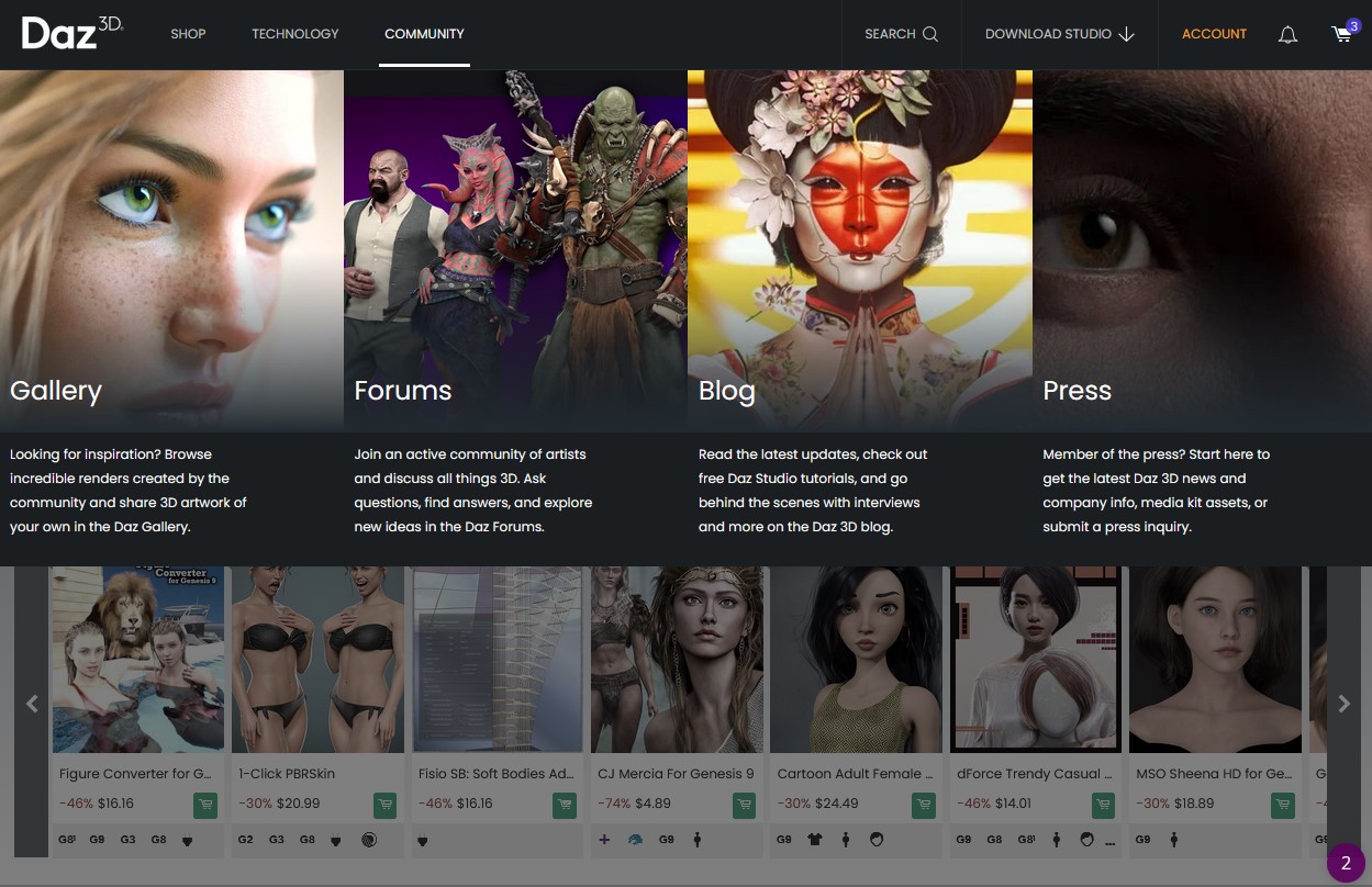
Image Based - which looks like this:
or
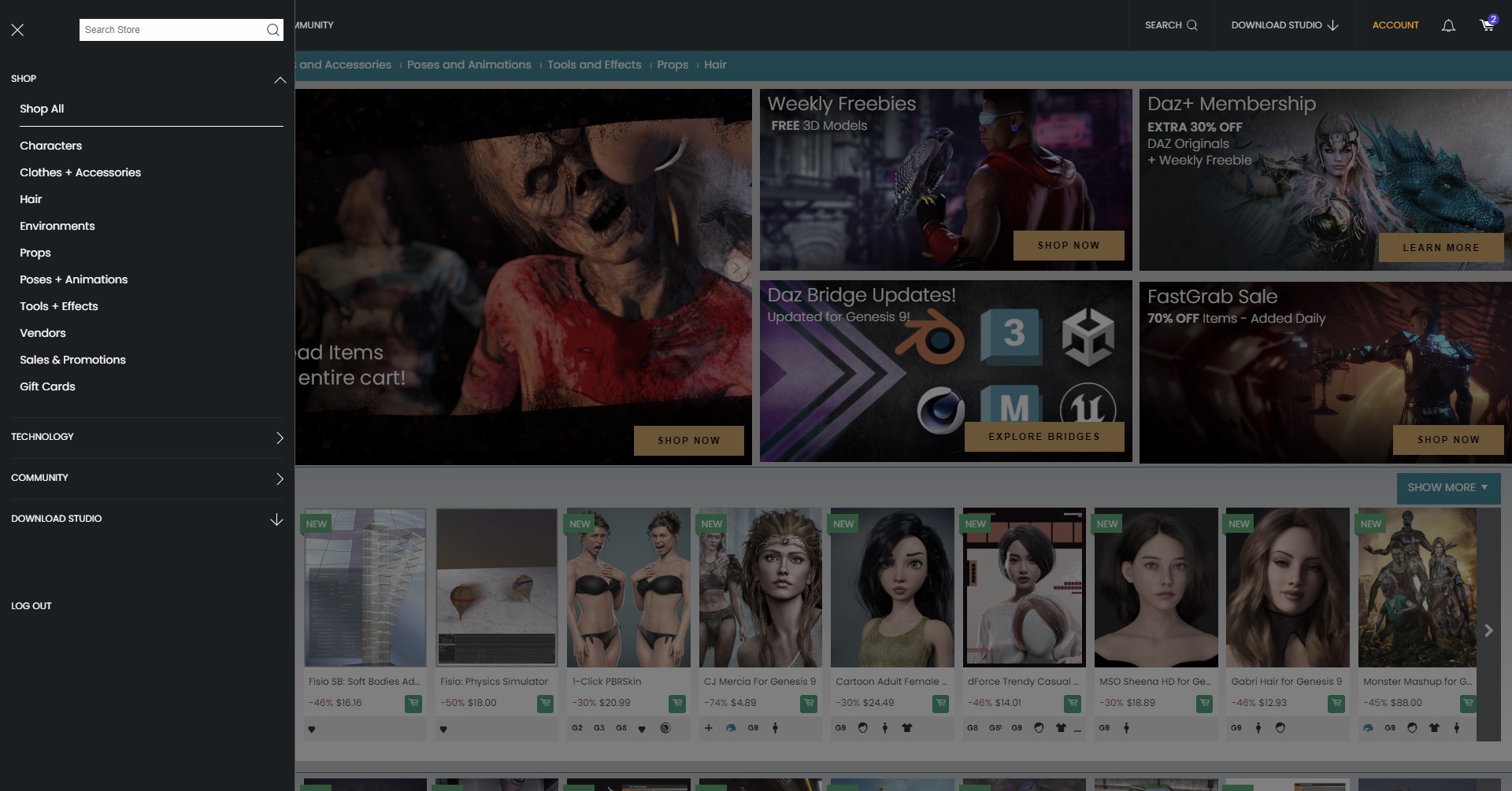
Text Based (Side Navigation) which looks like this:
If you find any issues, please be sure to list which Navigation Bar you are seeing along with what Browser you are using.
As always thanks for everything you all do to make this website a wonderful place 
Daz 3D is part of 
Connect
DAZ Productions, Inc.
7533 S Center View Ct #4664
West Jordan, UT 84084
Licensing Agreement | Terms of Service | Privacy Policy | EULA
© 2025 Daz Productions Inc. All Rights Reserved.
Comments
Necromancing the thread... The DAZ header on shop pages has changed. Cleaner interface, fewer items, big drop-down image menus. Search field with history. I like it...
ooooooh yes, I like the font sizes! It looks really clean right now... I like it too!
It's a lot cleaner looking. I like it so far.
Rearranging the furniture when you need a new house.
Nope, hate this. Took me entirely too long to find where the hell the link to hair is, because for some reason it's after props at the far end. And now I can't easily click to the Figures hair I want, because I have to use the filters now. Like not even after I choose what type of hair? How does that make sense? Like there no Figures in the top menu!! When I now go to "Characters>Human>Masculine" That's the end of the string, I can't click on the figure I want? I seriously doubt anyone was asking for this.
I like that it's now much easier to find specific categories of items.
Would it be possible to implement this as another category in the [artist/genre/figure/software] filter list?
There's certain things I have absolutely zero interest in, such as poses or texture expansions. But others I am very interested in such as hair and clothing.
It would be great if I could just filter out the things I don't want to see without having to browse one category at a time!
It looks like texture add-ons are separated now, at least in clothing and hair. I didn't do a close examination of the categories, but on a quick cruise through it seemed to be the case.
*Nope. Just looked again, and texture add-ons are still there. That's annoying. I don't want to sift through add-ons either.
Search is better. Categorization is much better.
Core Figures pages have been deleted though. It was nice to be able to audition Genesis 3, 8, & 8.1 Core Figures quickly and easily.
ETA: the pages are still there, but you have to access them by link now; if you type them in, then you are redirected to daz3d:characters.
I don't understand why Daz would eliminate a catalog of their flagship products.
You should still be able to select the figure down the side of the page as before (At least its there for me) So you should be able to do Characters - Human - Masculine and then on the side bar pick like Genesis 9 under Figures
Although I think the font on the top bar could be a little bigger. I think it looks great. Super easy to navigate, too.
I don't like the orange banners being turned into notifications. It's too easy to miss that.
I prefer the first screenshot. On my 3840 LG Curved I only see the latter, text based. No matter how wide or narrow I go it looks awful as though it were meant for a phone or tablet maybe? Some people who delve into graphic arts are very visual (vs programmers who maybe more text oriented) and although I do programming (secondary) and graphic arts (primary) I prefer the first screenshot. I have 3.0 readers for looking in dogs ears, at cat butts and under my Gouldian wings, but I don't wear them for monitors, so the fonts need to be bigger for @media large screens. Honestly, IMHO, I thought you guys had the navigation nailed and a change was not needed, other than to refine the search tool.
Edit: to upload the screenshots
Maybe a good priority would be to fix the upload issue. You know fix what's broken . . . just a thought.
I suspect that is related to the recent DIM/DS change log entries on notifications
http://docs.daz3d.com/doku.php/public/software/install_manager/change_log
http://docs.daz3d.com/doku.php/public/software/dazstudio/4/change_log#private_build_channel
I have an orange banner and it is above the menu header in the forum but at https:www.daz3d.com/shop/ it is gone—poof—invisible.
For starters, I'm not a fan of the image format - it takes up too much screen space. It also, as currently configured, still requires the text.
The images should be completely self-explanitory; 'characters' should be without makeup or accessories; 'clothing' should not have anything but clothing and related accessories; 'hair' should just be several hairs without the character - in general, the only items in an image should be the items the image links to, with nothing else to make it look pretty.
The forum doesn't have the new headers yet. Quite a few pages don't, at least for me.
It looks the same as it has looked for me...like the second image, except no text on the left like that.
I've got Text Based in Google Chrome and I like most everything I'm seeing, personally.
Not sure if this is really the kind of feedback your're looking for, but for instance, the "Animations" Category is still (like always, I believe) absolutely filled with static pose products and even figure/prop products that may have some amount of static pose aspect that comes with it. You'd think it would be pretty easy to separate Animations from anything that isn't Animations. Just a small detail probably in the grand scheme of things (though there may be many categorization problems like this remaining that I haven't noticed yet).
Overall, I like the look and feel, though I agree with the above mention that the main banner text is very small. It's not too small for me to read, but aesthetically it looks a little odd...
So far, I like it. There's a lot more granular control over searching for types of things which will be helpful for me.
Good point.
And the notifications, also currently broken.
Thanks. I agree with butterflyfish. I like the orange banner at the top, the in your face, don't forget about me look. I'm not one to hunt down banners but it's hard to ignore that orange show-off.
Oh... So that is what the landing page is supposed to look like...
Yeah, I get no images, but clicking on the 'Community' text the left panel pops open and I navigated to the forums there (so, that part works).
Next, for the 'Shop' -- The top banner images load (sales, freebies, bridges, etc), but all the product images refused to load (all black with a giant looping load circle going) -- Loading the Freebies page hand no issue, and clicking on any products had no issue (all pages, images working)
Last, I tried to log in on this very page to write this, and it hung for a few minutes then produced the Cloudflare error page (with Daz3d.com as the failure) -- But, after another few minutes, and me continuing trying to load new forum pages (all Cloudflare erroring out), this page finally loaded and I was signed in (so, at least it worked without having to redo).
Now that I am logged in the shop page is working correctly, and the hover-over three text is working correctly -- Hovering over each one shows me the category images, and the navigation with clicking is working correctly.
Also, just going to the landing page (daz3d.com) while logged in is working correctly as well now.
* Browser: Firefox 113.0.2_x64 (latest) updated just before coming here on Linux Mint 19 USB Live operating system loaded only into RAM memory (so I might be a special use case for your troubleshooting).
Maybe this was a hiccup when I first arrived here (not logged in), or maybe not -- I will try later to see if this issue persists with a fresh startup of my OS (shut-down/reboot into memory).
We as well as Daz are well aware of the forum issues but this isn't the thread to discuss such matters. Please keep the discussion on this topic to not get the two confused with one another.
I don't like this so far, because the UI feels less efficient:
I want to say "I'm sure there are some benefits to the new layout", but so far, I'm failing to see them. Maybe it's the categories, but I gave up on using them as the base for navigation so long time ago, I didn't even bother to check. I might have a look to see if they're less useless (filled with irrelevant items) than they used to be.
Edited to add: Chrome browser, 24" screen, and I only get the side menu (not that I think that the big picture one would be much better).
What side menu? Are you getting the mobile display on a desktop?
On desktop I hove over it to get the menu with the pictures, if I click on community I go to the community page and not a menu.
*And I ask because I'm wondering if they are testing multiple options, or if there's just weird caching going on or something else.
I agree with you. It seems like it's more steps to get to where I need to go. Especially the shop. Clicking on "Shop" should take me to the Shop. Not to another side menu to click on a category or Shop All. I personally like to look at the main store page to see what items are new. With this new layout it's now two clicks instead of just one.
And I only access the store on Desktop using Firefox. But I know I just have to get used to it, because this is the new normal. It will never go back. But I also know i will now look at the main store page less often.
/my 2cents
+1 on click main Shop and it goes to shop. Should not be two different clicks hunting in submenu for shop all. Amount of time i press click for shop from somewhere else is alot. Was using text version and ff.
And while revamping html for store, could you guys please add a Dark theme? Please? So many places have it. And i don't want to add a ff addon to manage for this.
are you not seeing images in op? 2 types.
I know this change has just started but I see a lot of clothing/wardrobe under human category. Looks more organized though.
Nope, I wasn't before but I'm seeing them now.