Carrara Non Photo Realistic Works
 Headwax
Posts: 10,098
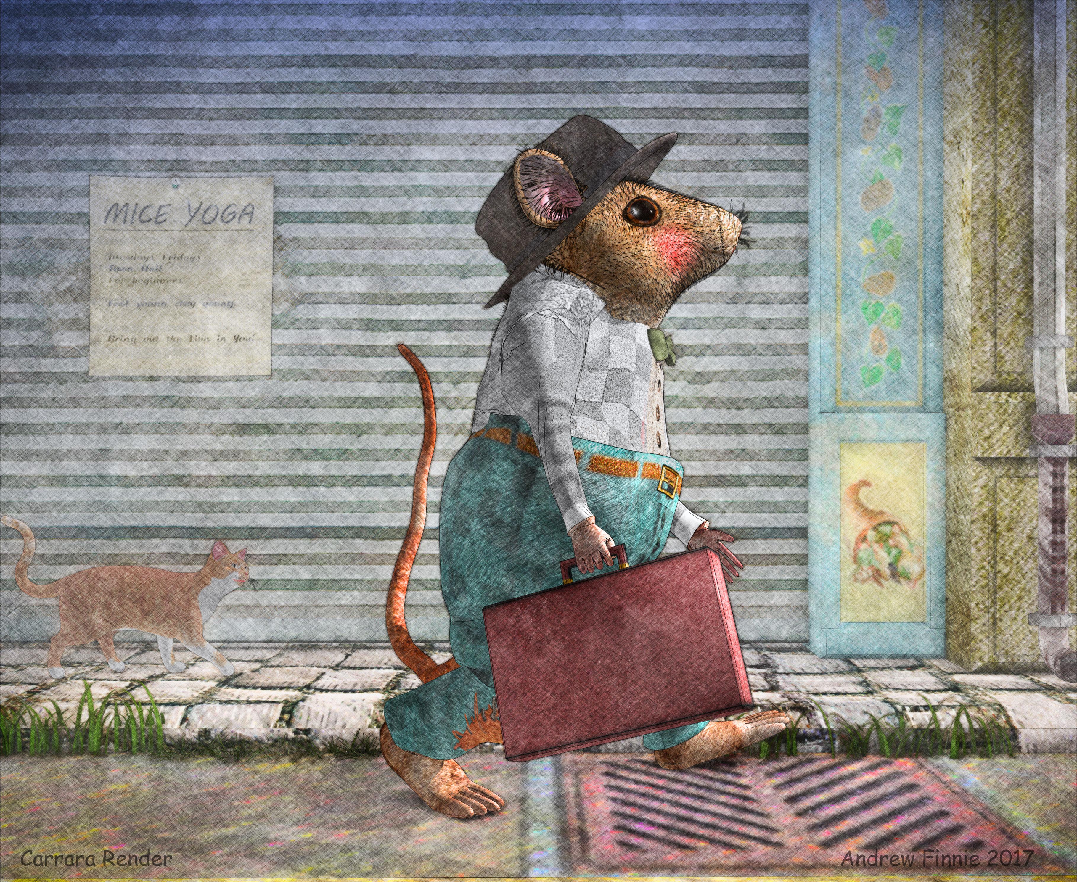
Hi, I hoped we could attract more Carrara users from the booming NPR sector if we demonstrate Carrara's capabilities as a Non Photo Real renderer and tool for people interested in NPR post work.
I know there are some other Carrara users who share this interest - eg Diomede ;) And I'd love it if people were to share their work.
From what I have seen Carrara (out of the box) has a great advantage over Studio because of its extensive selection of multipass renders (that can be rendered at one time) plus it;s NPR capabilities plus it's powerful onboard Toon renderer.
It also has a hair tool which gives reasonable NPR fur. You can also render this out as a different pass.
If you are interested in working up your Carrara renders and joining this thread that would be very kind. And if not, feel free to watch and chime in to add encouragement, and hopefully you'll be convinced NPR is a way to go.
BTW A great free tool for post work is Fotosketcher. http://fotosketcher.com/
The passes I have used in these two are diffuse, colour, coverage, shadow, beauty, index , primitive volume (for isolating hair) plus some others. The coverage layer gives object lines, but allows isolation of image elements for your post work, (as does the object pass - which gives more choice in masking for postwork) You can treat each pass eg shadow pass differently in post work and once combined in layers you have much more leeway than just trying to work with the beauty pass.


Comments
Yes, its true! Various forms of non-photoreal approaches generally interest me more than photoreal. For my tastes, I like Carrara's dynamic hair; however, it does not work well in my experience with either the Carrara native toon renderer or the Carrara NPR renderer. Therefore, I like the volumetric primitive passes of a photoreal render which I then use to bring dynamic hair to an npr or toon image. I have also experimented with designing hair models to work with the NPR or toon renderer. In my experience, these models work best when they are closer to the prop hair for V3 (transparency does not work well either).
I have shared an image or two in that thread in the art studio forum. I encourage anyone interested to join in.
Thanks Diomede :)
This image that have turned out really well - as far as looking 'hand done' The man's hair, the girl's legs and dress , the still life on the table and the stool , the faery tale feel all make it sing.
I think Carrara has a lot to offer for the NPR crew :)
Wow, thanks for starting this thread Head Wax! Wish fulfillment for me, and synchronicity regarding the next challenge!
You and Diomede are both great at using NPR. I hope that you guys are going to be willing to offer specific instructions, and "dumb them down" sufficiently for rooks like me to understand.
Pleasure UnifiedBrain - looking forward to the next challenge :)
One win I had recently is with the Toon1Part111 thingy (select Scene in the instance tab, then click filters on top right and select the Toon1Part111 filter
You get a window whuich is really really small to show you what the effect will be. So I've nevere really used it.
I only just found out that you can make that window bigger by grabbing the window corner and dragging (feel like a thickhead) . That way you can actually see what you are doing when you change the parameters!
Love the stuff you guys do....
here are some of mine from my Gallery....
oh wow Headwax great tip never knew that
that's great Stezza, really likeing them all, but especially The James Cook and The Plane - they really make the grade as far as mimicking traditonal illustrations.
Not sure why - maybe it's because they elements are taken out of their environments.
Have you seen these Russian (?) artists on facebook? named duginart? have a google, they make really flat images of the clothes combined with '3d' images of the hands heads feet etc. Their work glows - they use egg tempera I think, but their style is something I would like to mimic via carrara
eg of their work. Please note this image is NOT mine.
Wow! Cool renders here! Head wax, the last picture reminds me of traditional Japanese engraving. The only thing that like a thorn in my eye is the candle sticking out of the bowl.
Some great renders there
Thanks Wendy, sorry we must have cross posted! That makes toon1part111 a much more viable/rewarding thing to play with!
thanks Vyusur and @TangoAlpha - looking forwatd to letting one of these NPR go on your new product Tim.
and Vyusur, yes that is a bit odd! Love how he has tilted the viewpoint for the rug though ;)
Great stuff here - this is the type of result I'm going for in photography. ON1 Raw and fotosketcher make a great combination.
Well done for starting the thread, head wax:)
Thanks Roygee, ;) Must look at On1, thanks for the reminder! Be great to see your images you are making. :)
Here's a few renders using Carrara built in Toon1Part111 - you can render this with no lights at all! Very fast :)
One has no lights, one has a very bright bulb in the centre of the scene.
The larger two are post worked combinations of render passes combined with the Toon1Part111 renders.
An image of the Toon1Pro111 render settings is also attached.
The subject is one small part of TangoAlpha's excellent new product.
Head wax, but everything is beautiful, saying of the scene of tea drinking! How did you get this print-like looking illustration effect (flat island with a thin contour)? All the same Toon III?
The challenge for Paradise Lost has quite a few good tips for non-photo approaches. Zgock explains some ways to use the free Yatoon plugin, with screenshots. Antara explains how to make custom brushes for Carrara's native NPR renderer.
Here is a link to a post from that challenge thread in which Antara shows combining an NPR render with passes from a regular render. I highly recommend interested folks skim this thread.
https://www.daz3d.com/forums/discussion/comment/402088/#Comment_402088
EDIT: The Paradise Lost and Found challenge did not specify NPR, but several people went that direction. Here is the entry thread. Check out Philemo's!
https://www.daz3d.com/forums/discussion/28208/winners-announced-carrara-challenge-3-paradise-lost-and-found/p1
Cool... while I don't have anything to contribute, due to my not diving into NPR just yet,... hopefully I'll pick up a trick or two here. Thanks mucho Andrew.
Diomede, thank you very much for the link! I've seen many great images there in paradise thread. I've just got Yatoon and I'm going to play with it as soon as possible. Btw, there is very helpful tutorial on using the plugin. Thank you once again!
Love those, Head Wax
One thing that Cripeman pointed out is that it can often be good to set a very low brush size in the NPR renderer.
.
Also, Cripeman on making a blueprint style
.
Also, here is Marcelo on the NPR. Some great Carrara help videos by Marcelo. Worthy of much more forum love, in my opinion.
Srezza, those were just awesome. Sorry to leave you out when acknowledging some of the experts here, as I had never seen your NPR's before. You are definitely an expert.
Ha! Agreed.
Agreed there too.
Diomede, thanks for posting some of those tutorial videos, and to Head wax for the toon1 tips. Sorely needed at this end. It's like you guys have a key to a magic door, and I can't even see the door.
I had a go at an NPR this afternoon. Sad to say, after 5 hours it was still on square 1. So I force quit it.
Obviously needs a bit more thought . . . on another day.
Vyusur sorry, this image is not mine. It's something I aspire too. It is by a husband and wife team named Duginart. http://duginart.com/
I am rendering something a long the same style though. will post later!
thanks TangoAlpha, that's a great set you made.
plus two. thanks Diomede, hadnt seen those. !
john and unifiedbrain - pleasure. Looking forward to seeing what comes up!
Some very impressive images in this ... so many toys, so little time ...
SteveK so true - so I got up at 5.30 today instaed of mu usual 8.00 am :)
That can happen when everything is ticked!
To start off untick everything and just select Outline... that's a good quick start..
Shadows ticked will slow it down
Diffuse Layer ticked will slow it down and so on
Background ticked isn't to bad.. but just start with Outline and adjsust your lengths, thickness ect.. till you get something you like.
edit to add--- don't forget to save your settings file so you don't have to remember what you did.. just load up the settings and away you go
Thanks for the compliment UB
Just enjoy having fun with it..
add your own Meme to this and repost
thanks for that advice - if the shadows are taking so long I'd run a photo real render as well with a multipassed shadow render and use that to add the shadows to your NPR image in post - you could turn off aa even to make it quicker.
That's terrific Stezza. Care to give us a few clues as to how you made it?