Adding to Cart…

Licensing Agreement | Terms of Service | Privacy Policy | EULA
© 2025 Daz Productions Inc. All Rights Reserved.You currently have no notifications.

Licensing Agreement | Terms of Service | Privacy Policy | EULA
© 2025 Daz Productions Inc. All Rights Reserved.
Comments
Chestnuts added, and now I'm slowly weeding down what trees I want to use. I'm thinking 3-5, maybe with a couple of variations if they exist. Then... instances.
(extremely large picture linked. Gotta be able to zoom in and examine tree details after all.)
Watching with interest
I've picked out my tree and shrubbery pieces and stuff. Now I'm going to go in and place some set pieces from top down, and then.... consider whether I want to use Ultrascatter for the trees or handplace them. I do need to use Ultrascatter for the ground stuff, which I want to center around the trees if I can. Ultrascatter is scary because I never know how many scatters to put out.
Meanwhile my wife sent me this link, because a later kitbashing project involves using Nurnies 1 & 2 and Morphable Primitives to make spaceships:
http://murraybreen.com/tag/john-selvia/
I've been working with the Terradome base and Ultrascatter, figuring out just what I can do. I've some screenshots and some renders but too sleepy to upload. I'll be at Norwescon (SFF convention) all weekend with my family so no 3d time for me. I'm hoping I haven't lost my momentum on this when I get back. I've just reached the point of thinking about making a distribution map, or, rather, several of them. I think it'll really make things nice; the control of hand placement but much, much faster. And I'm thinking I should be able to just use the Terradome UV as a template? Guess I'll find out.
I shall get back to my forest scattering today but yesterday I took some time to generate some images to put through some new Topaz Labs filters. Two variations on a setup:
and
I learned two very important things in those renders.
1.) Future Height is NOT SIZED FOR HUMANS. I had to scale Tamara up 500%.
2.) In retrospect, despite the many pieces, I should have scaled Future Height down. Because scaling up your subject screws up potential lighting solutions beyond reasonable repair. At 2:45 AM, I gave up and let it render with the headlamp because it was the only light I could get to work properly.
I have a few other images destined for postwork fun but AFTER I do my 'real' work.... I hope.
Ugh. Making Ultrascatter distribution templates is just as frustrating as trying to avoid doing that. I don't think I'm cut out for constructing scenery, at least at this stage of my skill development. I've no idea how folks like TangoAlpha do what they do.
I saw that first one in your gallery but I really like the second one as well. I had no idea that the GIS series had to be scaled down. I will keep that in mind thank you!
I don't know how they do it either. Its crazy the amount of stuff that one needs to learn!
Yeah. I think I'm going to leave it to the pros, honestly. Andrey and TangoAlpha do such flexible sets and Stonemason is great for set pieces and I can either spend time customizing scenery or I can render it for these narrative projects but I don't think I can really do both. Yet.
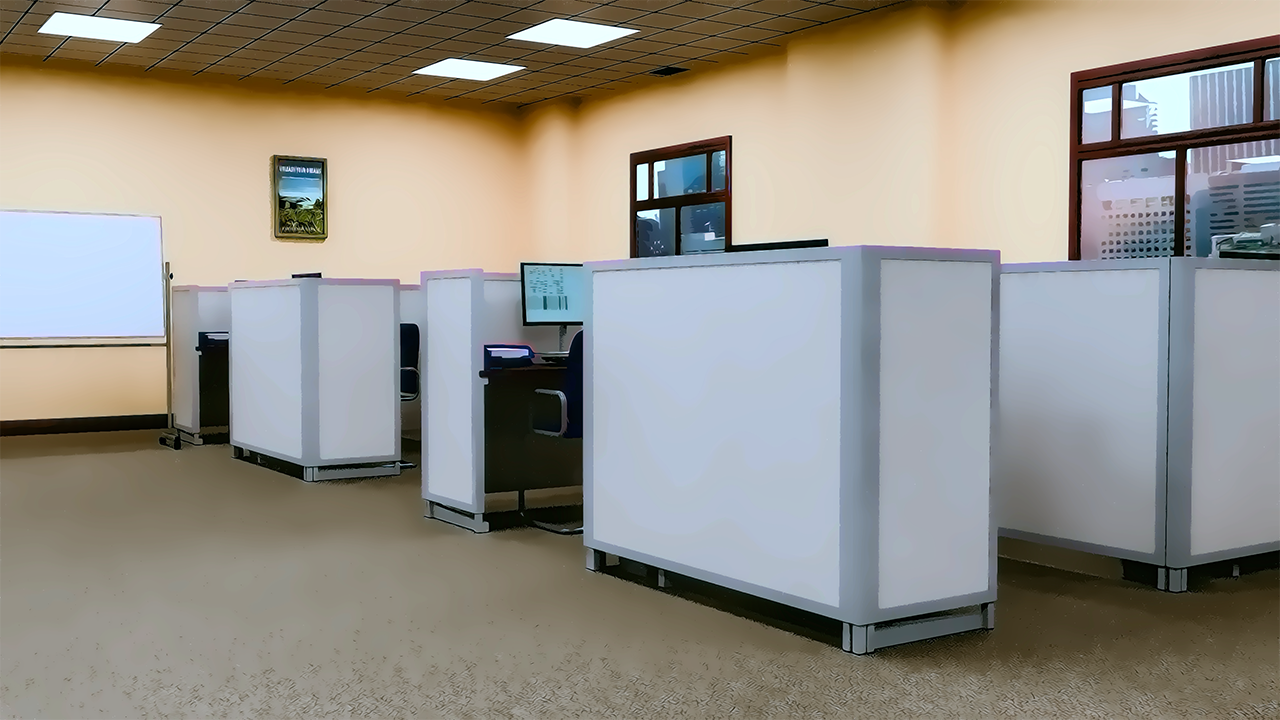
I've been hard at work on a project (ok, the same old project but I recieved new, external motivation to focus on it) so almost all of my renders have been related to that. Today I made a cubicle farm by extending The Filing Room and filling it with Everyday Office supplies from Renderosity.
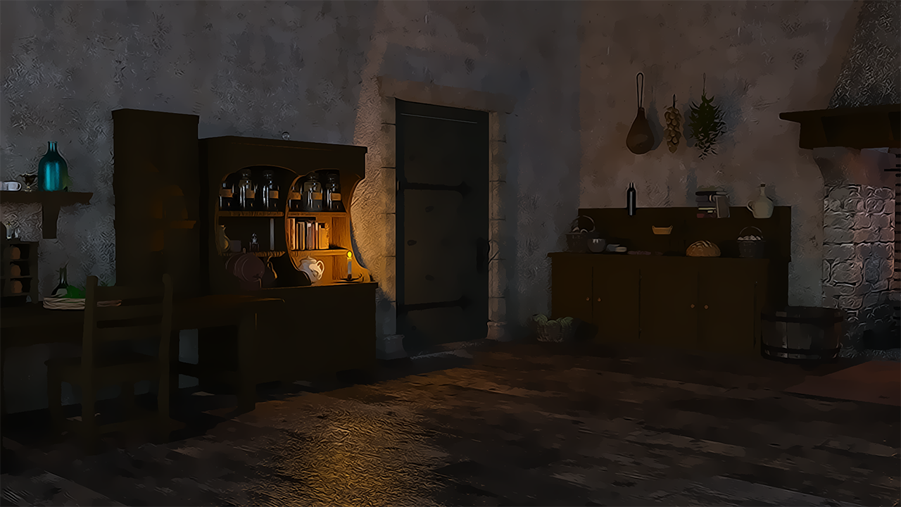
I've also made a cottage interior, starting with MICK and using a lot of props from all over. One corner of it below!
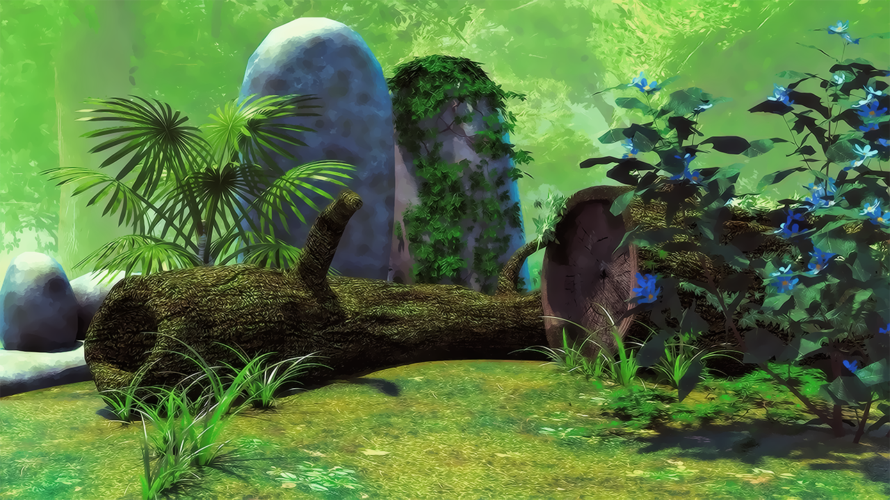
A forest backdrop, made with an Enchanted Glade (?) set from DM over at Renderosity, with a pre-rendered background.
And finally, a transformed dragon.
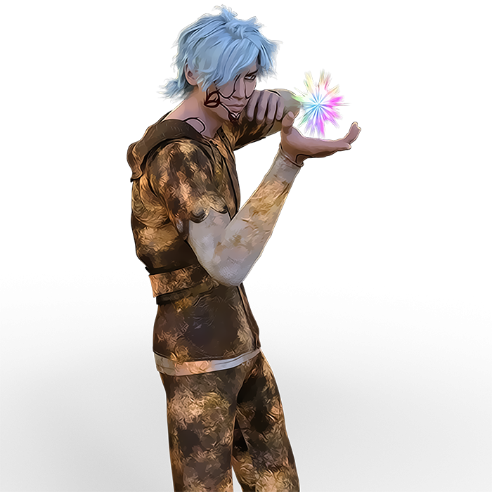
Great renders, all of them. The cube farm is convincing. Cottage looks warm and inviting. Your transformed dragon looks great. Did you use post work or a filter on him?
Yes. Most of my current stuff is for a visual novel so I'm using some combination of Topaz Clean (Cartoon) and other filters to taste. And I had to add the tattoos on the skin texture myself (from some brushes I had) which was an adventure.
Thank you!
I love Topaz clean and use it all the time too! I'm also playing around with filter forge and some photoshop actions. Everytime I play and get a good result, I forget to write down exactly what I did... It's kind of like dial spinning w/out writing down what changes you made so it is hard to recreate, LOL
Do you intend to add lineart, or use another filter/program to add it, or do you prefer not to have lineart at all? I go back and forth with that myself because auto generated lineart seems to be a crapshoot - works with varying degrees of success on various images. I need to apply myself and really get to learn linerenderer.
After a lot of experimentation I decided rendered line-art is too much work for me, but one of my friends has worked really hard on setting up a process for herself. Check out: https://www.daz3d.com/gallery/#images/339931
Oh that looks good - thanks for the link.
Have you tried sketchy? It's been hit and miss but I truly don't know what I'm doing and once again, I need to study up on it! It's hard to know what to learn first when there are so many moving parts.
I used it briefly but ended up returning it just because it didn't at all fit what I was currently trying to do. I did ping my friend who made the above to see if she wants to step in and talk about her experiences, though because she is like a Sketchy master...
It's worth noting i've since improved my process (from the gweni link above)
sketchy is a complex beast but i love it. i pair it with lr9k, filterforge, and topaz clean (linerender 9000 has one annoying compatibility issue with sketchy, there's a decent workaround, but it's labor intensive. worth it for me, but not for everyone.)
in order to achieve my signature look, i used filterforge to create two new textures to plug into the sketchy diffuse and outline maps, which i will attach.
In addition, i make a few changes to the hair alpha maps to toonify it more, which is mostly for the benefit of lr9k, not sketchy. If you take the hair transmaps into photoshop and open the levels adjustment window, smoosh all three dials close together on the darker end of the scale. You want to retain the transparency of the roots and tips of the hair while keeping minimal transparency within each lock of hair.
I also use topaz clean now, layered on top of a filterforge pass, on top of the raw iray render, with some tweaked tone mapping during iray render.
Don't want to highjack @dreamfarmer’s thread anymore, but if you have more questions, let me know :)
https://www.dropbox.com/s/76d6jnj1se8z3n9/ff watercollor dark large.tif?dl=1
https://www.dropbox.com/s/p3nka159sj0n4ka/ff-perlin-noise_0001_perlin-small-dark.png?dl=1
Thank you @lain105_eckomars . I will keep your instructions for the future as I don't yet know how to work with textures and maps (other than presets) yet but will get there. I do have and regularly use topaz, filterforge and photoshop.
I think I'm more likely to use sketchy than linerenderer and I believe there is a youtube I need to rewatch about it.
Thanks again and thank you @dreamfarmer for hosting the discussions :)
Hopefully, in the coming months, I'll have some renders I can practice on.
no problem. I found i ended up using lr9k and sketchy in order to get the look i wanted but you could easily make lovely things without lineart
I just bought a yacht! Specifically, TruForm's yacht, elsesite. And I love it. I bought it purely as a toy/wish fulfillment but now I'm thinking hard about kitbashing it some to add in a proper crew quarters, and then using it to illustrate crazy floating-hotel-melodrama. Or maybe some sort of fantasy Gilligan's Island.
I've been using Collective3d's Create-A-Room to figure out floorplans for some house models. Here's the first floor of Single Home 6. It's not really for renders (well, maybe some rooms where I have all the pieces to decorate)-- I'm totally willing to use other room products for specific shots but I have this compulsive desire to _know_ how everything is laid out so that all my shots can look consistent.
I want a yacht.... the room builder looks rather interesting.
Sonja, you're so nice for always checking out my thread. I really appreciate it.
I've been posting a lot of pictures in the Daz Gallery/DeviantArt. I usually do postwork these days and I thought I'd show off a before/after.
Could do other before/afters if there's interest.
Another one.... Not quite the same framing/aspect ratio because I rendered the postwork version with different light layers. But I had this render with all the lights on hand, so...
Your before and after examples are very interesting. Your last one came out fabulous. The postworked one can be an actual photograp and has a nice, dreamy quality to it. Both characters are adorable to boot.
Wow, great job on the postwork! Really like them both. Love the *dog*. I love seeing before and afters.
I enjoy your work, so its always fun when you post new stuff!
Wanted to continue my intermittent study of the art of fantasy/sci-fi cheesecake pinups. It's been really hot here lately so getting renders done has been a challenge. You'd think I'd take a break and do some chores or writing or something... but instead...
Another of my floorplans, based on the Haunted Victorian at Renderosity. I actually had to scale the house up over 300% and then make it a bit wider and longer because I couldn't otherwise imagine humans living in it. A first floor. Collective3d's Long Island Mansion props already coming in handy!
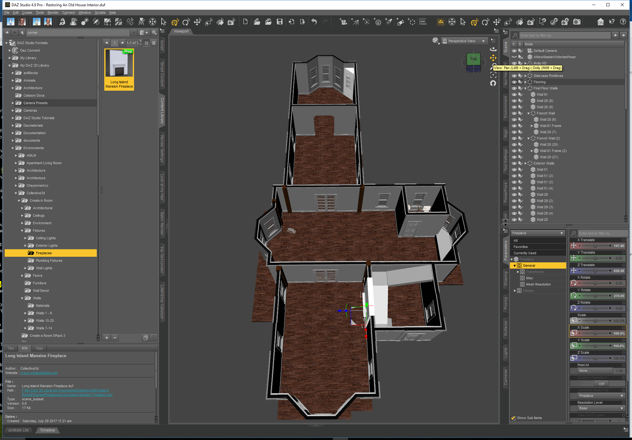
Second Floor, possibly. Very big bedrooms, I think. And a sitting room outside the master bedroom.
I just love renders of horses and this one is just stunning!!!!
Keep the Horse renders coming I would love to see more of them!!!