Adding to Cart…

Licensing Agreement | Terms of Service | Privacy Policy | EULA
© 2025 Daz Productions Inc. All Rights Reserved.You currently have no notifications.

Licensing Agreement | Terms of Service | Privacy Policy | EULA
© 2025 Daz Productions Inc. All Rights Reserved.
Comments
Posing is a tweak on something from a pose pack. :p I have to say, for somebody who started with something called 'Poser', posing is one of my least favorite bits of this hobby. I'm really glad lots of other people find it enjoyable! As for looking back....your current piece in the Newbie contest is INCREDIBLE. I can only hope to get there some day.
More silly stock tweaks. The model is HP Azari and her knee was poking through the dress. I took the expedient route of scaling the knee down. >.> Pre-posed dresses are my favorite.
"Senior Yearbook Photo"
I'm trying to hate and fear Photoshop less.

Dreamfarmer, that is an interesting render with the pair on the bridge and I like the mood that is present there. What I was wondering is how that woman works.. I don't see a body or legs or is it meant to be a genie
She's a full-on woman, but turned away. And yeah, my spouse told me that too. I couldn't even tell there was a problem since I knew what was there.

Anyhow, I've been practicing my Photoshoppery skills, with some tutorials and backgrounds from Sveva, and brushes from Ron.
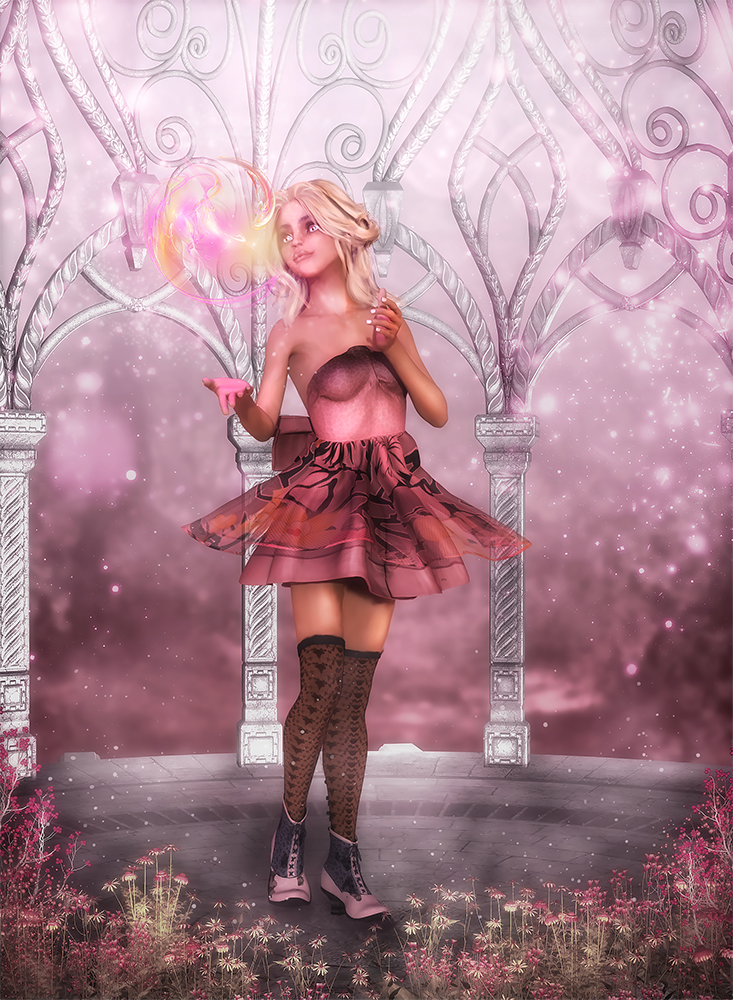
I've been calling this Fairy Portrait Studio.
Next verse same as the previous:

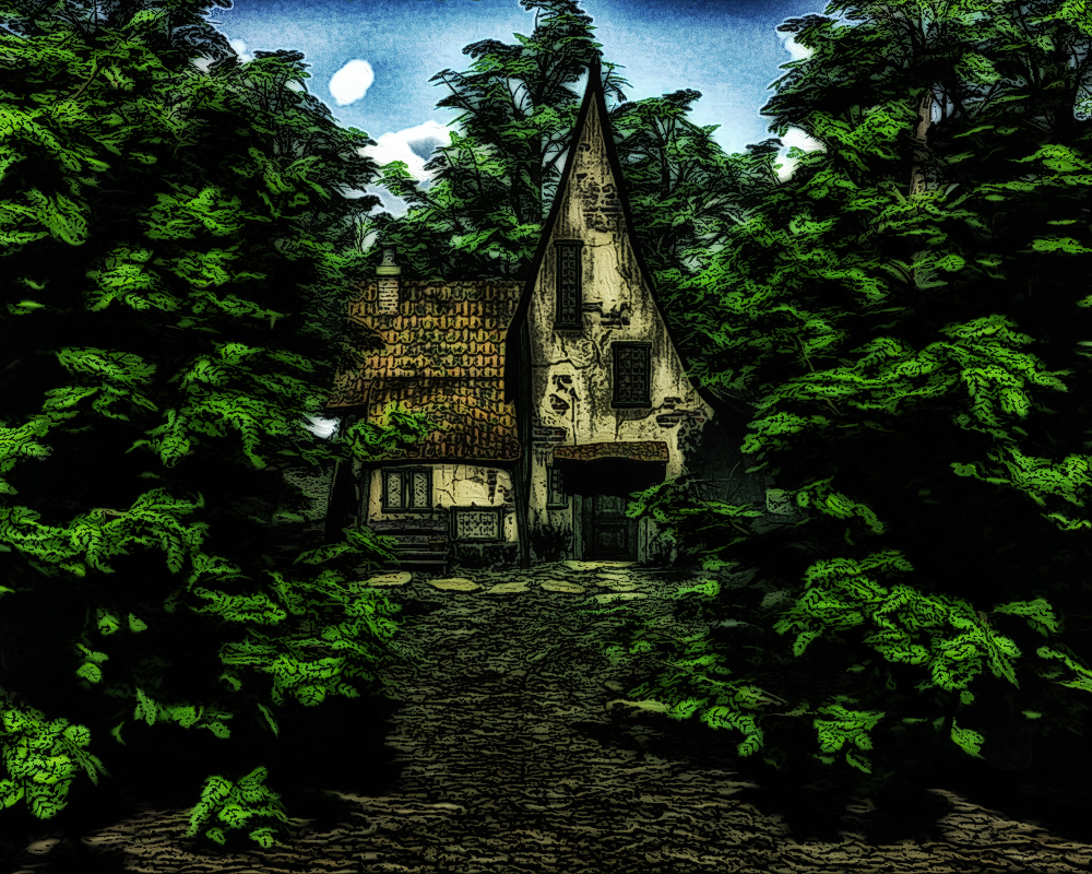
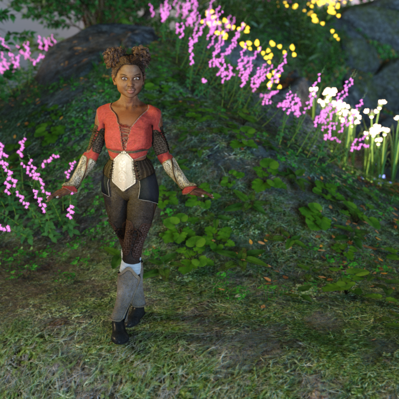
"Forest Friends"
The Fairy Portrait Studio use of pink is delightful- and I like the scaling of the flowers, with height on both sides and lowering in the middle so as not to distract. Nice framing! Great bokehs and glow on the hands, the list goes on. Very impressive! The posing in Forest Friends is quite lovely, love the foot touching the cat. The shrouded background really sets off the foreground figures.
Wow, thank you so much! For the record that piece has probably more photoshop in it than the contest judges really want. Which is okay, its the kind of art I wanted to be able to do, blending 3d with 2d. And I have way more experience with photoshop than Studio. And in reference to your other post about photoshop, don't be afraid of it! Just make a working copy so you don't screw up the original. Use layers. Lots and lots of layers. that way, if you don't like one thing you can just toss the layer and start over. Experiement. Toss a layer in and click on a button and see what happens.Also, I watched a huge a mount of you tube videos from speed painting to photo manipulation tutorials. I know there are purists out there who think using photoshop is cheating but I personally feel that they are all tools. I am going to use the tools that are going to allow me to make the art thats in my head and that means using whatever tool will allow me to do that as well and as efficiently as possible.
I really like your play on the pose mimics and the shapes. Posing is one of those things that I hope I wil like more when it doesn't take me three hours to get a hand to wrap around a sword the way I want it to lol. I have a large library of poses that I use as starting points and don't mind admitting that at all. Its a good time saver as well.
I didn't see this one when I was writing the first post. Why are you afraid of photoshop again? This is really good! And the second one is very well done as well.
Well... I was! Am much less so at the moment and it's ALL thanks to Sveva's tutorials, which are like.... babytalk, almost. Exactly what I needed. She gave screenshots and exact numbers for tool settings (which is SO important because tools can do such different things at different intensities) and I was teary-eyed grateful and I went through like three of them to produce that (and it's her background I used, although I think I could take a stab at making something very similar now.) Still a ton to learn but I think I got some really basic ideas that I needed. Which I'm super excited by, because yeah, I like the sort of 3d-2d look myself too. Even if I do still feel like using so many resources created by others is kind of cheating. Trying to get past that too.
I really like how this one turned out! Nice! :)
Those fairies are delightful! nice postwork done there. The world need more fairies so keep it up!
One of the contest entries I've been working on:
Great render!
Really like this one, very creepy. Great use of DOF too.
I have a couple of her tuts, I have one that goes through her process to create a background image from photographs that I am very eager to try.
Man, contest renders really eat up time sometimes. And we won't even talk about nasty real world distractions.

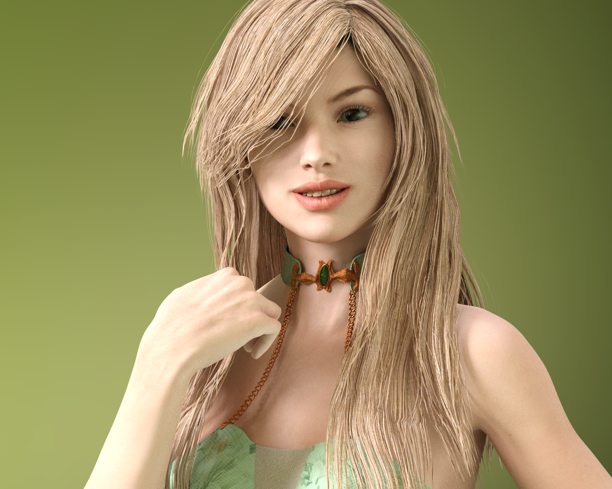
This is not a contest render. I was going to use it in a paintover, and I may still do it. I believe it's one of my first experiments with the new NGS Genessis 2 product. That hair is certainly desperately in need of some kind of attention.
Lookin good - I like the choice of the BG color with a subtle gradient. Have you tried a smoothing modifier and/or turning on subD on the hair?
- Greg
Wow that one is amazing Dream I really like how it turned out!!!
Thanks, Saphirewild!
This was for the VR contest. I rendered pretty much every bit of it separately then composited in Photoshop and added some of Ron's brushes. It was fun experimenting with different ways to synchronize the lighting (which was technically already synchronized because it was all literally lit the same) but.... yeah. Blending layers are the bomb.
I really liked how this one turned out in the VR thread. I still have to go track it down in the gallery. I haven't been over there in days. The first time I was over there in a while was when I uploaded my entry. This is really good, though. :)
Thanks so much, knittingmommy. Man, that Raining Men contest. I have a couple of ideas but apparently my current MO is to take a week or more per WIP. I have one of the two models for Raining Men 3/4th done...
Anyhow, the last week or so this has consumed almost all of my artistic attention. I should have fixed the dragon's mismatched textures on the arm, but I learned the important fact that I only have about a week's attention span for one project. But hey, what I learned this time doing everything else will help me get more done faster next time.... right?
Very cute!
It still looks great. I love the composition. It's very a playful render. :)
edit: edited for clarity
this looks so cute, they seem to have a lot of fun!
Thanks! I wish the pieces I set out to make came out half as satisfying as the ones where I just kind of stumble around.
I've been experimenting with merging light layers in Photoshop and thought I'd share what I've done so far.
So what I did was render all the lights individually, then layer them in Photoshop. (Blending mode screen upon a black background is some kind of voodoo as far as I can tell.) Also, just to have a point of comparison, I also rendered with all lights on at the same time. So the first image is 'just Daz'. The next one is all the light layers individually toned with Level Adjustments, and most of 'em at 100% opacity. The third one introduces some Photo Filters for most lights, along with some opacity shifts, and, ok, one more layered render just of the young lady so I could do a couple of tricks later, (Most of these steps courtesy of Shiba Shake.) The picture itself is just a smallish render I put together to test the techniques--I have so far rendered Photoshop-destined work at 2500-3000 pixels but these were only 800. And I wanted to use the new DE Nadira figure; I made her an 'older teen'.

I plan on poking at it some more in Photoshop still, but I can't do the full touch-up/paintover process I'm also studying because of the small size. But I THINK the light adjustment stage is done.
Hi! I need advice.
Attached is a picture I got all nicely rendered in Daz then took into Photoshop to complete and... hit a brick wall. I have no idea what to do. I want the picture to be 'Iris, Lady of Rainbows' but I have no idea how to make that happen. I can't even decide if I should keep the backdrop and rainfall or toss it for something else. I can't decide if the white orb should actually have rainbows spilling everywhere, or be the sun and she's somehow the rainbow..... I was working on this a couple weeks ago and the thumbnail of the PSD file keeps arresting my attention, so I feel like I have SOMETHING there. I just don't know how to finish it.
I actually like it like it is. Maybe just put the rainbow inside the ball? I don't know I kind of think rainbow colors would throw it off somehow. You have these lovely shades of browns and golds and soft pinks... Maybe wings? with a really toned down rainbow sheen or something in the aforementioned color pallette? Purely my opinion so don't feel like you need to take my advice lol.
I like the idea of the rainbow in the ball...that would provide a small focus of attention with the rainbow color palette without those colors interfering with the rest of the image's palette.
Hmmm. Hoping I can get to this later in the week.
Meanwhile I've been doing lots and lots of tiny samplers of DT's lightprobes.... trying to figure out the perfect lighting for the fairy tale I'm producing.