July 2016 New User 3D Art Contest “Portrait Rendering” – WIP Thread

1246720

Comments

  • Kismet2012Kismet2012 Posts: 4,252
    Hemms said:

    Think I might have my pose and lighting down. Just need to figure out a good scene to place her in... Any thoughts? Any feedback on how you'd make her better?

    She looks like she is on a catwalk or walking into a party.  Definitely exuding self-confidence.


  • Kismet2012Kismet2012 Posts: 4,252

    I managed to work on the poses for my 'Best Friends'.  Posing these two was not easy as their heads kept getting in the way.  I can't figure out any way to morph them either, because somehow d-formers just don't work on these 3D Universe figures or hairs.  I don't how they managed to turn off the ability to apply d-formers, but if anyone knows how I can undo that, I'd appreciate the advice as I think could get their head closer together if I could move Toby's hair.  However, there are no morphs of any kind with the hair and trying to create a d-former doesn't even get me the grid and the d-former itself can be moved all over the place, but does absolutely nothing! I've seen a few items like this and I can't say I like the trend of hiding the ability to make modifications to a prop or figure or hair. I tried taking the figures into Hexagon via the bridge and adjusted stuff, but when I brought it back in to DS, the morphs did unusual things and not in a good way.

    Tell me what you think.  The only things changed were the poses and a slight adjustment to the camera angle because of the pose changes.  Everything else is the same for now.

    These 2 are adorable. 

    I have issues with dformers as well.  Sometimes I can get them to work and other times I can't.

  • ewcarmanewcarman Posts: 180

    Ok, I think I have it where I like it now. Brightened up the eye and did a lot of postwork on the hair. Forgot which hair I used, but it looks terrible in close-ups... Now to think of a title...


    I really like this image. The hair and the expression are great. The only thing that seems to distract my eye is the light on her left shoulder. I struggle with lighting a lot, so grain of salt time here. If there is a way to mute the light somewhat. I don't know if it is coming from the main light on her face or a rim light. It just shows as a hot spot competing in intensity with the soft light on her face. 

  • ewcarmanewcarman Posts: 180

    Thanks all for the feedback.  I incorporated most of the suggestions in the next draft.  I moved the hand/arm poses to hopefully look more natural, shifted the background so that the figure doesn't blend in as much, and changed the hair texture to have more shine so it doesn't blend into the background and glasses frames as much.  I'm not sure about how to add more light to the face without causing the necklace and glasses to turn into giant reflectors.

    This is looking very nice. Nice hand poses too. I spend a lot of time trying to get the hands right. When they are off, the whole image just feels wrong, but you've got them looking really good.

    The glasses seem to be floating a little on her face. It could be me but they seem to be hovering a little above bridge of her nose. Also, her eyes look like they are focused straight ahead - perhaps if they were pointed down a bit (little bit) they might be focused more on the book. It could also be an illusion with the glasses, so start with those first and see if that takes care of the whole thing.

    Some small details (maybe in post?) could be cool. Maybe a little ripple in the coffee or streak of creamer would make the liquid come to life. 

  • mal3Imagerymal3Imagery Posts: 709
    dawnblade said:


    You have some interesting shadows on his face.  If am finding the background just a little too bright and a bit of a distraction.  I like the colour as a compliment to his outfit but perhaps a slightly darker colour or the application of DOF to tone it down a bit?

    A soft fill light from the front might help to soften the shadows on his face and bring out some of the details on his uniform.

    He has a great expression. 

    Thank you for your feedback, @Kismet2012! I adjusted the 3 spotlights I had set up, and added a different backdrop. I now have DOF on and have fiddled with it for quite a while, but I am unable to make the backdrop render out of focus. It appears that the backdrop surrounds the main figure, even as the ground.  I googled it but haven't found how to use DOF to make the backdrop out of focus. I'm sure I'm doing something wrong but haven't found what exactly that is.

    I tried just adding a plane and using the background as the diffuse color image, but then the reddish shapes in the background scaled up considerably, so I switched back to the backdrop.


    Hi Dawnblade!  You're portrait is looking good so far.  It reminded me of my Celestial Angel portriat.  I got a few suggestions that you could use to make it better, but it is easier to show you than to tell you.  The background you have is good, but it doesn't match the theme or color of your subject.  You could go with a golden simple background with a hint of white in it.  Also in your original render the eyes was dull and didn't have reflections in it or not enough contrast.  To me the eyes are the most important part of a portrait.  I exaggerated the eye colors to pop.  I have messed around with Daz a bit you can toggle on the DOF Parameters tab under the Camera dropdown.  Just turn it on and use the Focal Distance to adjust the DOF point.  I think you can add bloom through DAZ, but I'm not sure how you would do that.  I also used a 1920x1080 size for a more cinematic portrait.

    Test.jpg
    1920 x 1080 - 585K
  • evilded777evilded777 Posts: 2,440
    edited July 2016

    Tweaks, new pose, a little better with the hat.

    Thoughts?

    Yes that is a big giant spotlight emitter in the back there. Not too sure how that happened!

    portrait1.jpg
    600 x 800 - 271K
    Post edited by evilded777 on
  • dawnbladedawnblade Posts: 1,723

    If you added the image as a background in the environment tab the DOF will not apply.  A plane should work but you may need to play with size and scale to get the image to look the way you want.  Another alternative would be to either take the image into a 2D program like GIMP or Photoshop and blur it there or choose a background image that already has a blurred effect.

    Thanks for this info! Would be nice to use DOF in that way in a future version of DS. Until then, I'll use Paint.net or Gimp to blur the background as you suggested.

    Picking the right background image can require a lot of trial and error.  Sometimes you get lucky and find one easily and sometimes you end up going through quite a few before finding one that works.

    The first background was a little too bright but the one you are currently using has a lot of texture and interest but does not take away from your figure.  It is actually helping me focus on him.  The background is no longer distracting to me.

    Great! Thanks for your help, @Kismet2012!


  • dawnbladedawnblade Posts: 1,723

    Hi Dawnblade!  You're portrait is looking good so far.  It reminded me of my Celestial Angel portriat.  I got a few suggestions that you could use to make it better, but it is easier to show you than to tell you.  The background you have is good, but it doesn't match the theme or color of your subject.  You could go with a golden simple background with a hint of white in it.  Also in your original render the eyes was dull and didn't have reflections in it or not enough contrast.  To me the eyes are the most important part of a portrait.  I exaggerated the eye colors to pop.  I have messed around with Daz a bit you can toggle on the DOF Parameters tab under the Camera dropdown.  Just turn it on and use the Focal Distance to adjust the DOF point.  I think you can add bloom through DAZ, but I'm not sure how you would do that.  I also used a 1920x1080 size for a more cinematic portrait.

    Wow @mal3Imagery! Your Celestial Angel is incredible. Thanks for all your feedback and the great sample! I agree about the eyes too. Was hoping my spotlight changes would help with that but they still look like shark's eyes. I'll work on them.

    Will have to read up on bloom since I'm not familiar with it. I like what you did with the different size portrait and background.

    Thanks again!

  • DefenistratDefenistrat Posts: 68
    edited July 2016

    Wow! I don't pay attention for a couple of days, and come back to all kinds of helpful feedback, and so many new entries. I looked back at some of the other new user contests, and it seems like "portrait month" always has a lot of entries.

    SickleYield has a very good video tutorial on using Outdoor Lighting and Skin Settings here.  

    Thank you for this one. Watching this video is where I had my "Aha!" moment where it all made sense.

    Crush Blacks and Burn Highlights can also affect how the colors look.  You can use other lights in a scene besides HDRI.  Make sure your Dome is set for both Dome and Scene.  I believe the default is Dome Only and you need both Dome and Scene if you are using the HDRI and scene lights.  Make sure that you turn off the Headlamp on your camera, too, as this added light can really mess up your lighting and give you effects you don't intend.  I do like the pose and camera angle.

    As for Sun and Sky mode, I haven't used it much, but from what I can tell, that mode is ONLY Sun & Sky, no other lights.  That mode does seem to completely take over the whole show and you need to change things around by changing the time of day, the date, and longitude and latitude to make any real difference. 

    Thank you for this! I didn't wind up using Sun & Sky mode. Actually, I looked up the date of the next full moon, set the time to 11:00 PM, didn't have to change the lat and long since it was already set to where I live (fun fact, I actually work in the same building as Daz HQ, just one floor up, completely separate company though). The scene was completely black... So I guess they don't treat the moon as the sun... which kind of makes sense.

    Definistrat I like the way you have her framed in between the two doorways on two different levels.  Nicely done.  As far as the lighting goes, I am still on a steep learning curve myself.  I know if you dont' have dome and scene on it will completely ignore any scene lights. 

    @Ice Dragon Art Thanks for noticing that! I'm actually kind of excited to be "competing" with you, I have clicked on your images more than once in the gallery and when surfing old new user contests... Not that I am stalking you or anything, just once I saw your name so many times I figured I must have liked your work and went ahead and checked out your gallery... anyway... now that I sound creepy... nice to meet you...

    Plugging myself, but this might help: http://www.chariotswheels.com/3d-rendering/daz-studio/37-practical-example-1.html

    Your image is very over exposed. I like the way it works. Its more artistic than realistic. I might rein it in a little... but... its unique the way it is. I'd be interested to see it render longer... because I don't think its quite finished.

    Thanks for your plug! I will be reading this soon. :)

    Also, interestingly enough, that was the 100% render, but yeah, I think it looking washed out was bad. I thought it was an interesting affect, which is why I shared it. That and to demonstrate how far off I was at creating a night scene...

    barbult said:

    I like the sort of overly bright, high key look to this image, even though your aim was a night scene. It has kind of a high fashion look to it. Her skin looks a little too pink to me, though, if you are aiming for a realistic skin tone. If you are going for something a little more editorial, it is fine. It looks like you did a great job on the posing. The hands look very natural to me. I'd crop just a tiny bit off the bottom to eliminatre the bent thigh part and have just torso and up.

    To address your questions:

    1. Daz Studio has several Iray Render Settings for Environment Mode. If you use and HDRI in the Environment Map and select Environment Mode of Dome Only, your scene lights (point lights, spot lights, distant lights) will NOT show in the render. If you select Dome and Scene, they WILL show in the render. If you have selected Dome and Scene and still don't see your scene lights, it may be that they are too dim. You can select them in the Scene pane and adjust their Luminous Flux (Lumen) in the Parameters pane. I can also recommend a wonderful product in the Daz Store called Iray Light Manager Pro. It makes adjusting lighting much easier.

    2. Yes, Sun Node should be your main source of lighting in the situation you described. One thing that can cause a black render is if you have a skydome prop in your scene. The Iray sun cannot penetrate a 3Delight-type skydome unless you jump through hoops to change surface settings of that dome. Even then, the results are far from spectacular. It is best to eliminate skydome props from an Iray render. Using a skydome prop is like putting an opaque inverted bowl over your image. Your camera inside the bowl does not see any light, because the bowl blocks it all. Many 3Delight products come with a skydome. If you load a preload scene from one of those products, you may be loading a skydome without realizing it.

    To render a night scene, you can use the Sun Sky and set the time of day to an evening hour for the latitude and longitude you have specified. You can also use the Tone Mapping to adjust the exposure index. Think of it like a camera. If you stop down the aperture (bigger number) or use a shorter exposure time (bigger number), or a lower ISO setting (lower number), less light reaches the camera sensor and the image is darker.

    These are exactly the next steps I am looking for. Thank you for taking the time to share all of this.

    Anyway, thanks to all your comments, YouTube, and some experimenting I was able to do...

    ...

    ...

    THESE!

    Er... actually they look way darker now that I have taken a step away from them and am looking at them again, but they are just so much closer to what I was trying to accomplish that they look great to me. I still want the contrast higher, and there are some pretty obvious artifacts that I need to get rid of... but I have seen some decent tutorials here and there for that.

    I can't find the quote, but someone mentioned that the section of her body where the image was cutting off (they said it better) looked a little off, which was something I thought as well so they just confirmed my concern. The second image is another, but similar view that cuts off mid thigh. My opinion is that the figure looks better in the second image, but I think I've just thrown the composition out the window by doing so.

    Anyway, there's a lot I still don't like about it. Back to tweaking again. Thanks for all the input and thanks if you took the time to read this!

    moonlit.jpg
    538 x 872 - 238K
    moonlit stance.jpg
    538 x 872 - 228K
    Post edited by Defenistrat on
  • SaphirewildSaphirewild Posts: 6,653

    Yes it is because it did not finish rendering me thinks!!!

    I was really frusterated when it shut down at 37%!!

    Do not know why it did shut down on me like that.

    I will give it a go again tomorrow as I am watching hells kitchen in a few mins:D

  • barbult said:
    noseeum said:

    My  latest progress.  fixed eyes and other tweeks.   changed point light color in front of girls face.  Been looking for a youtube video from way back that tackled the volumetric shader (or something like that) for dust in the lighting but can't find it anywhere.   Darn I really wanted to try that affect out.  Anyone know a good link (with video if possible).


    I think this is a better version. I like the composition better, although I find the man in the background and the bright lights overhead to be distractions that pull my eye from your subject character. The pose looks good to me, but I think she isn't quite looking at the camera; I can't tell for sure on the small image.

    I see Knittingmommy has posted a link to SickleYield's dust and atmosphere tutorial. That should help you achieve the look you are trying to achieve,

     The more I see this image, the more I like it. On the one hand... It kind of doesn't make sense. Here's a happy beautiful dancer, in a dark creepy hospital, and a man in the back ground holding a... OMG is that a knife!?!? oh wait, maybe not, maybe it's just a big metal pipe... WAIT! Why is he holding a big metal pipe in the shadows!?!?!

    So I will politely and subjectively disagree with barbult (but I'm almost positive that barbult has more experience in this sort of thing than I do). For me it's the man in the background that keeps me thinking about this image, although compositionally he does kind of compete with the main subject...

    But then on the other hand the image is kind of unsettling anyway... in a way the unbalanced composition kind of adds to that. Like you need to know the rules before you can break them... 

    Anyway, I'm digging this image... but in a sureal Silent Hill sort of way... I am excited to see what you do with the volumetric lights.

    Oh, but the lights on the ceiling. I totally agree. My eyes just kind of shoot right up to the top of the image whenever I look at it.

  •  

    I managed to work on the poses for my 'Best Friends'.  Posing these two was not easy as their heads kept getting in the way.  I can't figure out any way to morph them either, because somehow d-formers just don't work on these 3D Universe figures or hairs.  I don't how they managed to turn off the ability to apply d-formers, but if anyone knows how I can undo that, I'd appreciate the advice as I think could get their head closer together if I could move Toby's hair.  However, there are no morphs of any kind with the hair and trying to create a d-former doesn't even get me the grid and the d-former itself can be moved all over the place, but does absolutely nothing! I've seen a few items like this and I can't say I like the trend of hiding the ability to make modifications to a prop or figure or hair. I tried taking the figures into Hexagon via the bridge and adjusted stuff, but when I brought it back in to DS, the morphs did unusual things and not in a good way.

    Tell me what you think.  The only things changed were the poses and a slight adjustment to the camera angle because of the pose changes.  Everything else is the same for now.

    These two are adorable. I love the little story you shared with your first post. In the first render Toby looked like my four year old... daughter. But looks more like a boy now. I wonder if the problem with Toby's eyes are actually that his cheeks are too big? Comparing them to... Makena's (?) they seem to jut out just a little bit more, definitely to the side, and possibly to the front.

  • ewcarman said:

    Hello All,

    It seems my abilities have been going sideways rather than improving - so I thought it was time to step back and get some input/perspective from my favorite forum for learning. Everyone can learn from a good critique. In this portrait, "Stop and Smell the Roses", my actor is taking a break from battle (hence the smoke and flames in the background) to literally smell a rose and take a moment to enjoy the beauty from an otherwise chaotic/scary environment. 

    I've used the LIE to dirty up her armor some and the fire and smoke are my own creation (happy to share if anyone wants - just images on planes).

    This is an Iray render and I can tell there are a couple of things just off about it (or, perhaps way off?), but I am at a loss as to what. I'm happy for any input. Don't be afraid to be brutal - imagine what we can all learn with some hard lessons. I find I fall into a mode where I really start liking where an image is going and lose my objectivity. 

    Thank you in advance.

    Best Regards,
    Eric

    So I looked at the image before I read your comment. When I first looked at the image my initial reaction was impressed, I think it's a good image, but I remember thinking "Why is she holding this rose?" I think it's more the epxression on her face, but she looks more like she is trying to look romantic, and I recall thinking to myself "She's got a lady waiting for her in some wooden shack back home". So if she is supposed to look like she is smelling the flower... well, I think that's a difficult action to portray in a still image, but maybe if she held the flower closer to her nose. Also, when I think of someone "stopping to smell the roses" I imagine them closing their eyes, but that's... just like my opinion, man.

    Also, at first I thought her skin was too reflective... but then I thought "No, she's in the middle of battle... she would be sweaty and shiney, so why do I think she looks too reflective?" I'm not sure, but I think that the dirt might be reflecting light a little? Maybe you need to provide a spec map that prevents reflection on the dirty areas.

    Then I thought "Maybe I need to just start sharing objective statements rather than my whole thought process".

    Anway, I think it looks good over all, those are just the things I notice when you ask me to put on my judgemental glasses.

  • Ok, I think I have it where I like it now. Brightened up the eye and did a lot of postwork on the hair. Forgot which hair I used, but it looks terrible in close-ups... Now to think of a title...


    This looks great! I love the grainy look!

    How did you straighten out the hair, did you just have to fix it all in postwork, or is there some trick to get rid of those jaggies, cause if so, I would like to know.

    ...

    Ok... I'm sure I'm sounding super critical tonight... and I thought this would be my positive post... but my wife just walked by while I was typing this out, saw the shoulder and arm coming out of the image and thought I was looking at... adult images...

  • WonderlandWonderland Posts: 6,742
    edited July 2016
    ewcarman said:

    Ok, I think I have it where I like it now. Brightened up the eye and did a lot of postwork on the hair. Forgot which hair I used, but it looks terrible in close-ups... Now to think of a title...


    I really like this image. The hair and the expression are great. The only thing that seems to distract my eye is the light on her left shoulder. I struggle with lighting a lot, so grain of salt time here. If there is a way to mute the light somewhat. I don't know if it is coming from the main light on her face or a rim light. It just shows as a hot spot competing in intensity with the soft light on her face. 

    Yeah, I think that may have been a hair light that also made the top of her hair too bright that I toned down. For some reason, I think I like the light on her shoulder though, I think the image would be too dark without it. It gives it a bit of an edgier look or something. It would just be a face in darkness without it and the shoulder gives it some context. Anyway, I may be wrong, but I like it creativily and visually, so deciding to go with it. Or I may try toning it down just a little, I do like SOME light there, but maybe it's too bright...

    Post edited by Wonderland on
  • Version e up.

    Added anouther flame prop to cast some light on his hands, as well as shifting the camera around him to get rid of the spotlight right above. Afterwords I rotated him to be facing the new camera position, and adjusted his head and neck so he was looking more at the camera.


    So I have been trying to think up constructive feedback on this image from the beginning, but just couldn't quite figure out what seemed off about it to me. Your character is awesome looking, and you know, if you're going to do Star Wars, you need to go Sith or go home. His look, his clothes, the background, they all just fit well into the Star Wars universe.

    Anyway, I did a quick Google search to confirm this, but in almost all of the Star Wars images I looked at, I realized that the lightsaber is almost never the primary light source. It just doesn't work as a good one. I think as you are finding, it just doesn't bring out the details of a character's features, and it's a little bit too unnatural. However, it makes for a really cool secondary light source. I wonder what it would look like with a more natural primary light source with the lightsaber just providing some red highlights.

    But seriously, when I see the character, I think he looks like something out a KOTOR video.

  • LinwellyLinwelly Posts: 5,802

    I managed to work on the poses for my 'Best Friends'.  Posing these two was not easy as their heads kept getting in the way.  I can't figure out any way to morph them either, because somehow d-formers just don't work on these 3D Universe figures or hairs.  I don't how they managed to turn off the ability to apply d-formers, but if anyone knows how I can undo that, I'd appreciate the advice as I think could get their head closer together if I could move Toby's hair.  However, there are no morphs of any kind with the hair and trying to create a d-former doesn't even get me the grid and the d-former itself can be moved all over the place, but does absolutely nothing! I've seen a few items like this and I can't say I like the trend of hiding the ability to make modifications to a prop or figure or hair. I tried taking the figures into Hexagon via the bridge and adjusted stuff, but when I brought it back in to DS, the morphs did unusual things and not in a good way.

    Tell me what you think.  The only things changed were the poses and a slight adjustment to the camera angle because of the pose changes.  Everything else is the same for now.

    Knitting, ususally when d-formers are hard to apply there is a lack of polys. So lets say you have a floor and you want to make a dell  with a d-former, but the whole floor is just one poly because the creator meant it to be flat anyway you d-former won't do a thing. I don#t own the little ones but maybe check the wireframe for them to see if the area you want to deform gives you enough polys.

  • Version e up.

    Added anouther flame prop to cast some light on his hands, as well as shifting the camera around him to get rid of the spotlight right above. Afterwords I rotated him to be facing the new camera position, and adjusted his head and neck so he was looking more at the camera.


    So I have been trying to think up constructive feedback on this image from the beginning, but just couldn't quite figure out what seemed off about it to me. Your character is awesome looking, and you know, if you're going to do Star Wars, you need to go Sith or go home. His look, his clothes, the background, they all just fit well into the Star Wars universe.

    Anyway, I did a quick Google search to confirm this, but in almost all of the Star Wars images I looked at, I realized that the lightsaber is almost never the primary light source. It just doesn't work as a good one. I think as you are finding, it just doesn't bring out the details of a character's features, and it's a little bit too unnatural. However, it makes for a really cool secondary light source. I wonder what it would look like with a more natural primary light source with the lightsaber just providing some red highlights.

    But seriously, when I see the character, I think he looks like something out a KOTOR video.

    It's funny that you feel that he's out of KOTOR, because a friend of mine and I have gotten into SW-TOR. I guess that it's influincing me this month. 

  • Babalar1Babalar1 Posts: 71
    edited July 2016

    knittingmommy:  Your children portrait is really looking great.  The way they both are looking at the same thing (off camera) with expressions of excitement creates the feeling of a close bond between them.  Thanks for the volumetric light link from sickleyield. It was a good starting point for what I was looking for.

    Robotheadart:  I like the subject of the girl reading. It's an improvement with the simpler background and she looks more engrossed looking down at the book than holding it up.

    ewcarman:  You sure know how to create a mood.  The girls expression looks so real

    eviled777: I wish I could get skin to look that good.  Your last version seems to be more interesting.

    Wonderland:  That definitely is looking like a model shoot like a page from a glamour advert.

    Barbult: Thank you for your suggestions. I got the eyes to look more directly but then forgot to save ((  but it did make a difference so next render it will be back in.  Your render is looking like she is in real space with great lighting.  I'm not sure about the frown though because it doesn't look real.  

    Defenistrat:  Your first render was excellent with the washed out look but if it wasn't what you were going for than it makes sense to keep moving along.  Your newer versions look more realistic and I like the second one with the partial legs showing.  thanks for taking the time to comment in depth about my project.  I enjoyed reading your impressions and you are correct on the background guy holding a pipe but here is the story...  It should be a rifle that he carries as he is actually the dancegirls bodyguard but after looking in the Daz shop and seeing the prices for more realistic weapons.. the poor guy had to settle for a simple primitive lol..  

    Here are the results so far with the volumetric lighting (took a good part of the day to get it to work for me in 3delight)  which I think helps to pull the girl out from competing with the bodyguard and overhead lights.  Or maybe not.  Only 600x800 on this one as it's taking more time rendering with the dust particles.

    1.Earlier render  2. Current work 


    .  


    sitting dancer 3 volumetric light pw.jpg
    618 x 800 - 436K
    Post edited by Babalar1 on
  • Kismet2012Kismet2012 Posts: 4,252
    noseeum said:

    knittingmommy:  Your children portrait is really looking great.  The way they both are looking at the same thing (off camera) with expressions of excitement creates the feeling of a close bond between them.  Thanks for the volumetric light link from sickleyield. It was a good starting point for what I was looking for.

    Robotheadart:  I like the subject of the girl reading. It's an improvement with the simpler background and she looks more engrossed looking down at the book than holding it up.

    ewcarman:  You sure know how to create a mood.  The girls expression looks so real

    eviled777: I wish I could get skin to look that good.  Your last version seems to be more interesting.

    Wonderland:  That definitely is looking like a model shoot like a page from a glamour advert.

    Barbult: Thank you for your suggestions. I got the eyes to look more directly but then forgot to save ((  but it did make a difference so next render it will be back in.  Your render is looking like she is in real space with great lighting.  I'm not sure about the frown though because it doesn't look real.  

    Defenistrat:  Your first render was excellent with the washed out look but if it wasn't what you were going for than it makes sense to keep moving along.  Your newer versions look more realistic and I like the second one with the partial legs showing.  thanks for taking the time to comment in depth about my project.  I enjoyed reading your impressions and you are correct on the background guy holding a pipe but here is the story...  It should be a rifle that he carries as he is actually the dancegirls bodyguard but after looking in the Daz shop and seeing the prices for more realistic weapons.. the poor guy had to settle for a simple primitive lol..  

    Here are the results so far with the volumetric lighting (took a good part of the day to get it to work for me in 3delight)  which I think helps to pull the girl out from competing with the bodyguard and overhead lights.  Or maybe not.  Only 600x800 on this one as it's taking more time rendering with the dust particles.

    1.Earlier render  2. Current work 


    .  


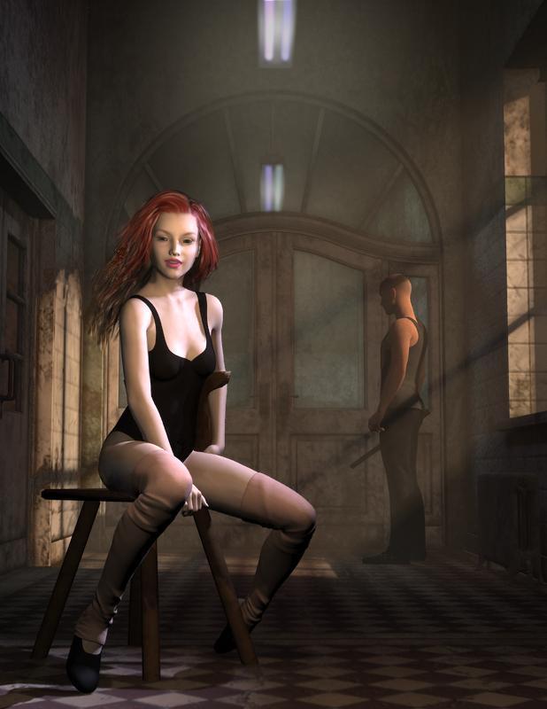
    Wow...those dust particles make a huge difference. It really brings out the girl and makes the guy fade into the background.  Well done.


    Since it will be in the background I thought a free rifle prop might suffice.  I found some but they are either Poser props or 3D models.  Hopefully one of them will work for you.  I have not tried them myself.


    http://www.sharecg.com/v/75819/browse/11/Poser/Rifle


    http://www.sharecg.com/v/44104/browse/5/3D-Model/Sniper-Rifle


    https://www.renderosity.com/mod/freestuff/31m-rifle-carbine-for-poser/68073


    https://www.renderosity.com/mod/freestuff/customizable-bolt-action-rifle/71821


    http://www.sharecg.com/v/287/view/5/3D-Model/S400-Air-Rifle-and-Scope


  • Kismet2012Kismet2012 Posts: 4,252

    Yes it is because it did not finish rendering me thinks!!!

    I was really frusterated when it shut down at 37%!!

    Do not know why it did shut down on me like that.

    I will give it a go again tomorrow as I am watching hells kitchen in a few mins:D

    Did you change the progressive render settings?  They default to a time limit of 2 hours (if I remember correctly...I always change it).

    Under Render Settings > Progressive Rendering change the Max Samples and Max Time (Secs).  In the image I have attached is the maximum time allowed.  I haven't tried it put according to others on the forums if you put a zero in the Max Time slot it will render until you either stop the render or it hits the Max Samples level.

    If you forget to change these settings before you hit render and it stops you can adjust the settings and restart on the popup render window.  There is a little box on the left hand side.  You cannot make adjustments to poses or textures without restarting the render.


  • ewcarmanewcarman Posts: 180
    ewcarman said:


    So I looked at the image before I read your comment. When I first looked at the image my initial reaction was impressed, I think it's a good image, but I remember thinking "Why is she holding this rose?" I think it's more the epxression on her face, but she looks more like she is trying to look romantic, and I recall thinking to myself "She's got a lady waiting for her in some wooden shack back home". So if she is supposed to look like she is smelling the flower... well, I think that's a difficult action to portray in a still image, but maybe if she held the flower closer to her nose. Also, when I think of someone "stopping to smell the roses" I imagine them closing their eyes, but that's... just like my opinion, man.

    Also, at first I thought her skin was too reflective... but then I thought "No, she's in the middle of battle... she would be sweaty and shiney, so why do I think she looks too reflective?" I'm not sure, but I think that the dirt might be reflecting light a little? Maybe you need to provide a spec map that prevents reflection on the dirty areas.

    Then I thought "Maybe I need to just start sharing objective statements rather than my whole thought process".

    Anway, I think it looks good over all, those are just the things I notice when you ask me to put on my judgemental glasses.

    Hello Defenistrat,

    I vote for your whole thought process rather than simple objective statements.... smiley

    I'm doing some experiments with her eyes and the shine on her skin. I had thought about having her eyes closed while smelling the rose, but Kismet noted that she is probably still very "situationally aware" and that might not be quite right. But the eyes are definitely in need of change.

    Good thought about the rose as well. I'll experiment with moving it a little closer to her nose. I don't want to obscure her smile too much. I think the smile looks good on her. So many of the characters don't emote well - you either have the attractive neutral look or an "I want to kill Batman" type of smile. But this one seems to morph pretty well for a subtle smile.

    Lot's of different things to try. If we got it right the first time, it just wouldn't be as much fun!

    Thank you!

  • ewcarmanewcarman Posts: 180
    noseeum said:

    Here are the results so far with the volumetric lighting (took a good part of the day to get it to work for me in 3delight)  which I think helps to pull the girl out from competing with the bodyguard and overhead lights.  Or maybe not.  Only 600x800 on this one as it's taking more time rendering with the dust particles. 

    .  


    Hello Noseeum,

    That lighting change is really dramatic - very nice.

    The knife/pipe/? the male character is holding is parallel to the shadow projected by the window - not sure if that qualifies as a tangent, but drew my eye to it rather than the rest of the scene. Also it might look a little like a male appendage given its position and angle - or I need to lift my mind from the gutter. Either explanation is acceptable. :)


  • Just happened to be working on this recently, so what the heck, may as well ...


    kimono and curves.png
    997 x 944 - 2M
  • IceDragonArtIceDragonArt Posts: 12,548

    Wow! I don't pay attention for a couple of days, and come back to all kinds of helpful feedback, and so many new entries. I looked back at some of the other new user contests, and it seems like "portrait month" always has a lot of entries.


    Definistrat I like the way you have her framed in between the two doorways on two different levels.  Nicely done.  As far as the lighting goes, I am still on a steep learning curve myself.  I know if you dont' have dome and scene on it will completely ignore any scene lights. 

    @Ice Dragon Art Thanks for noticing that! I'm actually kind of excited to be "competing" with you, I have clicked on your images more than once in the gallery and when surfing old new user contests... Not that I am stalking you or anything, just once I saw your name so many times I figured I must have liked your work and went ahead and checked out your gallery... anyway... now that I sound creepy... nice to meet you...


    Wo you totally made my day thank you!  And not creepy at all lol!  Nice to meet you too!

  • WonderlandWonderland Posts: 6,742

    I managed to work on the poses for my 'Best Friends'.  Posing these two was not easy as their heads kept getting in the way.  I can't figure out any way to morph them either, because somehow d-formers just don't work on these 3D Universe figures or hairs.  I don't how they managed to turn off the ability to apply d-formers, but if anyone knows how I can undo that, I'd appreciate the advice as I think could get their head closer together if I could move Toby's hair.  However, there are no morphs of any kind with the hair and trying to create a d-former doesn't even get me the grid and the d-former itself can be moved all over the place, but does absolutely nothing! I've seen a few items like this and I can't say I like the trend of hiding the ability to make modifications to a prop or figure or hair. I tried taking the figures into Hexagon via the bridge and adjusted stuff, but when I brought it back in to DS, the morphs did unusual things and not in a good way.

    Tell me what you think.  The only things changed were the poses and a slight adjustment to the camera angle because of the pose changes.  Everything else is the same for now.

    Adorable but I'd like a hint of what they are looking at and maybe a background would help this..?  Also, since this contest is about portraits, maybe zoom in a little? There is a lot of empty space that doesn't add anything to the scene...

  • evilded777evilded777 Posts: 2,440


    noseeum said:

    knittingmommy:  Your children portrait is really looking great.  The way they both are looking at the same thing (off camera) with expressions of excitement creates the feeling of a close bond between them.  Thanks for the volumetric light link from sickleyield. It was a good starting point for what I was looking for.

    Robotheadart:  I like the subject of the girl reading. It's an improvement with the simpler background and she looks more engrossed looking down at the book than holding it up.

    ewcarman:  You sure know how to create a mood.  The girls expression looks so real

    eviled777: I wish I could get skin to look that good.  Your last version seems to be more interesting.

    Wonderland:  That definitely is looking like a model shoot like a page from a glamour advert.

    Barbult: Thank you for your suggestions. I got the eyes to look more directly but then forgot to save ((  but it did make a difference so next render it will be back in.  Your render is looking like she is in real space with great lighting.  I'm not sure about the frown though because it doesn't look real.  

    Defenistrat:  Your first render was excellent with the washed out look but if it wasn't what you were going for than it makes sense to keep moving along.  Your newer versions look more realistic and I like the second one with the partial legs showing.  thanks for taking the time to comment in depth about my project.  I enjoyed reading your impressions and you are correct on the background guy holding a pipe but here is the story...  It should be a rifle that he carries as he is actually the dancegirls bodyguard but after looking in the Daz shop and seeing the prices for more realistic weapons.. the poor guy had to settle for a simple primitive lol..  

    Here are the results so far with the volumetric lighting (took a good part of the day to get it to work for me in 3delight)  which I think helps to pull the girl out from competing with the bodyguard and overhead lights.  Or maybe not.  Only 600x800 on this one as it's taking more time rendering with the dust particles.

    1.Earlier render  2. Current work 


    .  


    I like it; I'm not sure how I feel about the surreal quality of it. She doesn't fit. Cute little girl in her leotard in the dirty, night-lit hallway, sitting there smiling at us, with the menacing figure lurking in the background. I don't think it portrays the story as you related it, or are going for.  If she needs protection, perhaps there is good reason that she is WHERE she is, maybe even for how she's dressed.  But not for the smiling, casual pose. It doesn't all fit together. There's something wrong with the narrative.

  • WonderlandWonderland Posts: 6,742

    I'm confused because this contest is supposed to be about portraits and a lot of people are doing full body shots. So my universal advice would be to zoom in on the face for the purpose of this contest...

  • Babalar1Babalar1 Posts: 71

    Kismet2012:  Thanks for the like and the links.  ewcarman:  Thanks also for the like and the observation.  I'll be changing the angle of the window lighting later tonight so as not to offer any accidental tangents. ;).  

  • evilded777evilded777 Posts: 2,440

    Just happened to be working on this recently, so what the heck, may as well ...


    A little too evenly lit and unevenly cropped.  THe mid-thigh crop is good, but we are losing the top of her hair... we need some air between her and the top of the frame.

    I would move the main light source you have here off to the side or behind her and then supplement with other light sources. Its a good start, with an interesting character, but right now it all sort of blends together with the even lighting and nothing to draw us to her specifically.

Sign In or Register to comment.