Adding to Cart…

Licensing Agreement | Terms of Service | Privacy Policy | EULA
© 2025 Daz Productions Inc. All Rights Reserved.You currently have no notifications.

Licensing Agreement | Terms of Service | Privacy Policy | EULA
© 2025 Daz Productions Inc. All Rights Reserved.
Comments
When you say postwork thats in Photoshop/Gimp?
Yep. :)
Thank you :)
I don't own the rabbit so I'm not sure how fine the mesh is, but it's worth a try to use the geometry editor in DS and define different zones for the fur. I descibed it some pages ago for shinji's tunnel walls. If that not working the export still is an option. If you need further information on that, here is a more detailed information http://www.daz3d.com/forums/viewthread/42088/
hope you get this working!
Shinji, this is an interesting shift on the render, some things to consider: I liked the direball in the back of the tunnel a bit better, its to much seen as a plane here in front of the bricks, that steals the show. The other thin is being this close you need much more care with the textures than from a distance, just to pick out on thing, the hair on his right side has a gap to the head where the light from the fire comes trough.
How's this Linwelly? I scaled down the fireball, and tried to adjust his hair.
I quite liked the light on the hair... it appeared to be reflection which I think would be the case in this scene... bet he wished he didn't eat beans for breakfast ;)
Shinji, you might be able to keep the fireball as you had it if you do a strong DOF. There should be some, in any case, with such a strong focus on the front figure. Just size the ball down so you don't get the sharp angular edges.
Sorcerer's Apprentice (notice the wizard's hat and broom in the background - Mickey would be proud)
Iray - no post except for signature.
I showed the beginning of this image earlier in the thread when I posted about the LIE and her "Electric" eyes. Admittedly, this isn't where I figured this image would go when I started it, but I'm very happy with how it ended up - and the ton of stuff I learned doing it.
For this materials challenge, I thought I'd highlight the materials manipulation used here.
1. For the Wizard's hat, I made it from a simple cone and torus. I applied a velvet blue shader to give it that recognizable look. Then I used two deformers on the cone and another two on the torus to add some character to the hat. Give the brim a nice wave and the cone a little wiggle. One of my recent purchases was "Metal Magic Overlays". This is a fun one. I used it on the hat and added a lace pattern to give it the silver streaks.
2. Arabella's legs. I tried coming up with some clothing that would work well with her dress and not leave her legs practically glowing at the bottom of the image. Nothing I had in inventory really worked. So, I thought - what about stockings? Back to the "Metal Magic Overlays" and I applied that to her legs. I just changed the color and highlight color to black and there you have it. One other thing - since it is "Metal..." it still wanted to shine a bit, so I selected it in the scene list, navigated to legs in the surfaces and turned "Metalicity" down to zero - no more shine. It took me a while and a lot of experiments to figure that out - simple in hindsight.
3. The glowing ball was made from the same product I used to make her eyes - "IDG Iray FX Props and Shaders". I am still having fun with this one.
4. Eyes in the skull - simply a couple of primitive spheres with the emissive shader applied and the color set to red.
5. The broom - I made this too. The handle is a simple cylinder. The bristles are also cylinders but I applied three deformers to them to make the cylinder wavy. Then I duplicated them and applied the morph in various percentages and moved them around so they didn't immediately look like copies. I applied a walnut wood shader. I also used a torus with a leather shader to act as the thing tying the bristles to the handle.
6. Scrolls - on a couple of these, I modified the color of the shader to darken them up from their stark white defaults.
Originally I had some other stuff in the image that I ultimately removed, but I think the image works better without it.
Looking back over the list, it doesn't seem like much, but the trial and error getting to this point burned a lot of hours. Learned a lot. Now I feel much more comfortable with some of these tools.
Hopefully this is somewhat useful for you and maybe gives you some good ideas of your own.
Good Luck in the contest!
Thinking about maybe doing a second one this month. The weary dragon warriors isn't done yet but I am on my laptop tonight and not the pc so i thought I would play a bit more. This one is done in Iray which I am totally unfamiliar with But I wanted to try the Iray world dome and some of Parrot Dolphins materials shaders (Its great to play around with and see how the different maps change things. This is at 2% rendered. I forgot to do the trim around the bottom of the dress and am thinking about doing some kind of glowing light inside the door.
Thank you isidorn, chohole and kismet2012 for your comments and suggestions. Isidorn I do agree with you and I guess a new chair is in order. I have to create one and re-render. The renders everyone have created are fantastic and incredibly hard to compete with but I try and learn along the way.
used Gimp 2.6 for post work for black line between hair and crown.....much faster :) , changed the lights around for less shadows and the hair is not as puffy as before.
Hi everyone! I'm new to the "new user" thread :))) , so I'll start with a little introduction. I'm more of a technical person, and as someone pointed out to me, I use photos and images more to "document" things, than for actual art. "Been here, seen this" sort of thing.
I've been following the new user thread since October. I was in the middle of a render-intensive work-related project in October, and could not even start creating any renders for the forum. This month I saw the topic and had absolutely no idea what to do with it. :))) That is until I finally started working on a comic (totally hobby), and realized that I use several objects where I play with surfaces, so the very first image of the comic could be a good one to ask for advice.
Here's where I'm at right now:

Being a comic, speech bubble is going to be added in post-work in Gimp ("Here we are. I brought you to the island, just as you asked.").
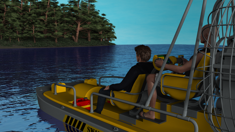
To get on topic: surfaces and materials. There's a self-made skydome used in the image, that is basically a half-sphere done in Blender, with a Gimp-created sky scene put on it. The water is a simple plane, with texture I created in FilterForge. It has a bumpmap and reflection. And color, of course. The island itself has tree and grass props, and below that it uses a ground shader for that sandy-grassy base look. No materials changed on the trees or the swampboat and people.
Rendered in Daz Studio 4.8, using 3Delight.
As for the composition, the idea is that it is a summer morning, maybe around 10 o'clock. Not too early, but way before noon. The island is to the west of the mainland where the boat is coming from. This sets the location of the sun to be behind and slightly above the people. This sunlight hits the trees on the island, and also reflects back from the water, providing additional lighting to the trees. This is the light that casts shadows. This made the faces of the people really dark, so I added another light with no shadows to come from the front, slightly from above, so it adds light from above, as well as below through the reflection. Looking at the image now, I realize that I messed the composition up because there is no obvious place for the speech-bubble. I'll probably put it on the sky, and shorten the text a bit. :)
Anyway. What do you think? What are your suggestions to make it better?
Ok, first things first, this is a lovely start and I absolutly love the water surface and the refelction is very neat! On a sidenote, I like it when the little icon is below with the render to open in a seperate tab then I can switch between render and my text without scrolling once its a bit more moved up (which happens fast in this thread) and I can look at it in a larger size.
Now for the details: the Island is pretty neat like this and from this distance I wouldn't change much, boat and people however look a bit like from LEGO, totally new unscathed plastic surface. I'm not shure what materials come with it but try looking for some bump, maybe a griminizer on the lower part where the water comes every now and then, some rust on the metal from the fencing (is that the word?) or make it shiny in the sun. What you might want to look at is that the waterline stops with the end of the isand beach.
What I would really like to see are some movement lines on the water surface around the boat. There is a tutorial with d-formers for that in this issue http://issuu.com/philatdsc/docs/ds_creative_15
For outside scenes with clear or mostly clear sky in 3dlight renders I usually start with two distant lights one in the position of the sun in a slightly yellow tint and shadows on 100% and no softness and the other one coming pretty much from the oppisite sky side in a blu/grey tint. This one sometimes without shadows or if with shadows they are on 100% softness. With variations on the intensity and the tint, this system gives me a rather useful variety to convey different daytimes and cloudyness. Depending on the situation I add a spotlight to light up certain areas but I try to keep them within the system. Hope that helps.
I'll be looking forwart what you come up with.
Hey gang,
I finally have something to post. I'm working with my accidental angle and for a bit thought I was going to have to scrap it. I don't know if it's the Beta build and the Michael 4 morphs not getting along or it's just being pissy but every time I made a change in position, his morphs would change subtly. He finally started looking like his shoulders were emaciated while the rest of his body was normal, then his torso started stretching out like he was Stretch-Armstrong or something.
So I did something a bit odd. I figured out how to fix his morphs, but it was slow going. In the meantime I started another scene with him in a T pose and that one I adjusted all of my lighting, did custom materials, and shaders. Saved everything from the Tpose as Materials, Render Settings, Shaders, etc. Then when I had the morphs fixed on my first guy with the pose and camera, put everything I had saved into the pose image and rendered.
Everything and I mean every mat in this image I have customized in some form, even the Sclera and the tongue - stuff you can't see.
So that is basically that - I still have tweaks to do, like I said on his face a bit on the hair and adjusting the postition of the environmental lighting as well as that special effect I just bought. One thing is certain, the goal of this contest is to help us learn about materials and everything - well, while I did know a bit about customizing, this contest has definitely pushed me to try new things and I'd say my knowlege as tripled at least, plus it had me finish that tutorial. So no matter what happens, I count this a 100% success for me because this is one of the best renders I've done yet.
So whatcha think?
Cheers,
Kath
PS - yes, I still have to work on the background but there's another idea I wanted to try as well, so we'll see how that goes.
Hey this is looking better and better! I'm glad you decided to change the camera angle.
Take this with a grain of salt, but I would like to see more light on his face. Yeah you don't want to detract from the fire behind him. But you've got a Kurt Russel feel going on with this character and I want to see his face and the intensity of his concentration a bit more.
Plus I had an idea regarding that scope. While in real life we might be able to see the fire behind him because of our angle to the scope, let's pull a page out of our writer's handbook here. lol! We've all heard about foreshadowing when it comes to stories and novel structure. Giving a little hint to the reader of what's to come by placing little clues here and there. Some can be subtle and easy to miss but when you get to the big moment the reader looks back and says - that's right! It was there al along! Or they can be obvious smack you in the head. The car with the driver's door wide open and the keys in it idling while the owner runs into Starbucks of course will be the get away car for the bank robbers.
You can do the same in art but it can be tough at times, but here's a golden opportunity for you. In the scope, instead of showing us, the audience, what we already know is there because we're looking at the fire, what if the scope reflected what he's looking at and what we can't see? Like the big Fallout 4 power armor suit with weapon charged waiting to shoot fish in a barrel. Then we'd understand that the dude really might be between a rock and a hard place. It could be anything really - a line of commandos a big trap. Oh no, how is our hero going to deal with that?
You might be able to set it up as a material on the lens of the scope, but if it doesn't work, I imagine yould could do that in post. We try to keep post to a minimum but it is a valid and very essential part of the work flow.
Anyway, just some ideas for ya.
Cheers,
Kath
Err, I uploaded the attachment to a different thread on purpose so it doesn't appear here twice, and we can keep things clean and tidy. :D I'll just upload them here next time.
Thank you for the feedback!


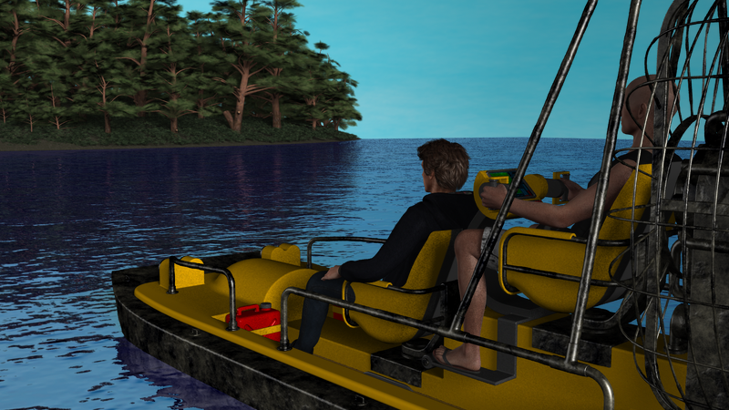
I changed the metal parts to be more shiny and a little rusty. You're right, it does look more realistic:
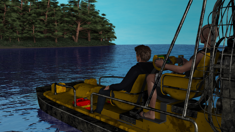
For the plastic parts... I added some dirt to the texture, but this does not look good:
What would you do with plastic, to give it a weathered look? I looked at the promo images for Grime-Inizer, that seems to add dirt similar to this.
The dirt actually looks pretty realistic. Maybe less on the seats but boats are hard to keep squeeky clean!
Does it? Maybe I'm too used to the clean look of it. :)
Trust me. We spend a lot of time around the water and its almost impossible to keep a boat pristine. The algae and the elements stain the scuff the plastic and fiber glass pretty quickly and no matter what you do it gets grungy looking.
This looks much better! The metallic and the dirt around the prow are perfect now. I agree on the dirt on the boat, that comes a bit intense. Did you make an additional layer for that? lie a geometry shell? then there are two possibilities to use what you have. For one just tone down the opacity on the dirt layer, the other one is to alter the tile number if you have the tiler shader. But then Sonja11 does have a point, once plastic of this sort has a tint its hard to get real clean, there is that greenish grey shade the sticks to it ;-)
I created a new texture file, and painted the dirt on there directly.

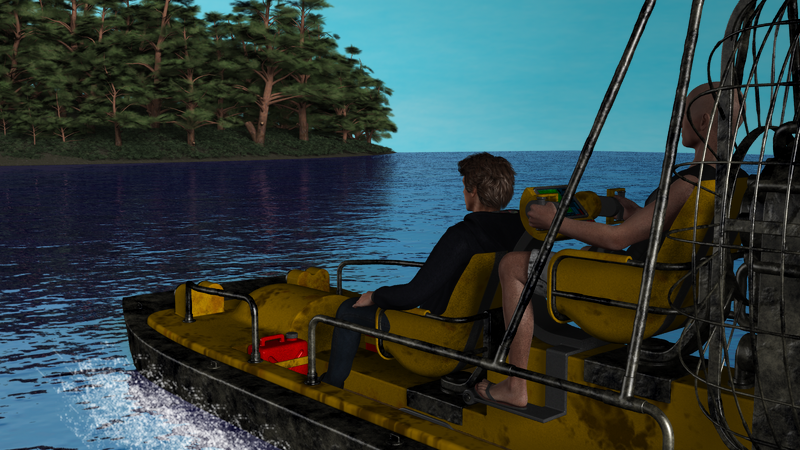
As for the sense of movement, I added some water splashes in gimp. This is the first time I ever used brushes. I want to get Ron's brushes eventually, and learn how to use them. (This is just a free set of brushes I grabbed.)
I think you've done a great job with this. It's uncanny how much he resembles me....
ROFL! Thanks - errr - I think.
That looks very cool. Next, I would try fooling with something I'm still learning about myself: camera focus depth. The distant island should be out of focus slightly, to increase the sense of depth.
That sounds like an excellent idea! Depth of Field was the subject for the September New User contest so you should find plenty of advice on the matter there.
And I also want to say that the "dirtying up" of the boat was a great improvement. Nice water splash effects too.
Two travellers rest at an oasis ruin, while Zir, the greater moon, rises.
I might consider this one. I did a lot of shader replacement on the shirtless man (changed his skin tone, textures of his clothing, etc), and a little on the man to the right (mainly his shirt and boots). I'm still not entirely satisfied with the lighting - it's suppossed to be a night scene, but I still think the guy on the left is a little too dark. Of course, he has darker skin, too.
Are those sprites/light globes a source of light? If they are you could either try moving one of them around a little to better light your flute player or add another one.
You may want to widen, very slightly, your camera's focus. You have cut off the fingers of the man on the right. Or possibly try a slightly different position for that arm. His overall pose looks very relaxed except for that arm. It does not look like it would be comfortable for a long period of time.
This is a very nice image. I love your cat in the corner looking at the higher/brighter sprite...he looks like he is about to act like a kitten and play with that source of light.