Sept 2016 New User Contest "Depth of Field" (WIP Thread)

2456711

Comments

  • Kismet2012Kismet2012 Posts: 4,252
    dawnblade said:
    isidorn said:

    Getting rid of that pole certainly opened up the view for the better. Well done!

    Three things you might want to consider:

    1. The charging skeleton's shield looks old (which is good) but it also looks unnused. If you could add marks and scratches to the shield's surface or otherwise make it look more used, it would improve the look and help making the skeleton warrior look more like a threat.

    2. Switch position on the archer skeleton and the skeleton next to it. Right now the skeleton to the right is nothing else than a cheerleeder and the archer seems to be blocking its way to get to the hero archer. Switching their position gives the skeleton warrior free access to the hero archer, adding an additional threat to her.

    3. You got rid of that post in the middle of the image. You might as well get rid of the rest that was above it. That wooden beam sticking out in the air now is kind of distracting.

    4. On second thought, make that four things to consider. To me it looks a bit like the charging skeleton is smiling, which makes it look friendly rather than threatening. But I don't know how much, if anything, can be done about that, depending on how morphable and poseable the skull is. Also, I think deleting the eyes would be for the better. Empty eye sockets are scarier than two wide eyes, which makes it lean a bit towards the toony side. But that of course might be a good thing, if that is what your intentions are.

    As always, this is just suggestions so please feel free to ignore them. smiley

    Thank you @isidorn! These are great suggestions. I can do 2) switch skeleton positions; 3) hide the post holder thingy on the top right; and part of 4) hide the eyes because there is a morph for that. There are no head morphs/expressions that affect the mouth, but I agree with you that it looks like the skeleton is smiling.

    Regarding #1, I don't know how to make the surface appear marked/scratched either in Daz Studio or in Gimp yet. The brushes I've found in the Daz store are either for Carrara or Photoshop, and I don't have those applications.

    GIMP can use abr brushes.  I have a lot of Ron's brushes. 

  • You can find all sorts of cool brushes on DeviantArt, too, so search there as well.  Most of the Photoshop brushes will work in GIMP.  There are some GIMP specific brushes there, too.  There is a GIMP group on DA so there are a lot of artists using it.  It's what I use, too, and I have all of Ron's brushes and like Kismet says, most Ron's stuff will work in GIMP.  He does have  couple of things that are Photoshop specific, but even in those products, the .abr brushes themselves will work in GIMP.  I've worked my way through most of Ron's brushes, haven't used them all yet, but I haven't had any not work yet.

  • dawnbladedawnblade Posts: 1,723
    edited September 2016

    Thank you @kismet2012 and @knittingmommy for the brush info.

    Post edited by dawnblade on
  • Here's version f. I rendered the dang thing this afternoon and forgot to post it until now.

    sept2016f.png
    533 x 864 - 910K
  • unLight865unLight865 Posts: 95
    edited September 2016

    ...thanks for the info on brushes. I already heard something similar, but wasn't quite sure anymore (didn't get to try it yet).


    I wonder how to make the most of the 'Morphing Flames' ?

    - they loke pretty much like plastic with the default settings (pic #1) frown.


    I already added some transparency and light emission and they DO look a good deal better now (pic #2) , but I'm still not really satisfied with the result - so, any tips please?

    ( pic #3 has somewhat higher flames )


    I also just tried adding DoF (this thread came just in time - I just recently wondered how to do that in DS)... Here's what you get with WAY TOO STRONG DoF-settings (pic #4) :

    <sorry, #4 just crashed DS during rendering (at ~40%) - starting rerender now ; but it already looked quite strange...>

    <funny, the rerender doesn't look that strange - before, it looked much like confetti while now it looks more like expected>


    P.S.: How do I add the images to the messages' body?

    ...And yes, I tend to use quite long filenames winkangel


    ( products used: Millennium SubDragon LE, SubDragon Textures 2, Castle Creator, Morphing Flames;

    and the clouds-background is from 'Land and Sky' by Tako Yakida at deviantArt [its readme says one should link to his page: http://takoyakida.webs.com ] )


    [Update:]


    Pic #4 finished - the confetti didn't reappear...


    Just now rendering to test the effect of increased samples like one of the tutorials suggests (though it shouldn't be necessary here).

    And I forgot to use jpg - updated #4 -> #5 .


    Also, you can see in #4 some weird line at the top that DS seems to like placing there - I cut it out in the other pics. On other renders I don't have this - any idea what's wrong here?


    Of course, once things look better, I plan to add a few more buildings (anyway want to experiment with the 'castle 2011'-stuff now that I have it) & eventually some figures.


    ...hm, in the samples re-render ( @ 34%, this time I made a screeny, pic #6 ) , the confetti seems to reappear, though not as extreme as at the first time - wasn't that tip about DEcreasing such things???

    I DO know that IRay-renders start somewhat grainy, but the first try at #4 was really extreme, and also a lot brighter then it should have been, considering how far it already was.

    Also, #6 doesn't seem to progress past those 34% - *confused* ...


    ...oh, and a small hint for those who don't see it:  The focus actually is on the wingtip in the foreground wink.

    [/Update]

    dragTest___05aaaaaca___fireT01adb___pic01___C10___c1a.png
    766 x 814 - 2M
    dragTest___05aaaaaca___fireT01adc___transpar+light+Emiss2ab_-aca___pic01___C17___c1a.png
    1154 x 890 - 3M
    dragTest___05aaaaaca___fireT01adc___transpar+light+Emiss2ab_-acab___pic01___C17___c1a.png
    1154 x 890 - 3M
    dragTest___05aaaaaca___fireT01adc___transpar+light+Emiss2ab_-acab-___DoF-test___pic01__C17.png
    1154 x 892 - 1M
    dragTest___05aaaaaca___fireT01adc___transpar+light+Emiss2ab_-acab-___DoF-test___pic01__C17___c1a.jpg
    1154 x 890 - 829K
    dragTest___05aaaaaca___fireT01adc___transpar+light+Emiss2ab_-acab--___DoF-test___pic01__C17___pre34pct.jpg
    1171 x 903 - 2M
    Post edited by unLight865 on
  • veeters2002veeters2002 Posts: 51
    edited September 2016

    "Long Road to Nowhere" first draft... All suggestions appreciated!

    Long Road to Nowhere.png
    1200 x 675 - 1M
    Post edited by Chohole on
  •  

    P.S.: How do I add the images to the messages' body?

    unLight865 - The way I do it is to first attach it as a file. Then open in a new tab. Delete the "thumbs" from the url and hit enter. You should now get a full size image. Paste url into the "image" box, size if need be, and you're good to go.

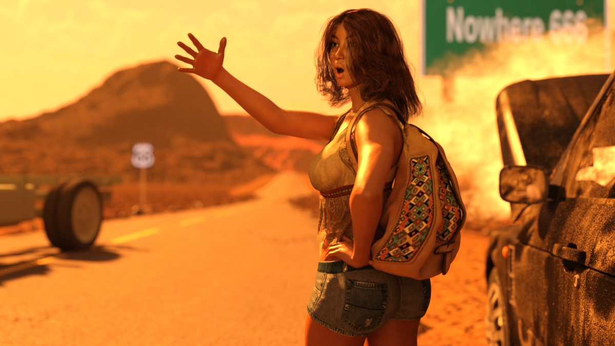
    I upload the image file with the attach file.  After the message is saved, I go back to my message, click on the gear icon and click on edit.  Then, I open my image in a new tab, right click on the image and choose copy image address.  Back to my message that I'm editing, I put the cursor where I want the image, open the picture box icon from the editing tools up above, paste the image address into the url slot.  Make sure to change the width of your image to 800 px.  Save your message.

  • dawnbladedawnblade Posts: 1,723

    "Long Road to Nowhere" first draft... All suggestions appreciated!

    I'm a newbie so please feel free to ignore.

    I really like her expression of "Really? You're not going to stop to help me?" But maybe she should be jumping up and waving her arms as well, given the severity of her situation.

    Also, if that were me, I wouldn't be standing near the burning car that is ready to explode. Maybe move her to the other side of the road where she can still see the burning car. You could also make the side she stands on less consumed in flames so that it gives the impression she is safe, but not for long.


  • social_stigmasocial_stigma Posts: 107
    edited September 2016

    Here's one i'm working on. Not sure the story translates: She stabbed the dragon in the eye before getting flung off.

    dmd2.jpg
    923 x 923 - 496K
    Post edited by Chohole on
  •  


    dawnblade said:

    "Long Road to Nowhere" first draft... All suggestions appreciated!

    I'm a newbie so please feel free to ignore.

    I really like her expression of "Really? You're not going to stop to help me?" But maybe she should be jumping up and waving her arms as well, given the severity of her situation.

    Also, if that were me, I wouldn't be standing near the burning car that is ready to explode. Maybe move her to the other side of the road where she can still see the burning car. You could also make the side she stands on less consumed in flames so that it gives the impression she is safe, but not for long.


    Thanks for the suggestions Dawn. One question... Does it really look like flames and that the car is getting ready to explode? If so, I really need to adjust that because I was trying to get more of a break down/smoke/over heating effect than imminent danger of the car exploding.

  • dawnbladedawnblade Posts: 1,723


    dawnblade said:

    "Long Road to Nowhere" first draft... All suggestions appreciated!

    I'm a newbie so please feel free to ignore.

    I really like her expression of "Really? You're not going to stop to help me?" But maybe she should be jumping up and waving her arms as well, given the severity of her situation.

    Also, if that were me, I wouldn't be standing near the burning car that is ready to explode. Maybe move her to the other side of the road where she can still see the burning car. You could also make the side she stands on less consumed in flames so that it gives the impression she is safe, but not for long.


    Thanks for the suggestions Dawn. One question... Does it really look like flames and that the car is getting ready to explode? If so, I really need to adjust that because I was trying to get more of a break down/smoke/over heating effect than imminent danger of the car exploding.

    You're welcome! It does look like flames to me coming from the engine and it looks like the hills are on fire as well. Those yellow/orange colors seem to blend together so I'm having trouble seeing the smoke as just smoke and not a fire. Could just be me though. You might want to wait until someone more experienced responds before making any changes!

  • FrankTheTankFrankTheTank Posts: 1,131
    edited January 2018

    deleted

    Post edited by FrankTheTank on
  • HollokoHolloko Posts: 75
    edited September 2016

    Father Time Awakens

    All feedback welcome. Father Time is supposed to look grainy; I added rock shaders of differing colors to him. I'm trying to make it look like he is coming out of the rock. I may try to toon this one, but I was so disappointed with my toon attempt last month that I might take a break this month.


    Father TIme Awakens.png
    1920 x 1080 - 3M
    Post edited by Chohole on
  • dawnbladedawnblade Posts: 1,723

    In this version I removed the beams etc. above the elf because they were a distraction, spread out and switched the 2 skeletons in the back, and changed the pose of the skeleton with the sword so that he is more involved in the pursuit of the elf.

    ContestD.jpg
    1000 x 1294 - 1M
  • dawnbladedawnblade Posts: 1,723

    Updated to include scratches, cracks and blood splatter to the charging skeleton's shield.

    ContestE.jpg
    1000 x 1294 - 1M
  • HollokoHolloko Posts: 75
    edited September 2016

    Here is a second version with more rocks flying; hopefully giving it more of an explosive feel. I also changed the rock shaders on Father Time so they look more rocky and less dirty. It may be transforming to a different title, maybe Laistrygonian Giant instead...

    Feedback welcome. It looks like one of the big rocks is blocking the light on his face, so I will have to shift that a bit, I think.

    Father TIme Awakens 2.png
    1920 x 1080 - 3M
    Post edited by Chohole on
  • dawnblade said:

    Updated to include scratches, cracks and blood splatter to the charging skeleton's shield.

    I'm really liking the progress on your work; it looks great! The batterings and blood add a good effect and it looks much more open without the post in the way. I do think the background seems to have a rather jarring transition from the tower to the background - they don't seem to go together very well. Perhaps use woodland realm playset or something like that to help tie it together more. Just a suggestion.

  • FrankTheTankFrankTheTank Posts: 1,131
    edited January 2018

    deleted

    Post edited by FrankTheTank on
  • dawnbladedawnblade Posts: 1,723
    Holloko said:
    dawnblade said:

    Updated to include scratches, cracks and blood splatter to the charging skeleton's shield.

    I'm really liking the progress on your work; it looks great! The batterings and blood add a good effect and it looks much more open without the post in the way. I do think the background seems to have a rather jarring transition from the tower to the background - they don't seem to go together very well. Perhaps use woodland realm playset or something like that to help tie it together more. Just a suggestion.

    Thank you @Holloko! I did want more of a rugged environment to tie in with the guard tower, but I'm open and I'll see what I can come up!

    Also, v2 of Father Time is awesome!

  • dawnbladedawnblade Posts: 1,723

    This version has a different background, with grass and a ghost town feel. Let me know if it works better than the rocky terrain.

    ContestF.jpg
    1000 x 1294 - 1M
  • isidornisidorn Posts: 1,601


    dawnblade said:

    "Long Road to Nowhere" first draft... All suggestions appreciated!

    I'm a newbie so please feel free to ignore.

    I really like her expression of "Really? You're not going to stop to help me?" But maybe she should be jumping up and waving her arms as well, given the severity of her situation.

    Also, if that were me, I wouldn't be standing near the burning car that is ready to explode. Maybe move her to the other side of the road where she can still see the burning car. You could also make the side she stands on less consumed in flames so that it gives the impression she is safe, but not for long.


    Thanks for the suggestions Dawn. One question... Does it really look like flames and that the car is getting ready to explode? If so, I really need to adjust that because I was trying to get more of a break down/smoke/over heating effect than imminent danger of the car exploding.

    For what it's worth, I thought it was self evident just a car overheating, with the hood up and the steam from the radiator billowing out. Then again, I'm a guy.. I know more than a few women who think a car is going to explode whenever they see steam coming from a radiator, lol. You know what would be cool though is if you could do the "wavy lines" heat off the road refraction effect, it would definitely add realism.

    I'm a man and I've also experienced overheated cars in real life but I was still unsure if that was the case here or if the car was on fire. It's definitely the colour that does it as the yellow/orange colour matches fire better than regular steam.

    I'll agree with the "wavy lines heat" effect over the road. It would be cool if that could be added.

  • isidornisidorn Posts: 1,601
    Holloko said:

    Feedback welcome. It looks like one of the big rocks is blocking the light on his face, so I will have to shift that a bit, I think.

    Yes that needs to be adjusted. In the first version it was obvious what kind of figure it was about but now it's hard to see. And I agree with Dvoraszenia that there's room for improvement with the water.

  •  

    For what it's worth, I thought it was self evident just a car overheating, with the hood up and the steam from the radiator billowing out. Then again, I'm a guy.. I know more than a few women who think a car is going to explode whenever they see steam coming from a radiator, lol. You know what would be cool though is if you could do the "wavy lines" heat off the road refraction effect, it would definitely add realism.

    That's a fantastic idea with the heat lines. Not sure how to pull that off though. Gonna have to play around with some things. Thanks for the suggestion!!


  • isidornisidorn Posts: 1,601
    edited September 2016


    dawnblade said:

    This version has a different background, with grass and a ghost town feel. Let me know if it works better than the rocky terrain.


    I think this background works much better! Not sure if it's related to the background change, but something happened to the blood stains on the shield. They looked excellent on the previous version, but now they're too colourful and exaggerated. Overall I like the changes you've done. Well done! The charging skeleton looks much more menacing now.

    A funny thing. I know I suggested removing the things that was above the removed pole and I do think it's an improvement to have them removed, but now there's a big empty space there instead. It would be a perfect spot for a moon, but then you'd have to completely rework the lights to make it night time. Or a sun, but you'd still have to rework the lights then to get the current shadows to match. So perhaps add some incoming flying monster there? It wouldn't really matter what it is, as with the DoF it would be too far away to see what it is anyway, other than the general shape of it.

    Edit to add: If adding a flying thing in that empty space, it wouldn't have to be a monster. It might as well be someone/something coming to our heroine's rescue. But again, with the DoF that might be left for anyone's guess.

    Post edited by isidorn on
  • dawnbladedawnblade Posts: 1,723
    isidorn said:


    dawnblade said:

    This version has a different background, with grass and a ghost town feel. Let me know if it works better than the rocky terrain.


    I think this background works much better! Not sure if it's related to the background change, but something happened to the blood stains on the shield. They looked excellent on the previous version, but now they're too colourful and exaggerated. Overall I like the changes you've done. Well done! The charging skeleton looks much more menacing now.

    A funny thing. I know I suggested removing the things that was above the removed pole and I do think it's an improvement to have them removed, but now there's a big empty space there instead. It would be a perfect spot for a moon, but then you'd have to completely rework the lights to make it night time. Or a sun, but you'd still have to rework the lights then to get the current shadows to match. So perhaps add some incoming flying monster there? It wouldn't really matter what it is, as with the DoF it would be too far away to see what it is anyway, other than the general shape of it.

    Edit to add: If adding a flying thing in that empty space, it wouldn't have to be a monster. It might as well be someone/something coming to our heroine's rescue. But again, with the DoF that might be left for anyone's guess.

    Thank you @isidorn! I was thinking about using a dragon for this scene initially. I'll add it in and give it a try.  I just learned today how to use brushes in Gimp, so to practice I used a different color and opacity for the splatters this time.

  • MN-150374MN-150374 Posts: 923
    edited September 2016

    @dawnblade: There is a free set of Rons Brushes available: https://www.brusheezy.com/brushes/12896-rons-sampler-brushes

    As a suggestion for your image, the Lady in the foreground is a bit grainy. Assuming your render is made in 3Delight. You could try to raise the value of the X/Y-Pixel Samples in your Render Settings.

    See the images below. It is just the SciFi-Warrior Scene with activated DOF. There is less grain in the background with higer values.

    Post edited by MN-150374 on
  • Thanks for the feedback DvoraszeniaStudiosisidorn, and dawnblade. I lightened the atmosphere to a little more yellow and less orange-y to try and get the smoke to look more like smoke/steam rather than flames. Had a real hard time trying to get a good heat haze effect on the road. All the effecys that I played with seemed to need more objects to distort in order to work. I ended up just adding some distortion effects in Gimp. Hard to tell, but I do actually think it gave a better motion-looking effect on the truck shadow on the road. 

    Changes are subtle but I think helped a bunch. Thanks for the great suggestions so far.  Still open to any others!

    Long Road to Nowhere.jpg
    1200 x 675 - 181K
    Long Road to Nowhere.png
    1200 x 675 - 1M
  • Holloko said:

    Here is a second version with more rocks flying; hopefully giving it more of an explosive feel. I also changed the rock shaders on Father Time so they look more rocky and less dirty. It may be transforming to a different title, maybe Laistrygonian Giant instead...

    Feedback welcome. It looks like one of the big rocks is blocking the light on his face, so I will have to shift that a bit, I think.

    I actually like the first version better, I was immediately impressed with your use of DOF when I saw it, it feels like the rocks are coming right at me. I don't think you need more rocks. But I think you need to do something with the water, its too fake looking.

    As others have said... A little more light on the face. As for the water, I agree that it looks like fake water, but at first I thought it was just a REALLY cool rock surface until I saw the ship. I think you need to either find a better water shader, or just delete the boat.

    Either way, this is shaping up to be a great render. Nice job dude.

    I agree, at least in part, about the water. I'm not sure what to do about it, however. I'm using Ocean Wide by Marshian. I don't know that I am using it quite like it was intended. The scale on my items is very large. I increased the size of my Gen 2 male to 5000% rather than shrinking the rock. It might be that I need to shrink everything down rather than scaling everything up. I'll do a render of the ocean from one of the cameras that loads with the Ocean scene to see how that looks.

    Any other ideas from anybody about how to make the water look better?

Sign In or Register to comment.