ShawnBooth’s Render Thread
 ShawnBooth
Posts: 465
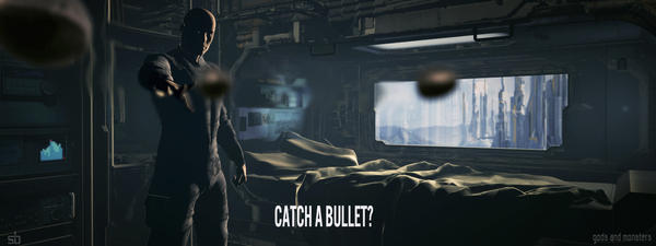
- my first serious go at a Daz render. Playing with volumetric and haze lighting. (Using Stonemason's Scifi Bedroom and Genesis 2 Male.)
Any comments appreciated.
Aloha -
shawnbooth


Catch_A_Bullet_.jpg
1280 x 480 - 366K
Post edited by ShawnBooth on


Comments
The lighting is off on the bullets. Will correct that.
My only comment is that i'm very impressed so far.:)
making some tweaks...
**correction - I'm using Michael 3, not Genesis 2. I also don't have head morphs, not sure if this is the only way to do expressions or not. I'm still learning and researching.
- adjusted the camera, tweaks on the lights, some tinkers there...
Any suggestions to improve? (other than facial expression since I don't have head morphs)
Personally I like the previous background with the blue-ish tint to the image. However in your latest render I can definitely see that he is throwing the bullets :) Couldn't quite tell from the first render.
I agree - I like the adjustments to the hand as well as the camera. I feel they made the render more engaging, dynamic, and convey the action of him unleashing the bullets from his hand.
Not sure I'm sold on the colors just yet. I do want to keep with the sunlight/warmth from the window though.
Thanks for your time kaotkbliss!!
replaced the Michael figure and added some facial expression... color tweaks...
Used City Ruins and Rubble by Stonemason to get the hang of exterior lighting...
Any thoughts or suggestions for improvement greatly appreciated.
Pretty Awesome if you ask me
Thanks Akoolpoptart!
More testing of 3D lighting...
As always, all comments are welcome and appreciated.
I very much like the color palette you've chosen for your lighting.
I've been posting my renders to the new user's area...
ANY crits welcomed. Thanks for looking!
Wow really nice job on all the artwork you've posted! You have a really great eye for atmosphere, coloring, and composition.
As a suggestion that is more of a general nature, I would recommend putting them up in the Gallery here (If you need help setting it up please let me know) as your lovely work will possibly get more feedback and visibility that way :) I would also suggest possibly starting an Artwork thread here in Art Studio where you add images to that thread as you go possibly over posting the images in individual threads. That way people can follow your progress and subscribe to keep watching rather than possibly missing something when they are in different threads. Also it makes for a nice way for you to see your own progression as you go forward :)
Also of note, if you'd like, we can merge the images from the threads in the New User Forum into this one and you could use this as your "Art Thread" if you like. If you would like for us to do that, just let me know :)
Yes please... How do we do this?
Hi, exumbra.
I'll go ahead and merge the threads for you. Once I do, it should put things in the order in which you posted. You should be able to change the topic title to something like exumbra's renders or something, and if you have trouble with that, let me me or one of the mods know and we'll help you.
Edit - Actually, I've renamed it, and if you want it any different, we can deal with it once I merge all the threads. :)
THANK YOU so much!!
Aloha -
Shawn Booth
Thank you so much Chris!!
Watching over UF2 by Stonemason.
Not sure how to play with hair yet...
I'm pretty confident with the lights in Daz. I'm gonna start playing around with the uber"lights/environment" stuff next. Also gonna try my hand at dialing in the various settings on textures/maps (I got rid of the red's in the backpack/shirt of Future Wilderness and added some custom designs to the backpack - you can't see them though).
Need to figure out how to make hair look loads better too.
Also need to learn how to apply clothes to figures other than the one(s) they were designed for. So many possibilities...
Punisher
Attempting to character design based on what I have...
On the second to the last image, nice set up. The only thing that jumps out at me is what appears to be a sword. It's difficult to see where it is and how it's being held, so seems to just jutt up by her breast for no reason.
The characters look good, but were they composed separately and composited together in a 2D editor? The foreground female appear to be much larger than the other characters, in particular, because her feet look so much larger than Lee's as one point.
Nice work.
Thanks Cris! I appreciate the feedback.
In the group shot, they are all together in one render. She is closer to the camera than anyone else. I will go back in a take a TOP CAMERA view look at things, dial it in better. Also wouldn't mind some shadows under 'em.
The sword is being held by her behind her back in a "playful kinda manner". I see what you mean though. This is the longest render I've done to date and I'm gonna leave as is. (Still learning)
Here's a trick for you for testing poses.
1. Create your scene; pose your figure(s) as you will have them in your scene.
2. Put a single light in the scene.
3. Turn the visibility off on everything in the scene but your figure(s). By having a light in the scene and then turning it off, you should see your figure(s) in silhouette.
Look at this figure in silhouette.
http://prntscr.com/4rdwcg
http://prntscr.com/4rdwyf
http://prntscr.com/4rdx47
See how, even though it's the same pose, the angles and what you see in the silhouette tell you more, or less, of what the figure is doing?
This is how you can see how strong your pose is and whether is relates to your viewer what you want them to see. The stronger the silhouette, the better your scene. It's just one trick, but a good one.
Great advice Cris, thank you!
I don't usually approach my renders from the typical "start with character/pose" first (obviously my last render does not apply). I usually start with environment and then camera. Character next, followed by lighting and a lot of test renders.
I like your advice and will try it out.
Feng.
Mute.
I would recommend you not worry about keeping scale when you do solo portraits since these are to isolate the present the characters. Scale is only important when there is more than one figure.