Adding to Cart…

Licensing Agreement | Terms of Service | Privacy Policy | EULA
© 2025 Daz Productions Inc. All Rights Reserved.You currently have no notifications.

Licensing Agreement | Terms of Service | Privacy Policy | EULA
© 2025 Daz Productions Inc. All Rights Reserved.
Comments
Hansmar, are we inside the torus? That's so pretty and creative.
Hansmar - I really like it, psychedelic is the word too! Pretty with interesting textures.
Hansmar - psychedelic is right! I love it.
Hansmar : Beautiful psychedelic render. awesome colours.
Wow Hansmar - psychedelic is right! I love it
Hansmar - looks really great.
NGartplay, MelanieL, Kerya, adbc, mermaid010, Horo: Thank you.
There is more where this came from. Same viewpoint, but very different textures and this time a 360 panoramaview.
Hansmar, there's no Photoshop on this? It's so cool.
Christmas colours!
Hansmar : this is so cool !
Looks fantastic, Hansmar.
Hansmar - another awesome abstract, superb
Still having fun!
A very pretty one Kerya!
NGartplay, Kerya, Horo, adbc, mermaid010: thanks again. I can't get enough of it. Trying to come up with something different each time.
Kerya: Wonderful shiny sphere.
Next one, same view, perspective render, different texture and lighting again. Makes me think of an old TV-screen.
Hansmar - what an amazing difference between the last two! They are both really stunning, but the first is great.
mermaid - I love the colours in that one.
Hansmar, you're missing the Indian in the image, lol. Cool work.
Hansmar Mardi Gras? Are you following a holidays theme? LOL
It sure looks great!
Kerya - beautifully done.
Hansmar - looks great with the coloured pattern.
Kerya : beautiful glowing sphere.
Hansmar : amazing colour effect.
Same scene, different camera position.
1:31 hours rendering ... reflection and refraction are fun ... I really would love a 64bit Bryce that is able to use all of my cores. Ehm ... the cores of my pc.
Kerya - both your renders are beautiful, I like both.
MelanieL - thanks but I think you mean Kerya
Hansmar - another superb abstract, I see a pencil trying to make it's way down.
Kerya - it looks a bit like two eyes. Very nicely done. There are so many possibilities to do abstracts with the same scene base.
Yes, I would also like to have Bryce 64-bit. When the last version (7.1) was in the making, we were told by the developer that maximal 8 cores (rather threads) are used for rendering because using more also uses more memory. At the time, none of us had a CPU with more than 8 threads (my i7 has 4 cores and 8 threads). Meanwhile, I have an i9 with 8 cores and 16 threads and I thought Normal (half threads = 8) and High (all threads, max 8) would be the same. NO! Normal uses the 8 cores and High uses all 16 threads. The CPU clock speed decreases a bit when all threads are used but the render finished in 2/3 of the time. So there is a difference between Normal and High Priority even though we're still at 32-bit.
Hi to all,
it is great fun to see such wild and zany images made with Bryce. The variety of results derived from this simple scene is really "surbrycing". :))
@@ NGartplay: Long time no read. Yep, it's the same "me" and I still remember said ex-3DCommunist "Burpee". ;)
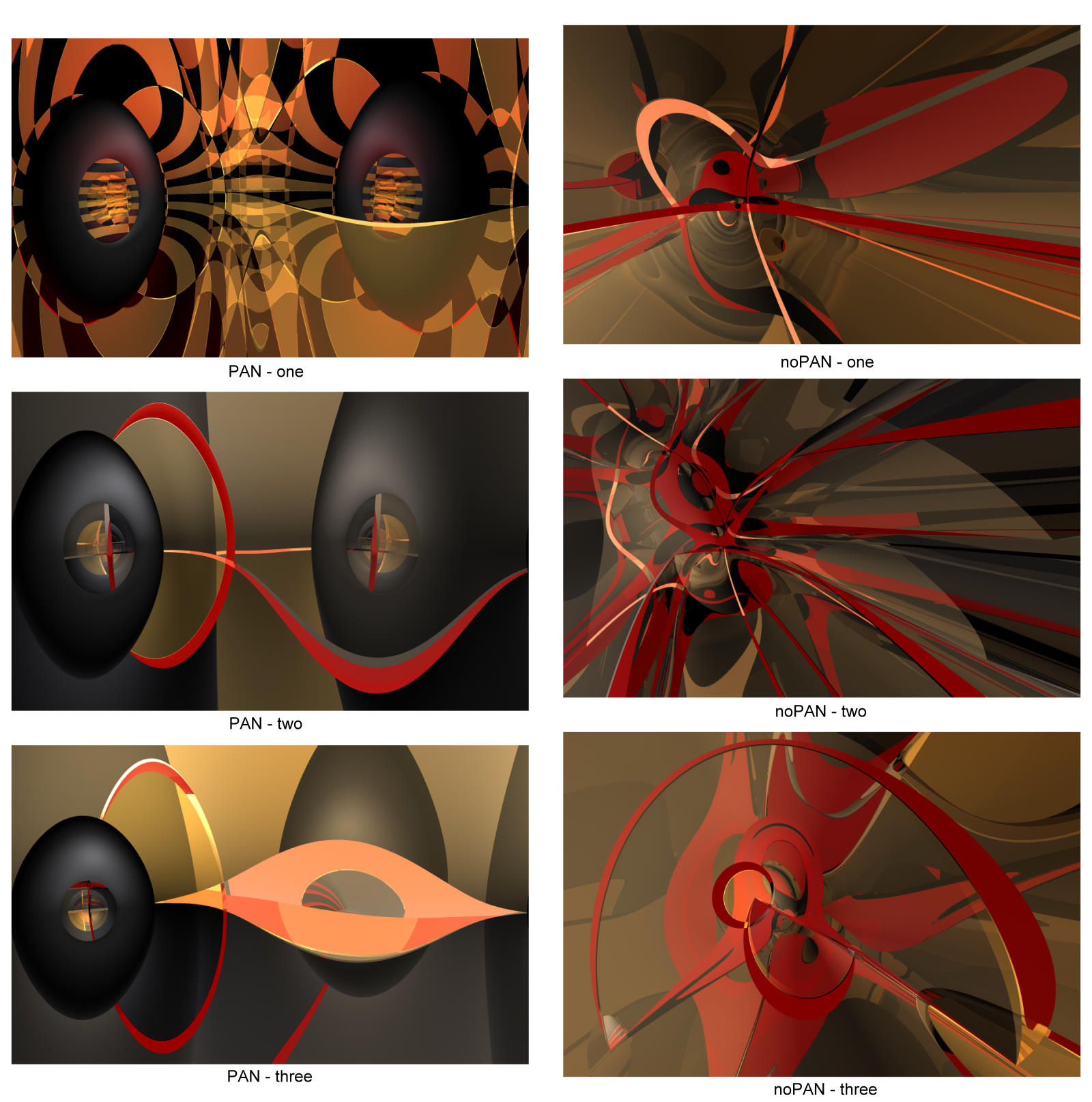
Here are six results of my attempts with your workfile. Mostly variants from playing with a simple checkerboard material on the Sphere, with reflections and camera position. Three scenes rendered as panorama and three as normal views. Whereas these "red lines" occur due to a Sky color and high Bump values of the Sphere's material! -- I just love Bryce for such unexpected effects!
Those of you who are interested in playing with my corresponding BR7 workfiles can download them from my server. (A 600kB ZIP file with 6 BR7 workfiles and a JPG as overview)
http://hubert-schaefer.com/hubert/temp/DAZ-Forum_BR7_HuSc_2020-12-26.zip
Cheers to (shiny) Spheres
Hubert
Kerya : Awesome render, I like the soft colours.
hubert : thanks for the workfiles;
Oops, you are of course quite right - I keep doing that!
Kerya - sorry for the mistake, I was trying to say I liked the colours in your previous image. The new one is good too.
hubert - interesting experiments. I was surprised to see the overall colours can look so different between PAN and noPAN, especially the first.
Hubert, this is funny because before I read any of the newer posts (to me) I saw your images without knowing who made them and thought to myself 'those look like Hubisms'. Now I find out it's you! Welcome and thanks for the files. Just last night I was tearing one of your Hubisms apart to see how you achieved that 60's abstract look. Very cool art you've posted here.
Horo, thanks for that bit of information on threads and cores. We'd all love to have a 64 bit but Bryce is only living by a thread (so to speak). No development ever again.
Mermaid010, I see the pencil, lol.
Kerya, so pretty.
NGartplay- What a fun idea, thanks for posting that. It sure produced some interesting and exotic images. A little late to the game but here is one that just mucks with the textures. A techno texture that is cubic meant to the objects (an odd choice but came out kinda neat). I also used scaled alpha mapping applied to the ambient, specular and reflection amounts. Rendered at Normal AA in about 17 minutes.
Hey Dan, all the techno ones look like space installations or ships to me...very sci-fi. Great job.
Dan - just great! There are thousands of possibilities using always the same basic setup and each one is amazing. Change colours, textures, bump, camera position, backdrop, ...