Artistic evolution
 RawArt
Posts: 5,955
I am at a crossroads with my art.
I am starting to see a difference in the pieces I make that are just "nicely rendered scenes" and something which I feel can be considered art.
I am not entirely sure where that fine line is, but it is there, and it is forcing me to take a closer look at what I create.
There was a time where I would be happy putting a bunch of characters into a scene, and rendering and feel somewhat proud. But I also have other pieces where I take a bit more time and can see the result more like art.
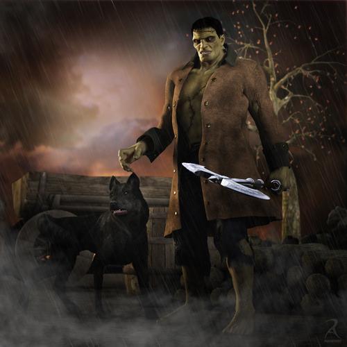
I set up this Frankenstein set on the weekend. There was a time where I would be happy with the way it turned out, but now it is just empty and kinda blah.
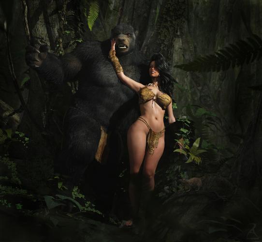
Now if I compare it to this shot of the Bear and a girl, I can see the subtle differences where I would consider it more as fantasy "art". The way the poses play together, the expressions, the general curves of the piece. The lines that the eye follows to flow through. The idea of a story behind their relationship....there is just that little bit more to the shot, than there is to my Frankenstein monster shot.
Guess I am just evolving as an artist, and "good enough" is just not good enough for me anymore.
Anyone else go through moments like this?
Rawn


Comments
I'm a million miles away from the quality of those renders, but I know it when I see an image that looks really like art. It's when I feel like I've been smacked across the Chops (face) with a large 'insert fish of your choice here'.
While I wouldn't go as far as calling my humble dabblings 'art' (yet?), I think I can safely say I made progress over time. Both in the actual rendering and post work touch-ups :)
It's good to go back and check where you started and then look at where you are now.
Sad part is...it is not about "where I started". The frankenstien pic is something i put together this weekend. But now it looks like I simply plopped a character into a scene and hit render instead of really trying to make something artistic.
Guess it means I have to work a bit harder :P
Maybe it depends on what your after. I personally like images where your looking for areas that have been done in post, but cant find them, as they are subtle. As opposed to the ones where the post work hits you before anything else. Composition plays a big part and can lead you into the image, maybe its like the golden ratio effect.
Yes, definitely have had/am having an experience like that, and I have a long way to go. I think it's the play between skill and inspiration and self-criticism. My sense is that skill and self-criticism grow and bounce off each other, improving gradually, and then maybe every so often inspiration leaps in out of nowhere and takes things up a notch, whether from something you saw somewhere else or in your own work. And your self-critical side notices and realizes it. And suddenly the skills and techniques you had developed relied on aren't good enough or sharp enough, and your self-critical side starts to try to drag you up to the next level to match the inspiration you had.
I know exactly what you mean. Skill level aside I have renders that just seemed to work and I am quite happy with the results and others that are simply okay.
As skills and experience develop acceptance of the okay renders becomes less acceptable. I think that is a natural progression for all artists regardless of the chosen medium.
I really like your Frankenstein image. I love the wolf, the fog, and the rain. =-)
As I look deeper into the Frank and Wolf image, I can start to spot some of the flaws that bug me.
Compositionally, it is boring and flat.
There is no real drama in the scene.
The poses are not accurate for someone/something stuck in the rain.
The lighting is also kind of generic and doesnt read "dark stormy night"
The battle axe really adds nothing to the story..a wasted element.
The warm tones in the sky dont sell storm either (admittedly the rain was an after thought...but it failed LOL)
and...there is just no visual flow to the image.
So as a render it is decent....but as "art" all those elements have failed.
(admittedly I just whipped up the shot while I was working around the house this weekend..so was not really a serious attempt at art)
Here is an attempt to improve the posing...though alot of the other elements would need work too.
I would have to set up the scene different for this shot, but this was just an attempt to make the posing more interesting.
Rawn
Yup, I dumped most of my gallery at DA, and all of it here at DAZ because It basically sucked lol. Most of what I do now is just scrap renders to test stuff out and see what it does, or looks like. The last few I did since December were really disappointing.
Well, in your defense Frankie is a bit of a stiffer/blockier character to work with then your bear/girl characters who are naturally more rounded and render-friendly.
I still really like the wolf one.
Maybe try the wolf on a rock above frankie Lowering, with some glowing eye going on and Frankie hunkered down glancing back over his shoulder towards the lights of angry villagers?
I think I am done with the frankie theme...will try for something more creative for whatever inspiration comes next.
Comparing your first 2 images I see this:
The lady with the bear has a flow. There are curves from the leg, up to the hip and even up to her arm where she touches the bear. Everything there has a flow and the bear gives a nice contrast. The low camera angle supports this in a very good way.
In the Frankenstein image there is no flow at all. His pose is very stiff and the dog adds nothing to the scene. You could remove it and it would still look the same. Maybe it looked better if his right hand would lay on the dogs head. The camera angle is also not very dramatic. The left hand could be twisted and bent a bit so that you can see the blade of the axe. The lightning is good in my eyes.
But I am in the same boat most of the time. Finding a good pose together with a good camera angle is not easy. Sometimes you get a really cool and dramatic image, sometimes it does not work at all.
Now firstly I'm definitely no artist, but looking at the two there's definitely a difference in my mind. The lady and the bear for me flows better not just in the way you've posed and centeralised the two but also in that my mind I can make up a story that goes with it
With Frank and the dog I'm struggling to see the story. The lighting is great, fits the background and love the mist on the ground. For me the Axe screams out of place though and takes my focus from his face. If you popped a Golden Rules grid on there I wonder if that axe fits into one of the grids crossing points (or near to it). If so I wonder if that could be the problem. The dog is alerted to something but we dont know as a viewer what that is. Maybe some silhouetted people in the background with some burning torches and pitch forks could maybe add more drama and give the story the emphasis that he and the dog have to fight their way out?
At the end of the day though I think we're all our own worst critics which on one hand is great and makes us constantly push our limits, but on the other hand makes this at times a painful hobby (I constantly think my stuff sucks), You've definitely made some good art though so hope what I've written here doesn't offend in any way!
Cheers
Jay
I find that things sometimes simply don't turn out as good as you had planned. Simple as.
I catch myself wanting to show too much of the whole scene sometimes, because I put all that stuff there and want to show . Often because from a story/background point of view, all of it belongs there. I suppose that in those cases, I simply want to tell/show too much in one shot. Changing the camera angle can suddenly fix the image and make it into something good. Sadly, I don't always allow myself to do that..
No offense taken at all....your list is very similar to the critiques I gave myself earlier. ;)
I think with me the problem sometimes is that I dont really have an idea or time to flesh it out....but i want to do somethign "creative"...so I end up plopping things together and hoping it works out LOL
I am working on somethign now where I am taking alot more time with.
I spent the last 2 days just tweaking the lighting till I got somethign I like. (and by 2 days...I mean evenings when I am done making products for the store here ;) )
I like the Frankenstein image, but I agree that it looks "flat"...I can't really say why, though. The Bear image seems to pop (I think because of the lighting). It would be interesting to see how other people framed and lit the Frankenstein image, using the same figures, poses, props and background. I'd add some DOF effects, and moonlight with rain dripping and splashing---but I'm stuck in a similar rut and nothing I've done lately looks "fresh".
I think with me the problem sometimes is that I dont really have an idea or time to flesh it out....but i want to do somethign "creative"...so I end up plopping things together and hoping it works out LOL
I am working on somethign now where I am taking alot more time with.
I spent the last 2 days just tweaking the lighting till I got somethign I like. (and by 2 days...I mean evenings when I am done making products for the store here ;) )
I do that all the time! Sometimes it works lol. Here's one I slapped together yesterday with one of your critters.
And dang it, I spent a ton on your sale...*shakes fist* :P
Can definitely see the story in that one MadBat...very nice!
Inspired by "Frazetta"...here is a Dinosaur and Caveman pic, where I took alot more time to work out the "art" of it.
I really like how this one turned out.
Rawn
and a version with some "Art effects" added to make it look more "traditional"
Not sure which I like better.
Rawn
I prefer the second one. The painterly effect meshes nicely with the retro-Fantasy look. Very cool!
yeah...I think I am leaning more toward the painterly look too.
Rawn
Thanks for the compliment. Getting the lighting right on that one took forever. He'd look better with hair, but LAMH does not play nice on my system for some reason, so I can't use it.
I like #2, it has a 'finished' look to it. The first one made me think of Frazetta before I even read your comment, that's why it seems to need a less rendered look. The same thing goes with Norman Rockwell styled renders. Without a certain treatment they look slightly off if they are too Normal Rockwell-like.
If that makes sense...
Here, have another:
I like both of those renders. I can't decide Rawn. The second one has a more painterly feel which I like, but I also really like seeing the detail on the cave-guy's face in the first one.
Here is this weekends attempt at art.
I really wanted to play with the dragon, so a bit of a play on Frazetta's chained conan image, with a girl added...just because I wanted to add a pretty girl to the mix LOL
Rawn
Yup, you have a Frazetta thing going on there. I like that one!
Your best one yet! Love the lines in that picture and how it moves with the eye! Great job. =-) I also like the back view. That's a different angle.
Really nice, love the angle, the tilted view, the strong diagonals, and the lovely coloring.