Photorealism
 bungle
Posts: 38
I'm looking for tips on photorealism. I have a working list so far, some of these are from the dreamlight training, but my renders aren't there yet.
Here is my working list:
In DAZ:
1) Use Iray
2) Use DOF where applicable
3) Use either Iray Sunlight or Emissives
4) Do multiple renders at different light levels/configurations to incorporate in Postwork
In Post:
5) Fix eyes, because Iray eyes look like they are in plastic bags
6) Fix teeth in post if they get too dark
7) Use transparent screens/overlays that are nudged a pixel or two in every direction to add depth to the skin
8) Add in film grain
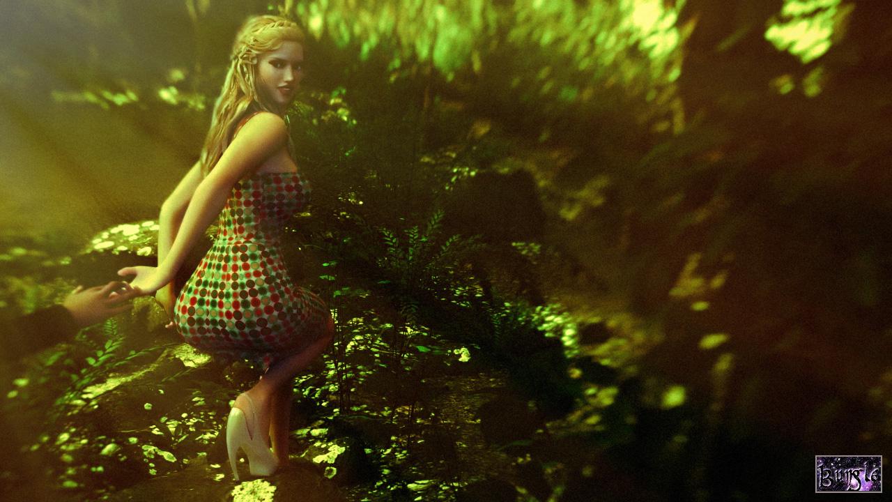
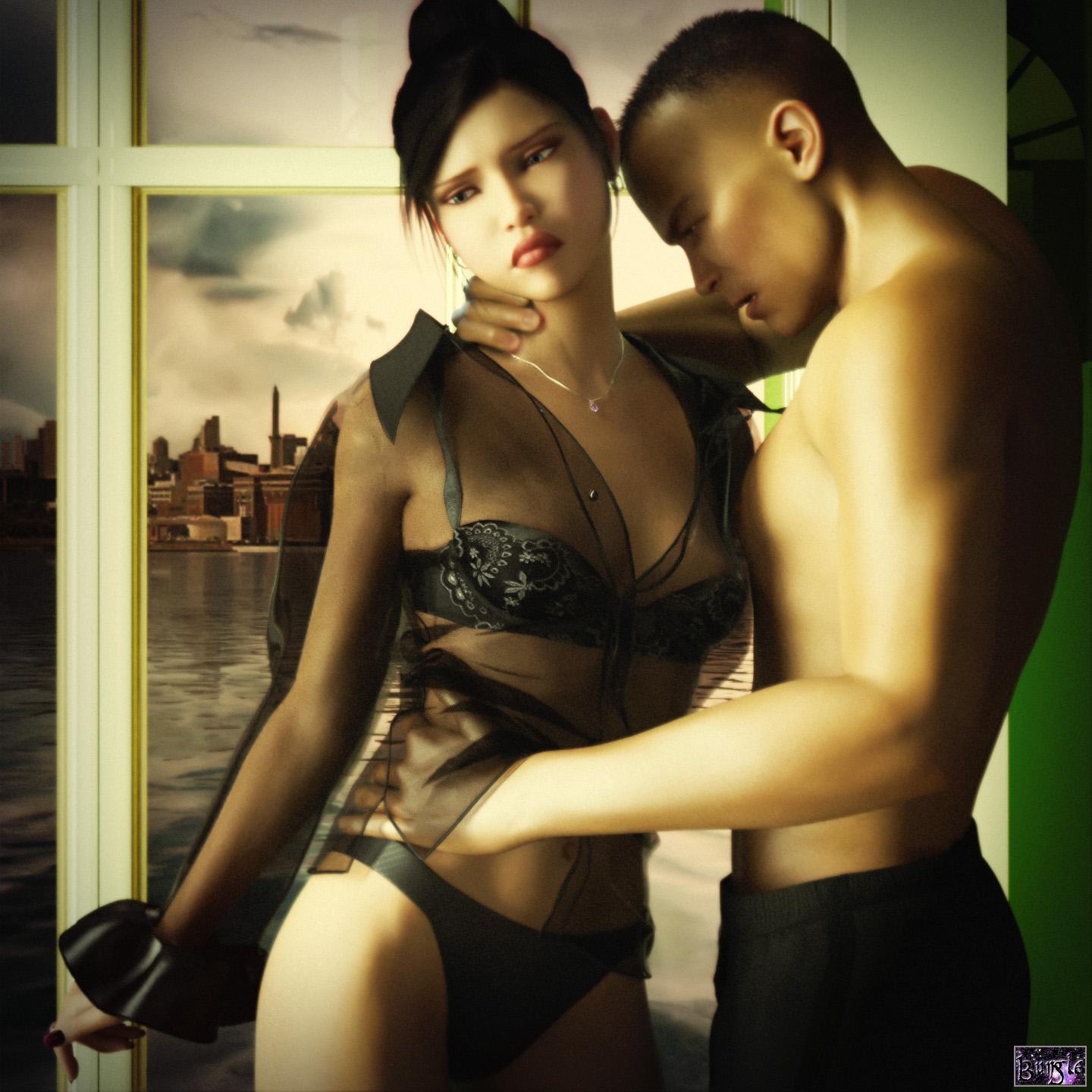
Here are my first two renders attempting photo-realism. The first one seems almost believable to me, and the second is still a long way off:


In the second render. I feel like the eyes are main culprit. When I cover them it looks much more realistic. I've edited them a dozen different ways and it doesn't seem to improve. Do you think maybe its her cheeks under her eyes that are the problem? What can I do to fix it?


Comments
I'm not sure who made this, its from the "It's raining men" challenge thread. Does anyone know what sort of settings went into this? What was the render engine? Render Settings? Lighting? Etc.
The artist is nemesis 10. He is active at the moment in this thread http://www.daz3d.com/forums/discussion/comment/1092806/#Comment_1092806
You could ask him.
Not saying that the eyes aren't an issue, but I think some of the other "usual suspects" are causing the greater believability shift. The scene could work with their eyes closed, so if you want to see how much effects the eyes are having, try that as an option. Don't just cover with your finger, because that will throw off the composition.
For both figures, their poses are unbalanced. His right arm is unnaturally torqued up, giving him a hunchback look. He also has a nearly blank expression, almost like he's studying her necklace. What's on his mind? We don't know, but necklaces probably aren't what the render is about. The cityscape background and water -- made more prominent because of your composition -- are far too resolved (focused and in light), and threaten to overtake the scene. It is because of the prominence of the left side of your composition, we notice more that the city looks lifeless, and the water doesn't look real because, well, takes a lot of work to get water to look right in Iray.
There are others aspects, but the key thing here is that it's easy to get caught up in striving for photorealism in skin and hair shaders, but do things like pose the characters in ways that look unnatural.
Both of your images are photosurreal rather than strictly photorealistic, and I think that's a fine approach to this subject. You can more easily hide the distractions to full realism, but these tricks won't hide issues with posing, expression, and composition.
I guess the title would help there. It is titled "Strange Amethyst" and he is studying her necklace. I wanted to keep the eyes open, because with them closed she looks randy instead of sad. I was going for a transitional moment from when he is caressing her to becoming angry with her. I tried to photshop the fingernails to make it look like he was squeezing a little.
Maybe photosurrealism is more what I was going for. I mostly was trying to avoid obvious cartoon looks. I will work on the posing. It is a struggle to get the pin-up qualities of soft curvy gracefulness on the girl and hard angular looks on the man while still looking natural.
I tried a variety of expressions, but whenever I showed any teeth, it basically ruined the render because they came out like chiclets.
I've been experimenting with the iray teeth settings. The defaults usually look like chiclets:
However you can mess with the transparency and refraction to get a tooth with no enamel:
And the half-way setting looks like ceramic teeth:
Eventually I'll find something that works.
Ah, so he IS looking at the necklace! Then the expression makes some sense.
There is a thread in the (I think) Commons forum on Iray skin shaders that also has posts about eyes and teeth and hair. The discussion is long and sometimes wandering, but there are nuggets to be found. I recall some folks have found decent teeth settings using subsurface scattering, though as I seldom do teeth unless it's on a vampire, this isn't something I've experimented with much.
You might want to also use a map for the teeth, as only rich and famous actors have teeth that are all the same color. Even for people that whiten their teeth, it's usually just the front. Teeth have varied tones. The better character textures have more realistic teeth. As long as the UVs match, you can always swap out the teeth from some other character you have where the teeth look more realistic.
On your first image, BTW, it wasn't until just now that I realize there's a hand coming into the frame. I immediately thought of this DVD cover, though I'm guessing you want to be more discrete.
I will have to find that because I hate every eye render I've done, and spend forever in photoshop trying to get it to passable.
After a hundred renders, I think I finally got human teeth:
Here are the important settings
Translucency Weight and Color: I used 1.0 and a Bone Color (Light Pastel Orange/Beige) (Dark purple made it look nighttime)
Refraction Weight and Index. An index of 5 makes your teeth into liquid metal. Keep the index between 1.3 and 1.7. And the weight from .75 to 1.0. The index in this photo is still a little high, I suggest 1.4.
Abbe: Abbe is some sort of difraction wavelength characteristic. 100% turns it from unenameled bone into china plate. I used 5%.
I also put the teeth on the highest render priority or they never finished.
And sadly those earlier renders were all using maps. This render has the identical morphs, pose, and maps as the above renders, I just switched to sunlight from camera light so I could shrink my render window. In this case the difference is all in the shaders.
I wasn't using a reference. I just thought the guy was unimportant to the picture, and was too lazy to do any work on him besides the hand. (Mostly naked hairless and unposed) I'm guessing that not wanting to show the dude other than by the presence of his member is a common and repeated theme in art and imagery. Both men and women tend to prefer images of females to those of males (confirmed by a perusal of the DAZ store). Men tend to view unfamiliar male faces with competitve antagonism when near a female. That's also why I hid the face in shadow in the second image. All of those plants took 5 hours to render and then I DOFed them in photoshop anyway because they were all so realistic and in focus that it looked fake.
Those teeth look pretty good.
For some good eye settings, see if you can do a (Google) search for the user MEC4D (aka Cath). Let's just call her the Shader Queen, because what she has come up with for all types of Iray surfaces is nothing short of amazing. She did a writeup a while back on some eye parts settings that I found useful, but I can't tell you where the discussion was. She has some Iray shader products for sale on the store here, but so far, none for human skin and body parts (wish she'd hurry up and do some).
The ideal shader for teeth will include gums, teeth, and (optional) saliva line. I've seen a few "post your Iray renders" examples of some pretty amazing results. Users Arnold C, AndyGrimm, j cade, and several others here have greatly extended the knowledge base on these matters.
The end of the thread is here ... consider working your way backwards, as some of the discussion is by now pretty old, and superceded by new discovery:
http://www.daz3d.com/forums/discussion/54239/fiddling-with-iray-skin-settings/p75
Actually that is in the pipeline from what she has said on her PBS Vol. 2 shaders thread over in the DAZ PA Commercial artists forum and you can see some incredible examples of her current progress.
http://www.daz3d.com/forums/discussion/72523/mec4d-pbs-shaders-vol-2-released-commercial#latest
She's working on skin and eye shaders now. Ones that utilitize all the layers of the skin correctly. Her preview posts of in progress works are nothing short of astonishin and I would not be the least bit suprised if it doesn't completely change skin and eye shaders in the industry. she is insanely good at what she does.
Wow that was long, but I read all of it. I was able to make some progress. Ignoring the awful duck-like mouth pose, I think I got pretty close on the shaders and textures. There are still some problems and I had to slightly cheat by using "crush blacks" (which I think DAZ should consider renaming). I'm pretty happy with eye surface and teeth. However, these teeth don't work under spotlights only sunlight. The ear still looks a little rubbery and the lower eyelid looks too thin.