Canary's Colors for Strand Hair - Omni Shader Merchant Resource and Construction Kit [Commercial]
 Canary3d
Posts: 2,033
My new shader kit is live in the store today! Hundreds of organized shader presets for Omni Hair that you can use to make your own materials, or use the complete presets as-is to jazz up the strand hairs in your collection!
Canary's Colors for Strand Hair

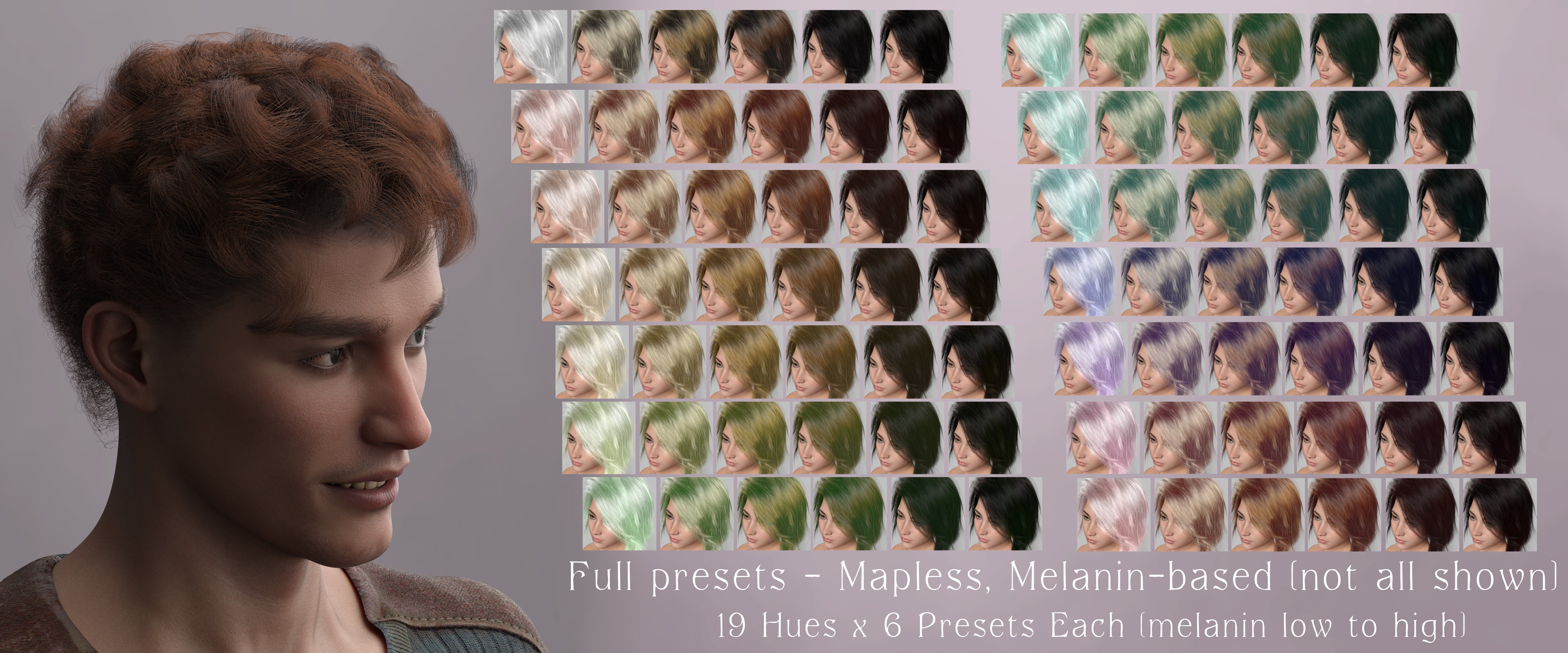
There's a wide range of complete presets, with and without melanin...

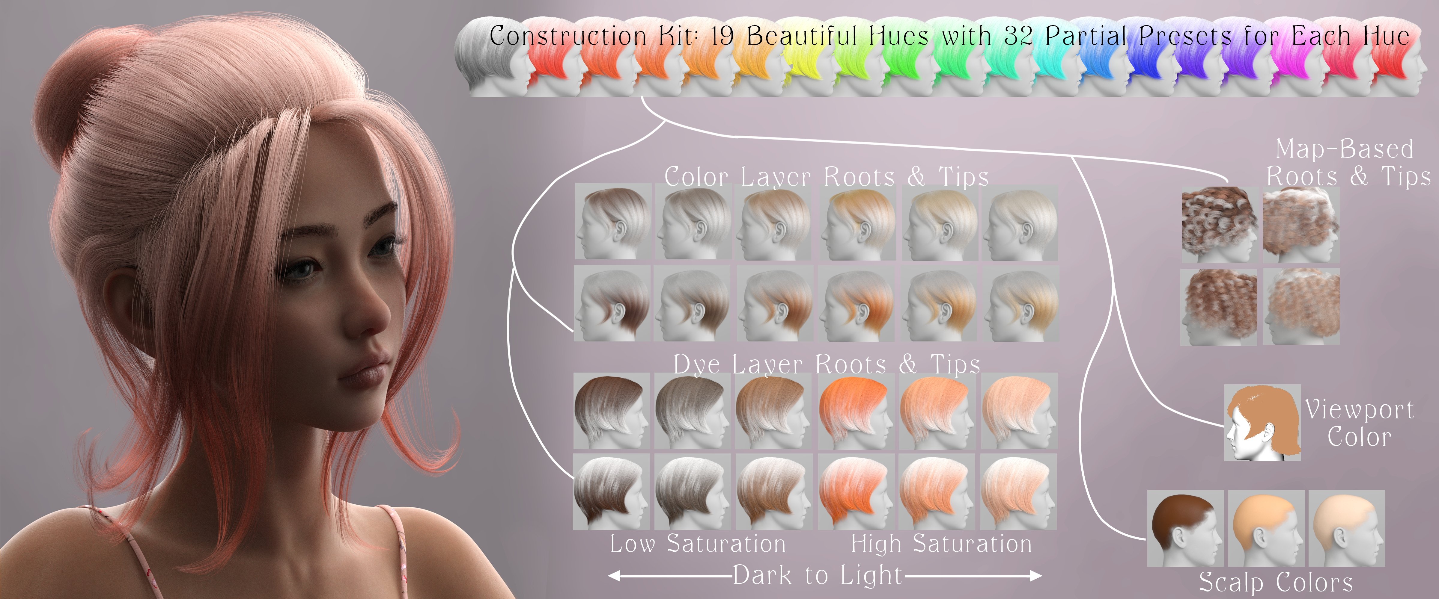
...and there is also a construction kit with roots, tips, style presets, and other goodies, for a range of 19 hues.

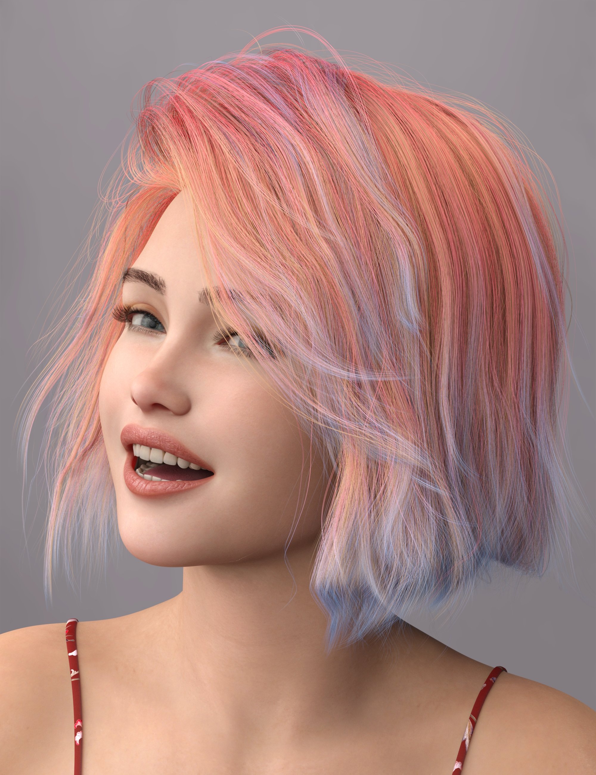
There are noise maps & presets that control the layer weights so you can have a "frosted" or "streaked" effect, even within a single surface zone. For this one I've used a pink-tipped dye layer with a streaked effect, and then I've put a lavender color on the little wispy bits, which are a different suface zone.

There is also a tesselation preset that you can use on older strand hair to make it work as curve hair so the root/tip direction behaves properly.

The "scalp color" presets are Iray Uber presets that will also work on many eyelashes and fibermesh or card-type brows. On this one I've put a darker color green on the eyebrows as compared to the hair, but keeping within the same hue.
I've made a video that walks through all the parts of the set that you can watch from the store page or go to on youtube directly here: https://www.youtube.com/watch?v=LmLrhwSv24o&t=1s
Oh and - all the hairs and characters in the promos are linked up on the store page - I used a lot of my favorites and I definitely recommend any hair that I show in the promos! Most of the characters are 50/50 mixes so if you want to know specifics feel free to ask in this thread.


Comments
They look nice and antural to me, which is a matter of taste of course, but how are they labelled? Do they say in words what colours theya re or do they leave it to our (defective in my case) eyes?
Good question! So, there is a set of what I call "signature mixes" where I mix more than one hue, and those are labeled with names as well as being numbered in a way that (hopefully) makes them logically kind of go in order. Like, I have several blondes, named golden, caramel, sand, cornsilk, tawny - those are kind of "hair dye" names that somewhat depend on having a US-English vocabulary. But they are also numbered to keep them all together, so all the blondes are together, then browns, then reds, then greys/white/blacks, then unnatural colors, then crazy mixes. (click the caps in the attachments to see them full size so you can read the text :)
The rest of the set labels everything by hue, with 000 being used for grayscale options. (Tech stuff for color nerds: In reality 000 is only grayscale if your saturation is 0, which it is on all my grayscale options, but calling that "0 hue" is a bit of a cheat since 0 is red, if it's saturated. All the rest use the proper hue number) and then the names provide more info for selection and sorting, depending on which group they are.
The melanin mixes have the amount of melanin in the name in a way that puts them in order from least to most melanin, per color.
The non melanin mixes have the hue number plus letters A through F to put them in order from light to dark.
The root and tip presets are grouped by whether they are bright or muted (i.e. how much saturation) and then are ordered from light to dark using A B C in the name. There is also a "map" option for these, which is using a map-based color mix with the dominant color in the map being the named hue. The icons for all of these face different directions for the color and dye layer, and the map presets feature a different hair, so it's easy to see what's what.
The dye mixes name the two hues in the mix, and also the name says whether it's a "distant mix," "near mix" or "single hue dark to light"
The headcap uber and the viewport presets have the hue and A B C for dark to light.
And the style presets have what type of preset they are, and then letters to group them as well as some explanation text where I can fit it.
Please note that the attached screen caps are only 2 rows each (mostly) but the set has way more presets than this! These examples just show a couple of hues each.
This is what it looks like when you're viewing a whole folder - the names are designed to make everything march in order around the color wheel and to go from dark to light, so if you pick a color and you don't like it, it's easy to tweak it to be more of whatever you want - redder, darker, etc - by just shifting a few icons in the direction you like.
Also I rendered all the icons with greyscale light so they should be accurate, which doesn't help a lot if your vision doesn't get along with colors, but at least it won't make it worse :)
Thanks, well hue values are easy enough to check if I can't guess - the main thing I always dread, as with skin adjusters, is accidentally going too green or red since I miss subtle tones.
Ah, yeah, I understand! I think this will probably work ok for you because 1. there are pretty big jumps between the hues I've chosen - I don't have every hue in here, so the gaps are pretty clear. 2. the "bright" presets for any hue give a clear indication of what it looks like, so you can use those to narrow down to the hue you want, and then from there you can stick with that hue as you choose more muted versions of it.
In the first attachment, I've gone to the dye tips and searched for "Bright C" (in the smart content panel) so I can see the purest version of the hue. You can see from the numbers how big the jumps are from one hue to the next - the full range of hues is 0-359, and my choices jump over 15 or 20 between hues. I've tried to get primaries, secondaries, and tertiaries on the color wheel, but they aren't exact because I've also stuck with hues I personally think are pretty. Also, they go in rainbow order, except that they have a red at both ends because that's how hue numbers work. Anyway, if you pick a hue by looking at these, then you can stick with that hue through all the different iterations, and you can be confident that it's truly the same hue even if it doesn't look like it. (For those who don't mess with colors a lot, be aware that darker versions of yellow will look green because yellow is like that, not because the hue has shifted).
In the second attachment, I've picked hue 168, which is a green-blue, as you can probably see in the "bright C" search. The second screen cap shows every preset in the whole set that has Hue 168 in the name. You can see that some of the icons are too subtle or pale to be able to really identify the color, or have too much melanin to see it super clearly, but it's definitely the same hue as in the bright preset.
Another way you can use the numbers is to eyedropper (in a photo app) a color you like or would like to match, and make a note of the hue number; then use that as a guide in picking a hue in the set.
Thanks, those are good tips - though I may need to choose a slightly less bright colour set (I see red, but muted, so when the other colours in the mix are very bright it is hard to spot the difference - and in dark tones the red is almost invisible; mid-tones work better, but I should be bale to apply the same method to those. (Anyway, purchased - thank you.)
In case it helps, here's what I would call these, mostly in plain English. I didn't look up official pigment names because saturation and value are part of how paint colors are named, which wouldn't work with these since I want to use the same reference regardless of saturation and value.
Thanks for your purchase!! Here's a more muted view of the colors - this is from the spreadsheet where I worked out all of the formulas - this is with a sat value of 40
Holy buckets that's comprehensive! I haven't gotten on the omni train yet (none of the SBH styles have been what I needed) but this is going on my wishlist for when I do!
It's in my cart now - I'll check it out soon.
Thank you, that does help to differentiate them.
Maybe this and the spreadsheet info could be in a PDF for a quick and handy lookup? Prob too late now to include with the set, but maybe in this thread?
I don't really want to provide a downloadable color reference for all of the hues and saturations & values, because that's the core of my workflow for all of my products. I thought about including a list of names with the product but the problem is names are subjective--these aren't regular intervals on the hue list, they're hand picked, so my "violet" might not be someone else's "violet." That's why I decided to stick with the hue numbers for the names in the majority of the set, because they're accurate.