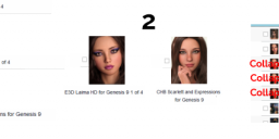
Please make the installer more beautiful
 Rafael
Posts: 145
Now that Daz Central can not be used to display the installed products, I am making this request.
You can not compare the beauty of the way the products are shown in Daz Central vs the Installer. U_U

Three specific requests.
1. Make the thumbnails of a decent size.
2. Make an option to display them in a grid.
3. Make an option to hide the parts of the same product so it does not repeat itself in the view.

For me, Daz Central was not just an "installer". It was the way to see what models I have, what assets I could use on a project, what assets I needed to buy, etc.


InstallerVsCentral3.png
1229 x 484 - 383K


InstallerVsCentral4.png
801 x 212 - 62K
Post edited by Rafael on


Comments
100% agree! They promised when Central went away that an overhaul would come to DIM, but it's never happened. Some tried to argue that we should use Smart Content instead, but I don't like how that works. I wish Central was still here because it was a great tool for visualizing and sorting my inventory that nothing else has equaled.
I don't think it was promised, it was said to be being looked at. It would seem that Daz Studio has claimed a lot of developer ti,e recently so I wouldn't give up on the hope of a grid view.