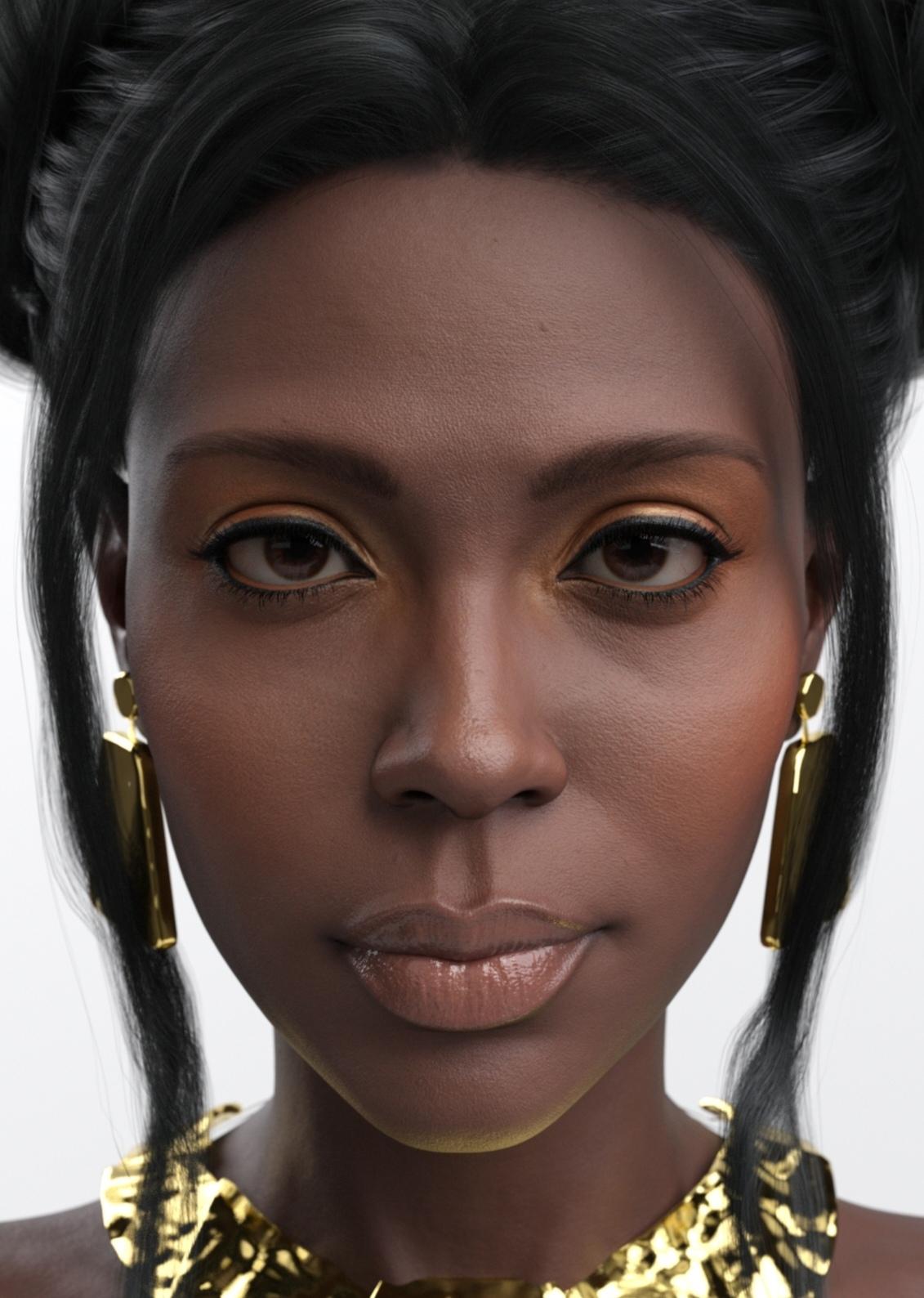
Help me create a similar scene as the preview of Angela 9 Makeup
Hello there, i really like the preview of Angela 9 HD MAKEUP https://www.daz3d.com/angela-9-hd-makeup, but I can't get the skin tone like the preview. I'm trying to create a similar scene and I'm noob with Daz lighting and render settings. What should I use to get the render like the preview? Render settings, lighting or post-processing?


Screenshot_20240929_142903_com_hihonor_photos_SlotAlbumActivity_edit_41317438288404.jpg
1131 x 1588 - 462K


Comments
For the background, create a simple square plane primitive, 2 meters in size. Select it in the Scene window, then go to the Surfaces tab. Set the Glossy Roughness to 50 or higher -- you may want to experiment with this. Move the plane primitive behind the character to make a background, say 1 - 1.5 meters behind.
Next, create a spotlight and move it so that it's behind the character's upper back, between the shoulders, roughly. Point the spotlight at the background, select the Spotlight in the Scene pane and change the Light settings: light type: Disc. You will need to change the Spotlight color to the color you want for the render and you can tinker with the spotlight angle and brightness. This gives you the lighted background with the falloff on the edges.
For the lighting of the character itself, you can use an emissive plane. Create another plane primitive 1 meter in size, then select it in the Scene and go to the Surfaces pane. Go to the Emission setting and change the Emission Color to pure white. This will expose some emission settings. You can then change the units of measure -- I use kcdm, kilocandles, usually. That keeps the numbers in the emission value low. Try 450 kcdm. Then position the emissive plane above the subject and slightly closer to the camera, To prevent deep shadows under the brows and cheekbones, you can use either another emissive plane *below* and slightly forward of the subject or use a pure white plane as a reflector in the same way.
That's classic butterfly lighting.
That should get you started! Good luck!
I made a scene as below. There're two key lights ... with subtle change. You can see which one you prefer. I don't have that hair, so there's no hair in the scene. Just load the one you like. And I just used the default focal length, so it's not like that promo with "wider face" ...
Some creators retouch their renderings with Photoshop, by adding layers.
Personally, I don't like to modify my 3D renderings with Photoshop.
But if I had to create commercial photos, I would do it to work faster.
This working method saves a lot of time, and allows you to put lights where you want them.
The brown background of the image that you gave in your link, looks like a layer..
Creating lights with DazStudio is useful for lighting a scene, such as a closed room for example.
For portraits, it is better to use lights that are already set.
For this, I recommend the Elianeck lights
https://www.daz3d.com/catalogsearch/result?q=ElianeCK
The lights in the commercial photo are more velvety than those used by CROSSWIND in his post, and do not flatten the face.
I think that DazStudio's basic lights are not well suited for portraits.
With Iray, Dazstudio allows you to make very subtle renderings. You have to find the right method to achieve this.
Thank you very much for such a detailed answer!
Elbambito's wish is to obtain the same result as the commercial photo.
The background is quite easy to create either with DazStudio or with a layer in Photoshop.
The most difficult thing is to keep the volumes of the face, differently lit, with soft transitions.
It's necessary to avoid crushing the volumes of the face with basic lighting.
It's this difference that allows to create artistic photos.
Here is an example, created entirely in DAZ Studio - no post processing.
Here's a view of the simple setup I used. I turned on the default HDRI skydome just enough to show the objects used to light the scene, but for the render, the environment skydome was off. I wound up setting the background pane to a very dark gray -- "Thunder Gray" you might call it -- so that the background light would have some nice falloff.