Camera Focus, Width, Length, Distance and F/Stop For This shot?
Would like advice on Camera for this render that I made. I didn't turn on the Depth of Field as 1: I totaly forgot. 2: Now that I look at the render, I'm not sure how to set it up. Should I even bother with it?
The issue: There's four characters that are spread apart by a significant distance. I would prefer the characters in the background to stay in focus as much as possible
Rendered Image with no DOF.
With DOF on.
Position of the characters.
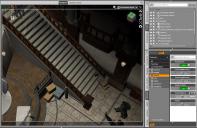

Jilleon RPD Stairs Camera 2 Camera V1 DOF on 3.JPG
1394 x 904 - 216K
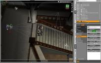

Jilleon RPD Stairs Camera 2 Camera V1.JPG
1393 x 876 - 195K
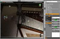

Jilleon RPD Stairs Camera 2 Camera V1 DOF on.JPG
1394 x 903 - 281K
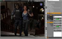

Jilleon RPD Stairs Camera 2 Camera V1 DOF on 2.JPG
1389 x 884 - 167K
Post edited by n.aspros123 on


Comments
As I've mentioned... two leading roles seem to be the focus, so it's better to have DoF in this scene. You just need to inscrease the value in F/Stop so as to make a blurry background but better no more no less. For instance, the poses from those two supporting roles can be still "identified".
And you don't have to turn those 3 emissive lights all on... or reduce Lumen values on their surfaces a bit... 'cause they look dazzingly bright. Besides, two lead roles may need more light...esp. some Rear light(s). They look a bit plain ~~ And Jill better "pay more attention to Leon" rather than just "look forward..." like that. And maybe, rotate the camera a bit to make some subtle change... now the composition is just more or less like an "orthogonal view".
Well, the above are just my prefs, for your reference only ! In general, a good render needs to have a visual impact that can easily "catch audience' eyes" ~~
Thanks for your reply @crosswind.
I do have a rear spotlight to their right side. There's also a "Godrays" light shining on the big statue adjacent to their right that emits some light onto them, mainly Jill. I have one spotllight in front of both of them that's around 45K lumen. I did have that higher but lowered it. I'm not sure what to set the height to? Currently it's 60. There's also a spotlight on their left side slightly behind. There's two spotlights on Nemesis and Mr X. One to their light and one to their right. Most of the spotlights have high lumen levels as the scene has a lot of lights on the walls.
I purposely have Jill looking forward so you can see her full face and her mouth. If you look at my deviantart page, she is saying something. https://www.deviantart.com/thenic123
What do you mean by, "pay more attention to Leon" ?
Rotate the camera in which direction?
I positioned the camera there so it's "looking" down the stairs at the two below. If you can, look at my deviantart page as I wrote a short story about the scene.
So you may try tweaking the position / angle of the rear light... as there's no rear on them. And also check if the surfaces of their costumes have enough glossiness otherwise there'll be reflection... Other lights should be fine as they're not dominantly contributing light to the leading roles.
No problem, that's what you want to show. I just gave a suggestion from my PoV. Because you never have to show the full face of a role... to me, what is more touching is how they interact... For instance, "pay more attention"... i.e. Jill may care about Leon's injure and/or make sure if he's still able to hang in there, so she'll probably look at him.... You know what I mean ? Then you may show them by tweaking the angle of camera to the right... then you can show not only Jill's face (full or at least 80%+) but her "careness" and "eye contact" with Leon as well.
Anyway, it's my thinking of how to show such a scene with "brotherhood" or something like "comerads-in-arms" ? haha ~
Like the screenshot attached...
As I said, it's always up to your prefs. and choices at the end of the day ! Good luck !
I took your image into PS as I don't have your scene to put in Studio.
You can do this is Studio by.
1. Dim the four background lights.
2. Move the camera to the right so that Leon is closer to the edge of the image.
3. Move the DOF planes back so they only cover from the bottom of the stairs back.
4. Lighten the scene so that the two main characters are the focal point.
You will probably have to play about with these settings to get something you like :)
Thanks for your replies.
I'll both PM you the files I've used when I have time later, so you can make your own examples if you would like too.
@crosswind I proposely made their clothes to have some reflectivity so they look "real".
@Fishtales
EDIT: Check your Inboxes. I've PM'd the files I used to create the scene. Have some fun and Show me your examples as I'm getting confused with your suggestions. I do very much appreciate them.
Sending mesh is against the TOS. It is alright to send the Scene file but then whoever receives it needs to own everything in the scene to use it.
@Fishtales
Is financial assistance (for you) needed then to purchase the files?
Things should be... actually more or less are like these, in Daz forum:
- We give ideas / solutions / advices, as well as tutorials with screenshots, yada yada ~~ Then OPs may go for checking / impelmenting / experimenting what we've proposed if they'd like to.
- In some cases, especially for complex trouble-shooting rather than heping with making / tweaking Scenes, we may intentionally ask for the Scenes from OPs. If OPs are willing to provide the scenes (user-facing files only !), we may get the Scene files,
- As Fishtales said, people can only send user-facing files (DUF ) and delta DSF files... so sending all other types of files as well as "derivatives"... are agains License Agreement / TOS.
- Then for trouble-shooting purpose only, when we open a Scene file, if we find no error message of missing assets, that'll be a lucky thing which'll help with find out cause of issues / culprits. But even if we don't own some products / assets, we might still have chance to get job done ...
- We usually don't buy the missing assets for trouble-shooting and don't need financial support either. But I have to admit that in a couple of cases, I used to get all things send by some OPs for trouble-shooting... Then I deleted the files after fixing job was done, TBH, I didn't need them at all haha ~ And some of my PA friends post me products for testing, that is another story... we have rules.
So, in general, pls keep things simple and rightful ~~
My bad then. I'll own it. Was just trying to assist both of you. I'm still learning the rules of this forum.
So send just the Duf file?
@crosswind You previously helped me with the Jill "bump" issue and adjusting the Battle Suit. Do you remember what I sent to you in the PM?
Be good to see yours and @Fishtales examples of light and camera placement, that's all. I sort of understand but get a little confused.
When I have time I'll have a go at placing another rear light for Jilleon. Use DOF. Drop all spotlight lumen levels a tad and see if I get a thumbs up?
@crosswind An all darkish render will cause the printing to a poster to be dark as heck when it's printed. That's going off the renders from the apartment created before.
Yes, because I decided to give you an online support, so that was our deal which fell in the cases as I mentioned above. Others might not think and do so. And I myself are not able to do so in all cases... for all OPs. You know what I mean ?
That may require more techniques but I've had no idea so far as I've never printed big posters. I just render.
I don't buy anything I don't need or want, so no, but thanks for the offer :)
I have two Rear spotlights pointing at Jill and Leon. What are you wanting them positioned relative to the main characters?
Top light is 1, bottom light is 2.
1: Where to position them, e.g: Height, Angle, distance?
2: Light Parameters e.g: Type of light, Height, Lumens, Temp?
Rear light 1 is a Disc, 50000lm, Temp 7500K, Height 60.00
Rear light 2 is a Disc, 10000lm, Temp 7500K, Height 10.00
Won't they will be "in shot" or frame if I move them more behind?
Spotlight Left 2 is the front light for Jill and Leon. What are you refering to in terms of Settings, e.g. Height, Lms, Temp, Height, ray length and Postion of the light?
Type of light is a Disc, Height is 60.00, 41000lm, Temp 7500K, Ray length 2.50, Render Emitter: Off
1: Are you reffering to the lights for Nemesis and Mr X?
How much should they be dimmed?
Are they positioned correctly?
Currently they are set to:
Spotlight Right 2 is a Disc, 50000lm, Temp 7500K, Height 60.00, Ray Length 2.00, Render Emitter: Off.
Spotlight Right 1 is a Disc, 65000lm, Temp 7500K, Height 95.00, Ray Length 2.50, Render Emitter: Off.
3: Where should the Cameras Focal Distance (the red line Traversing the blue line) should be placed and what length should be recommended?
How are the DOF planes moved to the bottom of the stairs?
How should the Focal length be adjusted too?
Should the Frame width be adjusted?
4: This contradicts @crosswind suggestions where they want the lights lower for Jill and Leon if i understand them correclty.
Suggest not paste big screenshots in the post, it's not easy for reading. Attaching them down below will be all fine.
Good rear lights need good position and angle to help with giving outlines to the figures as well as separating figures from the background. The lights there should be okay but seems too high. Then also check glossy settings on their suits.
To me, the key light there seems just fine, which gives some loop light on the faces of two leading roles.
@crosswind
Thanks for replies
If the spotlights are placed in those positions, will they show up in the camera view when in Iray mode? I've seen the greyish disc like objects representing the lights before if they are in camera view.
How are the light settings for those rearlights I've listed? Lumens, Height, etc.?
Increase glossy roughness for the clothes?
They won't... as long as you well position them, set proper Height / Width value and avoid placing them too close to other objects... otherwise there'll be some shadows coming from light geometry.
The settings with lights seems fine, from the screenshot you posted.
As for glossiness, on the contrary, pls reduce roughness. Then in perspective view, close-up the their suit, check if you can clearly see some glossiness, no more no less.
@crosswind
Is it possible for you to advise me on the camera setup questions I have, please? Fishtales hasn't replied.
Fishtales suggested the following:
--------------------------------------------------------------------
I took your image into PS as I don't have your scene to put in Studio.
You can do this is Studio by.
1. Dim the four background lights.
2. Move the camera to the right so that Leon is closer to the edge of the image.
3. Move the DOF planes back so they only cover from the bottom of the stairs back.
4. Lighten the scene so that the two main characters are the focal point.
--------------------------------------------------------------------------
I'm wondering from what you taught me:
1: Where should the Cameras Focal Distance (the red line traversing the blue line) should be placed and what length should be recommended?
You taught me to place the Red line inline with the main focal point character faces.
2: How are the DOF planes moved to the bottom of the stairs? The DOF panes are where the area of the image is most sharp? Why does they want them at the bottom of the stairs?
3: How should the Focal length be adjusted too?
4: Should the Frame width be adjusted?
1. Dim the four background lights.
There are four lights at the back that I assume are Emissive surfaces. Select each one with the surface tool, find the Emission settings and lower them so that the lights aren't as visible. They are bright in that area and draw the eye away from the main focus are which is the two figures at the top of the stairs.
2. Move the camera to the right so that Leon is closer to the edge of the image.
To get the main focus area on the two figures and lose the empty space at the left edge move the camera slightly to the right. This gives the impression that they are moving out of frame and gives a more dynamic look to the image.
3. Move the DOF planes back so they only cover from the bottom of the stairs back.
Select the camera and go into the parameters/camera and set the Focal Distance and F/stop so that the DOF Planes are only over the two figures on the stair. Have the Front Pane slightly in front of them and the Back Pane just at their back. You can play about with these settings to get the amount of blur in the background to how you want it.
4. Lighten the scene so that the two main characters are the focal point.
Use Tone Mapping and the spot light settings so that the main light area of the image is the two figures at the top of the stairs, which becomes the focal point of the image, with the background still light enough to see the two figures at the bottom but not so bright that it takes the eye away from the main focal point.
You basically have three layers.
1. The dark background which you can barely see.
2. The two figures at the bottom of the stairs with just enough light to see them and blurred with the DOF.
3. The two figures at the top of the stairs in brighter light and in focus.