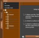
DAZStudio has trouble with Styles, how to make the best ones?
I'm trying to make styles but because in some places the panes are lighter in some places the panes are darker, And the color of Menus will be different too, you cant just let yourself be free and make what you want, you gotta think about what's gonna be good for the TEXT to pop out and not be unreadable.
There has to be contrasts in the background of the pane where text is and the text. The problem is there are text in different areas. LIke you have text in the Content library folders...then you have text in the Parameters tab and all those tabs and then you haev text in the Menus and oh man. Does anyone know how i can make good Styles? i succeded with only some but then i look at the parameters tab adn some of the text is like white and very unreadable cause the background in that pane . But then i loook at the menus and they are unreadable too cause the text that works in the Content library folder names doesn't work in the menus.
Heres a style i made. One part of it( one with dog is the content library) looks fine. The other is another area, the text is unreadable. . There's other styles the menus have the text almost unreadable all of it because you choose light blue color or red or green that works great on the dark panes of the content library but doesn't work in the Menus because the menus frame skeleton i made a colorful color. Does it mean i gotta make all colors of panes and Skeleton of Menu panees Dark?


