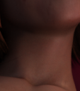
Constantly getting grain (fireflies?) in a render
Hello, I am still pretty much a beginner, but while I think I have got a decent grasp of how a lot of things in Daz work by now... this image has been driving me nuts.
It's supposed to be an atmospheric picture with fairly dim lighting and frankly, it's simpler than a lot of the stuff I have been able to do much more easily. There are 3-4 mild overlapping lights I think, and in some spots the rendering just looks unfinished and there are those annoying bright dots (I think those are called fireflies?). This time I cranked the rendering quality to 10 and left it overnight, and even though it apparently reached 100% convergence as usual, it's still far from perfect.
I cannot attach the whole thing as it is... a bit NSFW, but e.g. on the character's neck you can see it pretty well if you look closely. Is there anything else I can do to make this better and get a really finished render, rather than crank the quality even higher and hope it will be enough this time? I really like this kind of style, so this would be valuable. Thanks a lot for any help.


Comments
It is converging, not timing out?
Yep, I check the logs every time now because I couldn't believe it either.
2023-09-21 10:21:45.253 Iray [INFO] - IRAY:RENDER :: 1.0 IRAY rend progr: 100.00% of image converged
2023-09-21 10:21:45.448 Iray [INFO] - IRAY:RENDER :: 1.0 IRAY rend progr: Received update to 03730 iterations after 5722.024s.
2023-09-21 10:21:45.448 Iray [INFO] - IRAY:RENDER :: 1.0 IRAY rend progr: Convergence threshold reached.
Are you using HDRI lighting (Dome) at all?
One thing that can help me sometimes is to bump the intensity of the dome lighting a little higher and then, in Tone Mapping (Render Settings Pane) I lower the Gamma to 1.8 for a little more contrast.
If it turns out brighter than I like, I can lower the lighting in post.
It just seems to me that I get more of that "Unfinished Render" look with lower levels of light in the scene.
Thanks, I will look into that and I think I almost accidentally found out what you mean yesterday while working on another scene and using a premade background/dome (and wondering why the hell is the scene brightly lit with all the lights off). That could be helpful in having more options.
And good point, I am getting a similar impression and considering that as well - it's much easier to edit pictures to be darker and look natural than the other way around (even with my relatively caveman skills).
My pleasure. Rendering animations, I have to be sensible about how long I can give each frame to render since my average little animation sequence is 210 frames.
Once in a while I might find the need to add a "Light", but most of the time I'm only using an HDRI from joelegecko's HDRI Photoshoot, then I rotate the dome in Render Settings until I get the lighting I'm after for the environment I'll be putting the animation into - I use Fusion in DaVinci Resolve to composite my layers together and apply effects.
This is #10 from that HDRI pack. We see that there's a yellow key light on the left side of the image shining onto her and, until we composite this, we can barely tell that there's a really nice bright pink rim, and the nice subtle blue fill light, keeping her shadows from going black. Rotating this dome just a little bit either way completely changes the lighting, which is a lot of fun.
I know that many HDRI packs probably have excellent lighting. I really like this one because of the soft shadows it provides. And there are a bazillion ways to use the many HDRI that come with it. The fact that there's a mirrored version of each makes it limitless. Some can make very black shadows, if that's what we want. And sometimes we do.
If you click the image, you can see that there are some fireflies and that the render could use more iterations to become complete.
This is the compromise I've settled for, which is usually around 1 minute per frame to render - at this distance perhaps a few seconds more.
Here it is after being composited - although this was just an animation demonstration, so I didn't put in a lot of effort in post.
That wonderful stark red on one side, blue on the other Cyberpunk look is #21 in that pack alone.
EDIT: In the video above, sometimes the red on one side, blue on the other (#21, #21 Mirror) is pretty dark in front. I just wanted to point out that when we rotate it around so the the red highlight is on the opposite side, it's still red vs blue, but without being dark in the center. Very freaking handy!
Joe LeGecko is a master at this!