Steve's Superheroes
 Steven-V
Posts: 727
I've been a big fan of superheroes and classic comic-books for many years. Honestly, the current style of comics is really not my favorite, but instead, I like more Silver/Bronze Age style material (and stories). Probably that's just because those are what I grew up on (well, not Silver... I am not that old... but 1970s Bronze for sure). I'm currently working on the idea for a Bronze Age style comic, which I will probably put out in a webcomic form, using DAZ for the artwork (since I like DAZ and also I can't draw ;)...).
In any case, after much thrashing around with different ideas, I finally settled to one starring a character I originally made up for a roleplaying game. Back in 2004, I created a tanker character for my superhero group in City of Heroes (everyone else wanted to play offensive characters like blasters, and we needed a tanker, so I ended up being tagged with the responsibility). At first I was going to make a big hulking brute guy, but then I thought that was so obvious... big hulking guy is super-strong and invulnerable. Shocking!
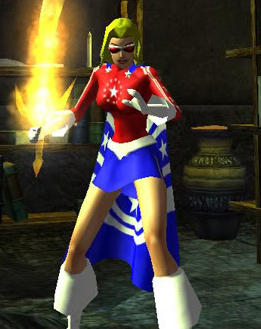
So instead, I chose to make a petite teen girl who looked like she could be snapped in half by a stiff breeze, but was actually the strongest and most invulnerable member of the team. It was a fun contrast. City of Heroes had some great costume options for American style patriotic themes, lots of stars and stripe combos, and I came up with one I really liked, so I decided to make a patriotic character.
Well, I played her for years, and loved her as a character, but COH is long gone (they pulled the plug on it in 2012), and here I am trying to make a comic-book, and it finally occurred to me that this character might be just what the doctor ordered, since she is very Silver/Bronze Age in style (code against killing, fights for "truth and justice" etc.). So the question was, how hard would it be to re-create her look rom City of Heroes in DAZ. Turns out... not too hard at all. I was able to come up with something pretty good, although I'm still not firm on the hair. Right now I am using the Sporty Braid mainly because most of the other hairs I've tried (and like in terms of look) do not have the movement options I need for a superhero (i.e. they don't look right flying, upside-down, etc).
Since I am creating the artwork for this comic in DAZ, I thought I would post the ideas for the various superheroes (and villains) here and see what people think. I'll start with our patriotic heroine... First pic is of the COH character, second is what I made in DAZ to mimic her. Overall I am very happy with the result. I think anyone from my old game group seeing the DAZ character would know her immediately.


Comments
I really like the one on the right.
Cheers,
Alex.
Thanks.
The one on the right is a DAZ render. The one on the left is a screen grab from City of Heroes back in 2005 or so.
Another superhero. This one is light-based and shoots beams of light out of her hands. I thought the Cyria costume was appropriate, in the goldish color.
I love that "star-spangled" character. What base figure are you using? If you still want the "cuffed" boot look, there are a couple of options, The one option that comes to mind for the original Genesis figure is the boots from the Far Journeyer set which comes with DAZ Studio 4. All you'd need to do is retexture them. Does she have a name?
As for the cuffed boots and gloves... I actually prefer it without them. The boot model I am using is quite good (it's from Darkest Eve, just turned white). The gloves just come as a morph of the G-2 suit.
She has a name, but I'm not going to reveal it yet. I will one day. :)
Here is an alternative take on my patriotic hero girl. This is actually the original costume she had in City of Heroes, before they allowed multiple costumes, and I created the variant with the red top and blue cape, and came to like that better.
Actually now I am not sure which one I like better....
The advantage of this one is that the white gloves and boots tend to "over-expose" in bright light, and the red ones are obviously much less likely to do that.
I read a comic-based forum called the Outhouse and they have a thread where people can share artwork. I haven't shared any of mine, but someone made the derisive comment that he didn't think CG art was "real" art, or that we here are "real" artists. So I decided to do a thread about what goes into a DAZ image. I will take them step by step through all the stuff we do to get a finished product. You already know all that so I won't share the steps with you but I thought folks here might enjoy the final image, including postwork etc. Note this is just an example and not intended to be gorgeous "hang on the wall" art.
This uses the Bus Stop prop, Jonah for M5, Genesis Supersuit, Crazy Locks hair, and Ron's Flames. The villain is named Hothead.
Can you share a link to the thread where they discuss CG not being art? As a cinematographer and VFX artist, by day, I'd like to chime in on that particular debate. I'd also like to point out what defines someone as an artist and something as art.
Welllllll.... the battle happened in the thread on the Outhouse's "Creators' Corner" about the art of a user named Scintillant-H. If you *really* want it I can PM you the link.
But... The person arguing that CG art is not art, however, named Doodledude, is clearly an adolescent and a deliberate troll. He mocks everyone's art but his own, which he insists is great (and it's not). He asserts that if you draw anything from reference, rather than just from your own mind, you are a forger, and not creating "real art." And his typing is, well... riddled with typos and grammar errors. When he started trolling Scintillant's thread showing off her hand-drawn art, I popped in to defend her, and I said something about doing CG art, and he mocked it as not really being art. But he was just doing it to be a troll... I'm fairly sure he doesn't actually believe any of the bilge he spews. As soon one of the mods came in and told the rest of the grown-ups to stop having flame-wars with him, he stopped. He was just doing it to be incendiary.
It is not worth arguing with him, or reading anything by him. But again, if you really want the link, let me know and I will PM you.
I think I'll skip it, thank you sir for the info.
Nice thread too.
BTW, Gods and Monsters looks awesome.
Many thanks!!
I can't wait to release the first issue. I'm getting it done as fast as I can. Each panel takes about a day to get finalized though and it's a full 24 page issue.
I know exactly whereof you speak. These superheroes are going into a comic of mine too. I've spent the last the 3 days on 4 panels. I think the hardest part is making my peace with the fact that doing this volume of renders, you just can't insist that every SINGLE panel is 100% a work of perfection -- because if you do, you'll spend a month on it and get nothing done.
Do you find yourself doing stuff out of order, like the way they shoot movies? I've found that. The first panels I've done are for page 19, because I happen to have all the resources I need for that page. Some of what I need for the first 12 pages or so, I still have on my wish list because well, I am not made of money. ;)
I just hopped over to that site to take a look and i love how you explained stuff in the thread.
It looks like you made it very easy for people to get the basic ideas of what studio is and how it can be used.
Thanks for the kind words.
Shawn... just so you can get an idea of what the one guy (it's just one) was saying, here is his comment in my 3 page thread about how to make artwork in DAZ Studio (notice he completely ignored everything I talked about such as lighting, rendering, postwork, buying props, using props, etc):
"This is worst than copying art.Because your using photography which is an art that's not your own.Basically it's just outright stealing if it's not your photography.I would really think about calling this an art thread.It's debateble whether this art or not art.The guys who work in video games and in those pixar movies can actually draw.This is not that."
For context, the guy who wrote it has already lambasted two of the best artists who do hand-drawn work because they use photographs, models, and other reference work -- he claims that since these pictures did not 100% spring from the person's imagination, it is "copying." So he is claiming that doing DAZ art is "worse" than that. I'm unclear, due to his 7th grader style of writing, if he is trying to claim here that ALL photography is not art, but it sure looks like that (i.e., that photography = "an art that is not your own"), or if he is claiming that because the models were not made by me, it's "not my photography" but someone else's. And of course he then says that calling it art is debatable.
He has also told a bunch of people who have critiqued his work that if you can't draw as well as he can or better, you have no right to critique him. This of course led to someone coming to my defense saying, "Well if you can't make CG art then you have no right to critique it by your own rules."
He's been rude enough that he finally attracted the attention of a moderator, who tore him a new one and told him to cut it out. I think he's stopped but he goes through posting bursts so it's hard to know.
So there you have it. He is not worth arguing with, but you can see what his sorts of comments are like.
I'm currently on issue one and I've been going at it in order, panel by panel. I took a break and worked on the cover for a while and then back to it. I want to go in order to make sure I have everything visually I need to tell the story (just my way of working). When I set out to make the book I shopped very carefully and made sure I had what I needed for the issue. However, I'm constantly finding new things that I want to add into it and sometimes this impacts everything else. I'm also always procrastinating away trying to improve my skills with rendering, skin, materials and lighting (my favorite). I've redone page one four times so far!
I'm also stuck on an appropriate lettering style that doesn't clash with the 3D/CGI artwork.
Have you checked out the free lettering fonts at Blambot? There are a lot of nice ones. I use Digital Strip because of its classic look but he has many more stylized ones.
Of course! Love 'em.
But what I mean is using the traditional speech/thought balloons looks horrible (IMO) with 3D/CGI comics. I'm trying to figure out something that works well with the art.
How are you doing the panel layouts on the page? I use Manga Studio and they have lots of balloon options (though very annoyingly, very little in the way of thought balloons, which I really wanted to use more). You can do more squared off edges and that kind of thing... and I believe you can texture them as well.
You could try something like... the words without the balloons, and then maybe just a tail in the same color as the words underlining the entire "balloon" and heading down to the speaker, kind of how some MMOs do it. I would think that would force you to do a lot of playing around with font color so the words were visible, though.
What about some kind of gradient for the word balloons? That might make it look a little more "3D" and less out of place.
Personally I don't have any problems with how the regular word balloons look, but I guess that is all just a matter of taste.
EDIT: Here's a look at how I am doing it. I am still tweaking the dialogue but the actual content doesn't matter. The balloons seem fine to me, but again, it's a matter of taste.