Which Album Cover do you think is better
 Kode of Bliss
Posts: 36
Kode of Bliss
Posts: 36
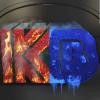
I rendered both of these in daz an then touched them up in photoshop using letters from my Letter Maker program. Which Do you think is better?


Post edited by Kode of Bliss on
Daz 3D is part of 
Connect
DAZ Productions, Inc.
7533 S Center View Ct #4664
West Jordan, UT 84084
Licensing Agreement | Terms of Service | Privacy Policy | EULA
© 2025 Daz Productions Inc. All Rights Reserved.
Comments
top one, with skull, no doubt, however for the inner part of the lettering could I suggest you apply a uncut gem deep ruby shader material? Or a cut ruby shader material, rather than the blue lettering. If deep red is too dark, go for a lighter red.
The lettering at the bottom, same style as top.
My first reaction was, the 1st one is better, it looks more professional.
But the more I think about it the more I like the 2nd one better, it´s more memorable. the 1st one is a little on the generic side.