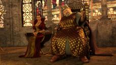
How can I further improve this wip postworked render in Photoshop?
in Art Studio
How do I add godrays dust and such stuff? Would that even look good in this image or not?
Would godrays and dust add more realism or not?
How else do you think I can improve?
Feedback Urgently needed from experienced artists.
Image Size: 3840 x 2160p


Fat King Indulgence - Queen Malevolence.jpg
3840 x 2160 - 4M


Comments
IMHO - I would try to do as much as possible in Daz Studio before hitting Photoshop.
I can see how the idea of the Godray lights filtering through the windows and giving the
figures a slight silhouette would add a bit of drama. I always find that a bit tricky to do
convincingly. I am trying to think of an example, but am drawing a blank.
I tried something similar in the past but didn't get exactly the result I was wanting.
Would be interested if you figure it out to see your result.
Example: Below, I used a fog field and a spotlight filtering through the
window and tweaked the glass settings. I should try it again with the
Godray product and see if it gives a better result. It's kind of fun to revisit
old projects after a long time and see how an approach changes with a
little bit of learning.
Might look at this product below as an example of how to set surfaces
to get the best refraction of light in shaders and then tweak them for
your windows.
https://www.daz3d.com/stained-glass--iray-shaders
The render below is done with Epic Props: Godrays...
https://www.daz3d.com/epic-props-godrays-volumetric-light-for-iray
The challenge there it seems is to get the geometry of the prop to be
positioned so as to not cut through the geometery of objects in your
scene so as to not make the light prop geometry obvious.