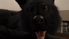
Render Setting Suggestions for Close Up of Dire Wolf
Hi all. I was wondering if folks had any suggestions for improving the quality of this render. The basic idea is the POV character wakes up and sees this in his face. I'm still something of a neophyte with Daz3d and this art in general, so any suggestions would be much appreciated. More practiced eyes may be better able to spot issues with the image, but here are some of the things I'm seeing. Since this is going to be the players' very first look at a dire wolf in the game, I'd like the quality of the image to be as good as possible.
- Individual fur strands. There are some strands of fur/hair, particularly around the brow, that are just kind of there on their own and don't look realistic to me. This might be something I just blur or fix in Photoshop, but was wondering if there were thoughts on this, or with the fur coat in general. Perhaps some sort of pixel blur to soften it a little?
- The nose. The nose seems too glossy to me, but I always get confused on the glossy, reflective and translucency options. What would you suggest tweaking here?
- The tongue. Part of the problem I think here is the shadows are too sharp, so I might change the two spotlights to discs or replace them with meshlights, but there's something about the tongue itself but I'm having trouble putting my finger on it. Glossiness? Texture? Displacement?
- The dew claw. Near the bottom-left of the image is a claw. It also doesn't look right to me, but I can't put my finger on why.
Thank you for any thoughts/suggestions.


c9_wake02.jpg
1920 x 1080 - 395K


Comments
I have a lot of experience waking up this way (Basset Hounds not wolves) so perhaps I can help :D
But I'm a Daz newbie too so I can't be too much help.
Nose is plastic looking but I'm having the same problem myself. I upped the translucency and reflectivity and it didn't make much difference.
The tongue is more jarring to me, it feels like it should look wetter.
For the claw, I would never have noticed it if it wasn't mentioned, it's not a focal point of the image.
My main suggestion is none of your points actually.
The vibe of the image seems to be big friendly wolf wakes up the protagonist with a rude slobbery face lick.
But I don't know where to look as I don't think there is enough contrast and I would like to see more definition between face and body
So if possible for your game style I would play about with the focal depth on the camera to focus on the face and blur out the area with the claw altogether.
Or add more lighting to pick out some highlights, blue tones from lighting can look awesome on black fur.
Dew Claw, would never have noticed it if it wasn't mentioned, it's not a focal point of the image.
Sorry I can't be more helpful.
Out of interest can you see the fur in Iray in the viewport. I can only see the fur in a render?
Thanks for the feedback and thoughts.
On seeing the fur in the preview... I have that issue with the dog, too. I feel like I had it with some werewolf models and found a solution. Not sure if this is it, but try this:
https://www.daz3d.com/forums/discussion/481406/where-is-my-fur
I don't have the Dire Wolf for Daz Dog8 but I suspect most what you want to do can be done with lighting as you seem to be leaning. Getting some fill AND backlighting will go a long way to snap things in place, particularly with fur. The fill might even be done bringing at least one of your keys around more frontal. That should help soften the bump textures some too but you might lower those values too particularly for a close up. Also, since it's a POV, where's the reflection of the hapless victim? Don't forget stuff behind camera that can reflect & also bounce light & serve as fill too.
Daz spec values for many things always seems excessive to me but tweek those once you've got the lighting adjusts.
Dew claw didn't stand out excessively but perhaps there's a morph that will allow you to retract & hide it.