45th Bryce Render Challenge ~~~Looking Ahead~~~
 Chohole
Posts: 33,604
Sponsored by Daz 3D
Theme for this challenge
Looking Ahead
![]()
![]()
![]()
![]()
![]()
![]()
![]()
![]()
![]()
![]()
![]()
![]()
![]()
![]()
![]()
![]()
![]()
![]()
![]()
![]()
![]()
![]()
![]()
![]()
![]()
![]()
![]()
![]()
![]()
![]()
![]()
![]()
![]()
![]()
![]()
![]()
![]()
![]()
![]()
![]()
![]()
![]()
![]()
![]()
OK it's the first of January in a brand new year, so let's try looking ahead.
How do you interpret that phrase?
There are any numbers of meanings you could try.
Lets see how many different variations we can get
Your imagination is the only limit
This thread is the WIP thread, so you can post here to show us how things are coming along before the render is transferred to the actual Contest thread for judging. You don't have to do that.we collect up all the finished ones and make the thread, with each render given a number and title, but no artist name shown, so it's a blind judging thread for the judging panel.
Rules
-
All renders must be new renders. -
You can enter up to 3 renders. -
You must abide by the DAZ 3D forum TOS -
Imported content is allowed, but the render must be obviously a Bryce render. -
Post Work permitted, but please keep it to a minimum. -
Rules may be changed for subsequent Challenges, depending on the theme and the person who has selected it.
Please don't post your entry renders anywhere else until after the Challenge is judged, as judging is done in a blind judging thread, so the Judges don't know who has done which image.
Challenge ends Febuary 14th 2021:- Midnight DAZ 3D time.
DAZ 3D Sponsorship, in the form of Store credit
Ist place $30 2nd place $20 3rd place $15
In addition DAZ 3D Store Credit will be given to the people whose renders are selected as the Honourable mentions,
$10 for each of 3 honorable mentions
We will also be offering a special prize for the render judged the best from a Bryce New User. DAZ 3D will add $10.
Judged by a poll which will be set up at closure of the challenge.
By entering this contest, you agree to allow DAZ3D to use any artwork you submit in any promotional materials they may choose


Comments
Lovely theme to start the new year
Interesting theme...hmm. New year, here we come.
Entry #1

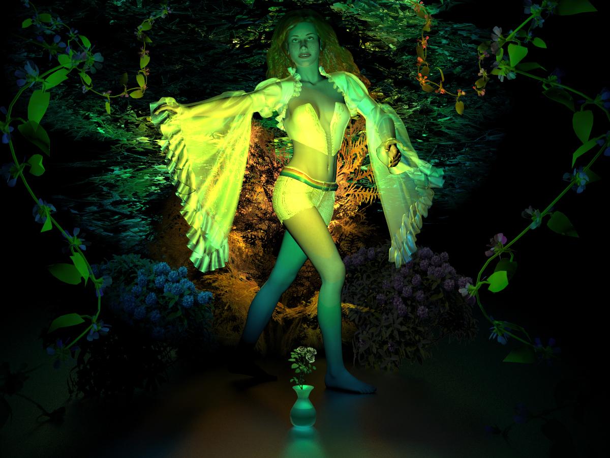
Light, Lace & Flowers
S Ray, what a gorgeous render.
SRay... I love the light. Beautiful Scene.
S Ray : excellent scene. The lighting is awesome.
S_Ray - beautifully done scene.
SRay - beautiful scene, the lighting is awesome
@S Ray: Really wonderful light. Very good work.
Thanks all, I like using gradient lights. Gives a nice sureal effect
S Ray - excellent idea, thanks for sharing. I did such but only a few and to make an inverse gradient. It never occurred to me to do it in this elaborate way. Thanks again.
Thanks S Ray for the screenshot
S Ray, never used the gradient before, thanks for sharing.
Entry #1 Looking A Head
I used a brick material on the ground to represent our civilization of buildings, parking lots, and institutions. The big head is looking behind and represents most people. As the people turn toward the future (on the left) there are less and less people looking forward, thus the figure gets smaller. I think most of us see the past as our future. This manifests itself in people resisting change and wanting things to stay as they were (the past).
Then again, I could change up the direction of the future and make it on the right. After 2020 most people are looking for a new 2021. You decide.
NGartplay: What a nice Idea. Great entry,, I love it....
S Ray : thank you for sharing.
NGartplay : very original idea, great work.
NGartplay - very good idea and very nicely presented.
NGartplay - very unusual idea and very nicely presented
S Ray Great image ...lovely lighting and foliage and thanks for the gradient idea
NGartplay Super idea beautifully made a great example of less is more
I promised myself that I wouldn't enter this challenge but this one got the better of me
To New Horizons
spuddy - nice adea and very well done.
Spuddy, another beautiful render. What makes this for me is the hiker. He's perfect in the scene.
spuddy : cool idea, beautiful image.
S Ray: great colouring work!
NGartplay: highly original take on the theme.
Spuddy: lovely render, specifically the light and sky are very good.
S Ray - "Light, Lace & Flowers" is stunning! I love the lighting.
NGartplay - "Looking A Head" is a great idea, I think the future is to the right though...
spuddy - "To New Horizons" is lovely, I like the bleak winter landscape and the hiker makes it a really nice compostition.
Ngartplay: My first interpretation was a young boy looking behind & as he grew older he looks ahead. But after reading your comment I totally get it & my interpretation is the opposite of most people's reality . Most start out in life looking ahead and as they grow older they end up looking behind. Great idea. I came here today because I've been stuck on what to do next. Your render has inspired me with a new idea. Thanks.
My first entry : "Looking ahead" I made a pencil sketch of it, used the head of Genesis.
adbc - good idea and very nicely done.
Spuddy - lovely render, I like the mood, the hiker is a nice addition.
Adbc - very nice idea and well done.