Advice? Feedback?
 jason-2455927
Posts: 51
in Art Studio
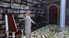
So after a lot of learning I've just finished a render that I would like to share. It's still not where I want it but I think I may just be being too hard on it. What are your thoughts? Any feedback positive or negative? Any advice?


king.jpg
1116 x 613 - 667K


Comments
Congrats on the first render.
My biggest take from this is the angle of the render, and the fact that a lot of it is empty space to the right, which pulls my focus away from the subject on the left.
Materials:
- One wall looks very different than the other, which doesn't make much sense
- The throne and especially the pillar look plastic and probably need a shader
Lighting:
- Overall not too bad, but a little flat
- Light temparature is a little chilly for my taste, but that's subjective
- The reflection on the pillar makes no sense for an indoor scene
Composition:
- Figure is cropped oddly
- Figure is quite small, we see a lot of empty space in background. I would either zoom in closer to the figure, or make the background more engaging.
Storytelling:
- I can't tell what the figure is doing or what he's thinking/feeling.
I hope some of that was useful! Have fun!