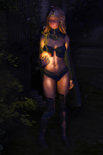
help me improve :)
Hi all,
When I last posted I was given some great links to mini tutorials and such - they've been a massive help and I still have a lot to learn from them.
This time i'm going to post a piece i'm currently working on in order to get direct feedback, suggestions and critque etc :) Here is the piece:
-replaced link with attachment as per moderator suggestion-
Currently the thing I am most unhappy about is the fireball which I will remove and try to find better stock. I'm also not greatly impressed with the look of the hair.
I created the scene in daz, starting first with the mage and her pose and then threw together the background from props from different background sets (like the dragon tutorial etc). I used an uber enviroment light set to moon preset I think, I added a directional light of a gentle blue colour to help light up some things the uber light was not lighting well and I created a small (indirect pin i think) light in her hand set to yellow as I knew I would be adding a fire effect and i wanted her to be lit with it.
In photoshop I added the fire, some orange smoke and darkened out some areas because I wanted it to appear misty but this didnt work well, it just got.. darker. My favourite filter of all time, diffuse glow, was used to give a little bit of grainyness and smoothness that gives the look I love. I fiddled with some other things too.
Hints, tips, suggestions? Thanks :)


Comments
You can attach an image to your forum post by using the Browse button beneath the type pane and then browsing to where it is stored on your computer.
It is easier for people to help you if they can see the image in the post, instead of having to jump between sites.
Oh okay, i posted from my phone during lunch break but when i finish work ill attach the image from my pc properly :)
I really like the abdominal lighting- shows her abs! The glow in the hair is nice too.
The only thing I might experiment with (not necessarily change) is perhaps move her arm slightly that is by her side. She is in a relaxed pose so it looks fine, but maybe move it slightly forward and see what the lighting would do.
I would also add a dim spotlight onto the lower legs so they have a bit more lighting- just to see if you like it. Put the spotlight where the orb is and point it downwards.
Nice job!
I think it is a very nice image. I have a few suggestions to improve it.
On composition, you don't generally want to center your figure in the image. There is the so called rule of thirds for composition. This says you generally want your main subject to be to one side or the other of the image about 1/3 of the way across. In this case, since she is looking to her right (the left side of the image) I would move her towards the right. The rule of thirds is just a guideline for composition, the kind of rule that is meant to be broken. In this case though, given the amount of space on the left and right, I would move her towards the right side of the image.
To me it looks like she is holding the fireball too casually, like it was some very ordinary object. Her expression is very calm and she seems to be looking at something far away. I think the image would be more compelling if she was looking at the fire ball and/or showing more excitement/tension/emotion.
Good start, hope you are enjoying doing 3D art.