Preview-Ready Renders
 ludickes
Posts: 27
I've been working really hard on a set of LIE face paints for the Gen 8 male but I'm having a hard time being subjective to my own work so I don't know if an image is ready to be submitted as a preview. I know that the store has some very, very high standards and I would like to meet those standards. I understand that the item could be of amazing quality, but if the renders aren't attractive, the product will simply fall flat and be rejected. So I'm looking for some feedback or help with the WIP face paints I have, to make sure they're of good, solid quality or tips on how to make them solid.
I've been studying the recent item releases and other sets of face paints in the store for an idea of what Daz is looking for. (Good quality, clear lighting with a distinct view of the product if it is regarding makeup or face paint.) Also the model I've been using for test renders probably isn't super attractive and I'm assuming that the models in preview images should be drop dead gorgeous. I will admit, I have a horrible taste in what I find to be drop dead gorgeous so I'm also worried that the model itself will be a turn away.
I've attached two photos to show some of the designs and to demonstrate my current lighting set up. I feel like the lighting might be too stark or drab, but I don't want to overpower the model and the paints with colors clashing in light and stuff.
Thank you!
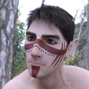

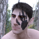


Comments
So you want feedback on your promo renders, not the product itself, right?
In my opinion you're not quite there yet.
Your renders are still noisy and your background is low-res.
I find the lighting a little flat and grey. I personally prefere more saturated colours and warm light, unless there's a specific reason to keep things cool and desaturated (eg foggy scenes, nocturnal scenes)
I'm not super into your character but I'm perhaps the wrong person to ask, since I'm generally not into Elves.
ETA: And I think you have some distortion going on because you might not have chosen the best lens for a close up.
I hope that was helpful! Good luck!
I added some changes to the scene, warmed up the lighting, etc.
There's probably some noise with this new one because I didn't wait for the picture to finish rendering. I'm going to say that these are mostly just test renders to see if I'm on the right track or if I've fallen farther back.
I'd ask more about the product itself to get some opinions but there's several designs and colors so I don't want to crowd this thread up with photos. It would be ideal to share all of the WIPs.
Would it be a smarter idea to use a character more in line with an Adonis type of appearance?
I like it better already!
I think your face is too dark now, especially compared to the chest area. A warm point light in front of his forehead?
I was able to update the lighting and I think it's coming along nicely. I will be fixing the weird hard shadow line on the second image. Are the two facepaint designs interesting and fun? I can share more examples via private message. But I do want renders that look amazing enough to present the product, and I want to know if the face paints would be something people would like.