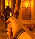
So, how am I doing? I would like to think I have moved past the beginner stage. Did I?
Just finished this render and thought it was worthy of sharing and getting feedback/praise or some like a lil bit critique. I considered myself or maybe I still do a complete noob but I suppose even noobs learn with practice.
This is part of my attempt at creating the first of an adventure/adult series spanning many stories. My goal is to make spectacular artwork, meticulously detailed with low errors, enticing/humorous story telling, high graphics and most importantly in light of all the priveleges I already enjoy in this life, completely free like totally. The only currency I would need would be a meagre quantity of Likes just like in Death Stranding, people who would enjoy my work and tell me so, to keep the motivation going.
So, how did I do? (no postwork yet)
I particularly like the menacing glare of TOR if you zoom in.


Comments
I don't think it's a noob render at all :)
I absolutely love the point of view and the lighting.
One suggestion- TOR's face is too dark. That needs to be "dodged." Are you familiar with that? You can lighten just that area. If folks have to zoom in to see the detail, IMO it's too dark. That's just my opinion though. Expressions are everything, and the focus is aimed at him, although the hand catches the attention first- and he's just too dark to get an additional "boost" of involvement from the viewer with a powerful expression from TOR.
I think it's good. Reminds me of when I 1st played the game Doom.
you are quite right now that I think about it thanks :).
can you list how that can be achieved? what i have already tried in the past is tried to use spotlights but no matter how much I tweaked it would be quite visible that this is an external light source and not the natural torch light and stuff plus I never could get it right and in order to lighten up some particular part of the render it ended up leaving prominent shadows and stuff cuz it would need a high lumen to even work as intended.
Can it be done postwork? If so then I will take all these pointers and do them postwork, aim is to finish the renders first then learn photoshop and add effects I already have in mind such as motion blur etc and like you mentioned lighten parts of the image. This way I would not have to do renders again :)
Very nice render, bravo ! Definitely above the usual 'beginner' standard.
For me the flames beneath the bad guys left arm are confusing - at first I thought it was the arrow that was aflame, then I thought it was a brazier behind him and to his left. Still not certain.
Edit: Ah! I now see the two burning arrows in his shield - I'd overlooked them, thinking that was the recflection of the wall torches on a bronze shield (forgot to zoom to 100% ! )
)
If it's a brazier I don't think it's really adding anything to the scene. But if you moved it so it's in front of the bad guy, possibly knocked over, and used it as a light source (orange-yellow point light, not spotlight) then it could provide the illumination of the bad guy's face that Novica mentioned in a way that matches the scene. This would of course also illuminate the poor lassie on the floor, so you'd have to play with the brazier light's intensity and position to get the right balance, and you might want to tone down the overall illumination to compensate for the additional light - but fiddling with the lights is half the fun !
If it's a burning arrow then you could perhaps use some artistic licence - have a dim orange-yellow spotlight positioned at the arrowhead pointing directly at where the arrow's aimed, adjusted to provide just enough subtle illumination of the bad guys chest and face.
P.S. Iray or 3Delight ?
You can lighten the face in post work, I don't know what programs you have. I have Photoshop but mostly use Corel Photo Paint. The latter has a brush (looks like a cotton swab) and you can either dodge or burn into the work. Dodge is lightening, burn is darkening. You choose the strength of the effect so you can do it slowly by repeating. As long as you don't let up on the mouse, it won't do an area you already lightened, so you don't get streaks. (Like when you overlap markers and get that darker strip.) So whatever graphic program you have, just look up dodging. You can also apply a mask just to that area and lighten it that way. :)
In the studio, you go up to Create then do a spotlight. If you name it say, Spotlight 1, then you go into the viewport and in the dropdown, instead of Perspective view, you choose spotlight 1. NOW YOUR VIEW iN THE VIEWPORT IS THE LIGHT. You are actually pointing the light! You can zoom in and just get the face.