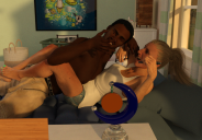
Looking for some critiques on my newest render!
in Art Studio
Hello! This is my second forum post, but I just wanted to share what is one of my most detailed renders so far pose-wise, and I was curious if I could get some general critiques/pointers from anyone on the pose posture, shading, expressions and lights.
It's for an upcoming book cover! The picture is attached.
Thanks for your time!


Book Cover Test 2.png
1009 x 701 - 1M


Comments
the pose of the male looks very contorted and unnatural to me and there are many mesh intersections happening. I think it hurts the visual legibility of the scene and its difficult to understand what's happening.
I think both of these figures dont seem to be interacting with (1) eachother and (2) the environment
also i question the choice of camera angle... it's quite a boring angle. I always cringe inwardly when i see someone put a camera directly parallel to the lines of the subject unless there is good reason to, especially if it's supposed to be a candid shot.
Okay! I'll definitely take this into account and make some adjustments. As for the camera angle, I wanted to capture both of their faces and expressions, as I hopped that would help provide some context to the picture, but it seems I still have a ways to go.
Thanks for the suggestions!