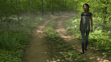
Figure looks pasted in
 Aabacus
Posts: 407
I'm experimenting with Harpwood and the Ultrascene package. I created an Ultrascene then placed a figure.
It looked terrible. The figure looked like I took a photo of a forest then dropped on a photo of a person. It didn't look like part of the forest.
So I added a distant light. Better...ish. (the only lights are the dome and the distant light)
I then adjusted for depth of field. Again...better but still not great.
Finally I added the After the Rain package for some low fog. Still not great.
Does anyone here know what I'm missing? (Image attached)


harp test.png
1280 x 720 - 2M


Comments
She isn't standing on the ground, she is floating in the air above it. Select her and keep lowering her until the bottom of the bounding box disappears. If she goes below the camera view then keep moving her back too.
That's what I thought too because that's what it looks like right? Nope, on the ground. (file attached)
Thanks!
she's within the ground...
did you turn off the headlamp on the camera?
Not sure if you're making joke but I've not found a good way to get someone ON the ground. They're either above or slightly into. I usually error on the side of slightly into the ground. In this instance she's just slightly into/within...
Negative. I instinctively turn the headlamp off and sacrifice it to the gods that hate headlamps. I don't know which ones those are but there should be.
Is the ground set to Auto or Manual?
That is a great question. I don't know. It's set to whatever it defaults to so I'm assuming auto. Where would I look? Thanks for the help! Everyone has such great ideas. I've learned things even if I've not fixed the issue. LOL.
It is in Render Settings/Editor/Environment/Ground Position Mode.
It would help if she were to actually cast a shadow on the environment and if the light pattern on the ground and her body would match.
Dont see how this is relevant
Well since the light in the scene isnt strong/angled enough to cast a shadow for the body on the ground, you might as well get some shoe-shadows in there while you can by positioning the foot properly. Normally this wouldnt probably be a big problem, but in absence of other visual cues to place her in the scene, it is. You could try putting a light somewhere to get her body to cast a shadow on the ground.
The incongruent lighting between background and character is unfortunate but seems to be just a result of their position (they are in shadow, while some of the immediate surroundings is still getting hit by light). If the character were positioned to have more harmonious lighting with the foliage around her it might look better.
She's also walking randomly from the side of the trail across the midline which probably hurts the image too, since that doesnt really make sense for someone who we assume was walking along a path to suddenly shift all their momentum toward the middle of the road.
Confirmed. Set to Auto.
I'm running another render right now (CPU only because Mac...*sigh*). I moved her farther back on the trail and she's looking better but is still kind of like a cut out.
I am now wondering if it's because of the shadows. I'm coming at the scene from a fairly high angle (just a bit off of straight down) so that I can get light down into the forest. That, however, has the effect of someone diminishing her shadow as an indicator. Also, there's nothing in front of her so maybe if I add a tree or a bush to partly occlude her and show some depth?
I don't think the ground is on - there's certainly no sign of ground shadows, which is why she is floating.
Here's the settings...Thanks for the thoughts!
isnt the ultrascenary ground geometry? does it matter if ground is on when there is geometry there above the ground plane to be a shadow catcher?
I'm starting to suspect this based on your feedback and my own looking around. I hate adding lights to a simple scene so I'm saving that as a last effort.
The story i'm telling myself is that she's out for a walk and saw something so she's turning to walk to it.
That said, you started me thinking about how things can look "not real" simply because they're doing things that don't look quite right...like not walking on the road where you'd expect (in the track) or maybe an arm at a strange angle or their fingers not right/natural. I know there are poses that look great and those that look very "doll" like or fake. I'm still studying what it is that makes the difference. I'm so glad I don't do this for a living. I'd probably be a fairly heavy drinker. Too many details! LOL. Thanks!!!!
I am going to try and change the angle of the light after this render completes. CPU rendering FTW.
Someone else mentioned this so I'm going to experiment with that next! Thanks!
yeah, the light is coming down nearly vertical so that it can get into the forest and down to the road so that may be part of the issue.
Rough render...looks better. I changed the angle of the light so that the figure would have a shadow. That seems to have helped but I now think her textures look too cartoony which is what's making her pop out agaist Harpwood/Ultrascenery.
On the plus side she does look more nested in the environment, but does look kind of cartoonish.
that is fantastic
Yes, UltraScenery provides the ground geometry. It is not necessary to turn on ground in the Render Settings when working with UltraScenery.
Thanks but, I give every bit of credit to Ultrascenery for this. Truly a game changing package. I got all the packages that were on sale the other day and spent a good hunk of my "October" funds. Worth every penny.
I've tried a few models now and most of them just look like a poor second cousin in comparison to Ultrascenery (ridiculously out of place.).
The good news, as you note, is that I found most of what was making her look pasted in. Thanks for your help @lilweep