Caption: Magic exists - you just have to look for it. If you notice a faint glow at night you could always dismiss it as a distant car light, or the moonlight reflection on a pond. Or you could chase the glow and discover a fairy - and gain a magical new friend.
1st Entry: Beginner's Contest
Software: Just Daz 3d :)
Any feedback is much appreciated - I will post to my gallery when finalized. :D
What an absolutely adorable image. I love the caption. Lovely sentiment.
It may just be my monitor, it tends to be a little dark, but I would love to see just a little more detail.
You could either try adding a fill light, if you do not have one. Or you could try adjusting the Tone Mapping setings. They are designed to operate like a camera. Adjusting the ISO to 400 may make a difference. Or playing with the FStop settings.
Here's a slightly brighter version, I changed the exposure value from 13 to 11. Not sure if its too bright now.
Thought I'd give this a go, first time entering a contest. I found DAZ a couple of weeks ago and haven't been able to leave it alone since. What do you think?
Nice eerie atmosphere! Love the subtle creepy arm coming from the bottom left. :) I think the lighting too is pretty spot on to give it that creepy feel
Nice eerie atmosphere! Love the subtle creepy arm coming from the bottom left. :) I think the lighting too is pretty spot on to give it that creepy feel
Thank you! I must have done 10 different runs with various lighting settings. This tutorial on shooting day for night was super helpful!
I find I often have to run mutliple simulations to get dForce clothes to do what I want them to do. But when you get a great result the effort is worth it.
You're right. i tried it alot. The Robe is nice and easier to work with. But the Cloak was a pain. But some "explotions" are better then expected. I'm not disappointed.
First time trying a contest. So i'm gonna enter the contest for Beginner. I'm new to daz, had been using blender for a year.
You have portrayed a lot of emotion with her pose. The monochromatic colour pallete really works without feeling cold.
I'm not sure if this is your intention but I find my eye drawn to the little vignette in the corner with the wine bottle, glass, candle, skull and subtle godray.
Thought I'd give this a go, first time entering a contest. I found DAZ a couple of weeks ago and haven't been able to leave it alone since. What do you think?
Welcome to the insane asylum club.
I like the story this image is telling. Your main guy has a great expression. There is just enough light to see his face. The set is appropriately dingy and abandoned with DOF just strong enough to make the arm a mystery.
This is getting very nitpicky but the male figure's foot is just slightly going into the floor. It isn't much. You might need to either raise the guy by maybe 0.5 point or lower the set. Whichever is easier to do and causes the least amount of adjustment to everything else in the scene.
Caption: Magic exists - you just have to look for it. If you notice a faint glow at night you could always dismiss it as a distant car light, or the moonlight reflection on a pond. Or you could chase the glow and discover a fairy - and gain a magical new friend.
1st Entry: Beginner's Contest
Software: Just Daz 3d :)
Any feedback is much appreciated - I will post to my gallery when finalized. :D
What an absolutely adorable image. I love the caption. Lovely sentiment.
It may just be my monitor, it tends to be a little dark, but I would love to see just a little more detail.
You could either try adding a fill light, if you do not have one. Or you could try adjusting the Tone Mapping setings. They are designed to operate like a camera. Adjusting the ISO to 400 may make a difference. Or playing with the FStop settings.
Here's a slightly brighter version, I changed the exposure value from 13 to 11. Not sure if its too bright now.
And here it is again at exposure 12.
This looks like it is just right. Not too bright and not too dark. Light enough to see detail and dark enough to keep some mystery and magic.
I find I often have to run mutliple simulations to get dForce clothes to do what I want them to do. But when you get a great result the effort is worth it.
You're right. i tried it alot. The Robe is nice and easier to work with. But the Cloak was a pain. But some "explotions" are better then expected. I'm not disappointed.
We call those "happy accidents". Sometimes unintended results work out better than what we planned.
Caption: Magic exists - you just have to look for it. If you notice a faint glow at night you could always dismiss it as a distant car light, or the moonlight reflection on a pond. Or you could chase the glow and discover a fairy - and gain a magical new friend.
1st Entry: Beginner's Contest
Software: Just Daz 3d :)
Any feedback is much appreciated - I will post to my gallery when finalized. :D
What an absolutely adorable image. I love the caption. Lovely sentiment.
It may just be my monitor, it tends to be a little dark, but I would love to see just a little more detail.
You could either try adding a fill light, if you do not have one. Or you could try adjusting the Tone Mapping setings. They are designed to operate like a camera. Adjusting the ISO to 400 may make a difference. Or playing with the FStop settings.
Here's a slightly brighter version, I changed the exposure value from 13 to 11. Not sure if its too bright now.
And here it is again at exposure 12.
This looks like it is just right. Not too bright and not too dark. Light enough to see detail and dark enough to keep some mystery and magic.
This is the final version of this month's entry for the beginner's contest.
I have added a sword to show the girl is a warrior. I Imagine she borrowed the sword from her brother because she wanted to join the battle. Her dog is the one true friend she can rely on.
Title: Together Forever (When only one sister says goodbye)
There is a special effect in here, but it is kind of subtle. Going for atmosphere.
Also a story.
Had difficulty with the lights, which kept showing up in the mirror even with render emitter off. Still not sure how to handle that but I manouvered them out in the end.
This is a powerful image. Framing most of the scene in the mirror is quite effective.
Congrats to the winners! Beautiful renders from everyone... On a side note, just wanted to point out that you've posted my image instead of Meraki's under the beginner challenge.
Congrats to the winners! Beautiful renders from everyone... On a side note, just wanted to point out that you've posted my image instead of Meraki's under the beginner challenge.
Comments
And here it is again at exposure 12.
Nice eerie atmosphere! Love the subtle creepy arm coming from the bottom left. :) I think the lighting too is pretty spot on to give it that creepy feel
Thank you! I must have done 10 different runs with various lighting settings. This tutorial on shooting day for night was super helpful!
You're right. i tried it alot. The Robe is nice and easier to work with. But the Cloak was a pain. But some "explotions" are better then expected. I'm not disappointed.
You have portrayed a lot of emotion with her pose. The monochromatic colour pallete really works without feeling cold.
I'm not sure if this is your intention but I find my eye drawn to the little vignette in the corner with the wine bottle, glass, candle, skull and subtle godray.
You have done a great job.
Welcome to the insane asylum club.
I like the story this image is telling. Your main guy has a great expression. There is just enough light to see his face. The set is appropriately dingy and abandoned with DOF just strong enough to make the arm a mystery.
This is getting very nitpicky but the male figure's foot is just slightly going into the floor. It isn't much. You might need to either raise the guy by maybe 0.5 point or lower the set. Whichever is easier to do and causes the least amount of adjustment to everything else in the scene.
This is a great image.
This looks like it is just right. Not too bright and not too dark. Light enough to see detail and dark enough to keep some mystery and magic.
We call those "happy accidents". Sometimes unintended results work out better than what we planned.
YAY! Worth re-rendering. :)
The Lonely Warrior and her faithful hound
This is the final version of this month's entry for the beginner's contest.
I have added a sword to show the girl is a warrior. I Imagine she borrowed the sword from her brother because she wanted to join the battle. Her dog is the one true friend she can rely on.
My entry for the Beginners Challenge.
Title: Together Forever (When only one sister says goodbye)
There is a special effect in here, but it is kind of subtle. Going for atmosphere.
Also a story.
Had difficulty with the lights, which kept showing up in the mirror even with render emitter off. Still not sure how to handle that but I manouvered them out in the end.
This is a powerful image. Framing most of the scene in the mirror is quite effective.
Thank you !
Was time consuming. Could tinker with it forever but got to call it a day eventually.
I couldn't quite get the effect I was looking for with the hands and flames, might have to revist the idea in a different image.
I also couldn't decide what colours I liked best, eventually settled on this.
Final Entry Intermediate Challenge:
Power Overwhelming
Daz Studio canvases Composited in photoshop
Entry for Intermediate Contest
This challenge is now closed.
Thanks to everyone for participating!
Hello everyone
Due to unexpected challanges related to the upgrade, there may be a delay in announcing the Spotlighted Images.
Everyone did phenomenal work. Thank you for participating.
Hi everyone. We apologize for the delay. We are hoping to announce the spotlighted winners early next week. `
Thank you for your patience.
October, 2020 New User Beginner Challenge – Atmosphere
Katywhite
Chase the Glow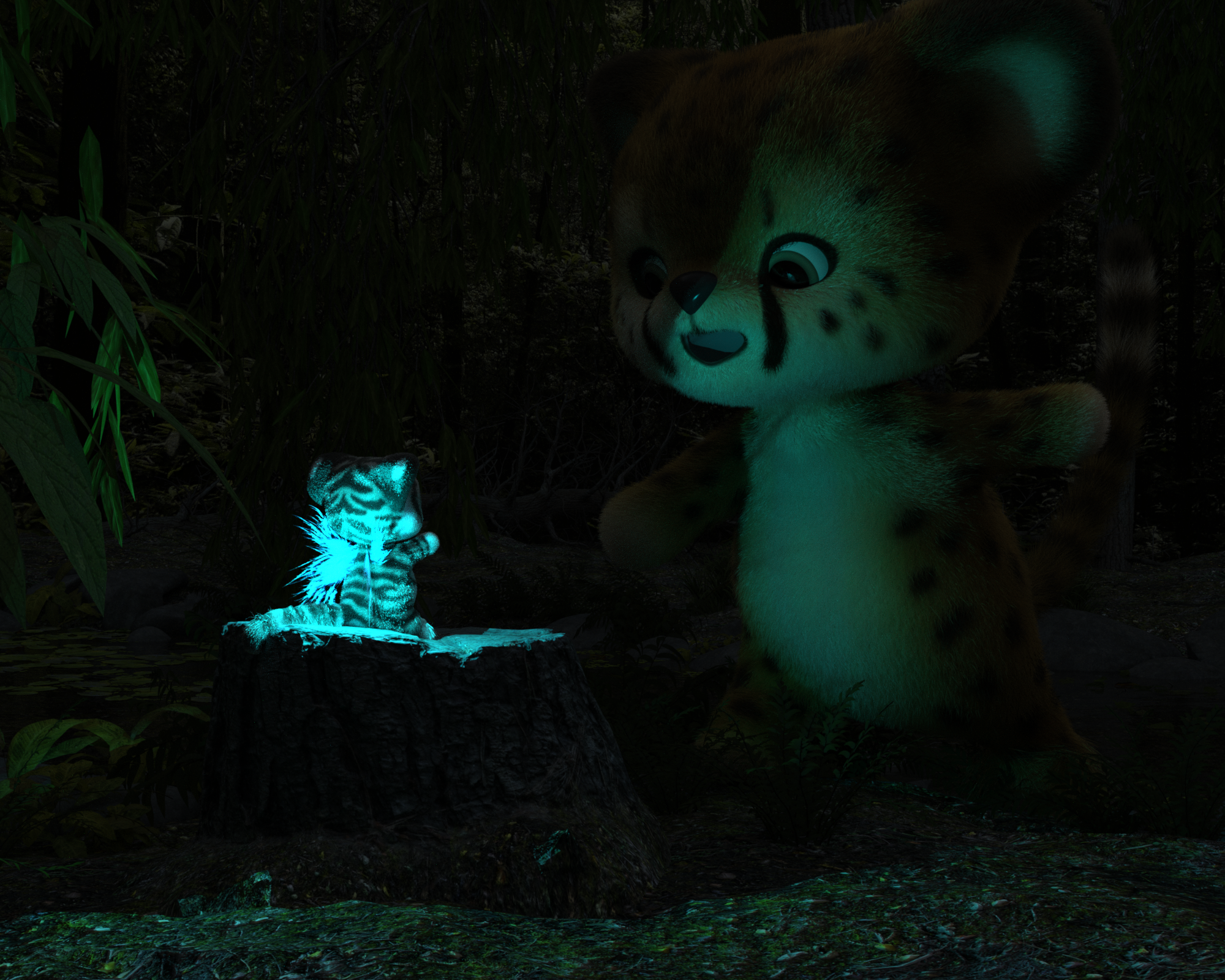
Exploring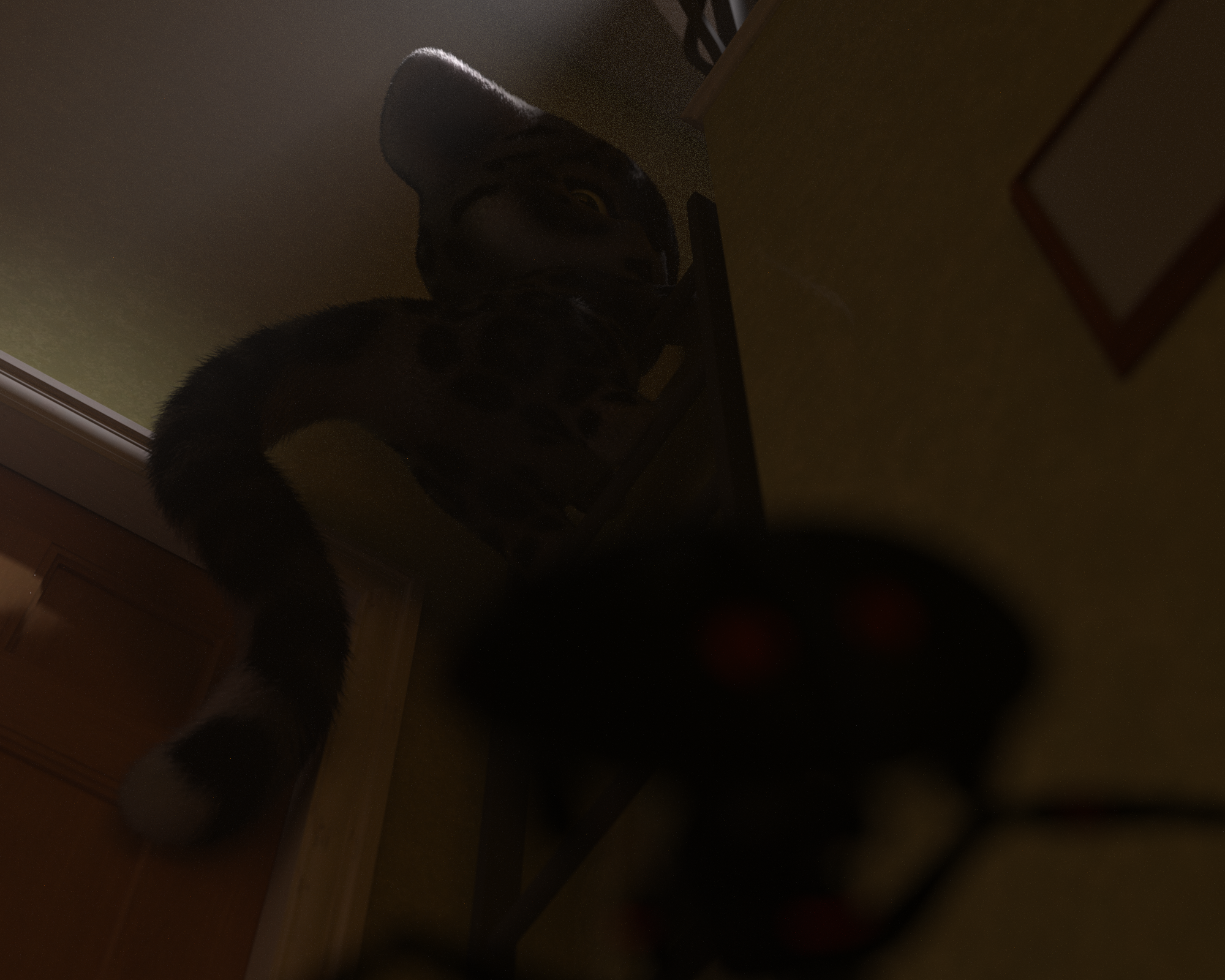
Meraki
Just Looking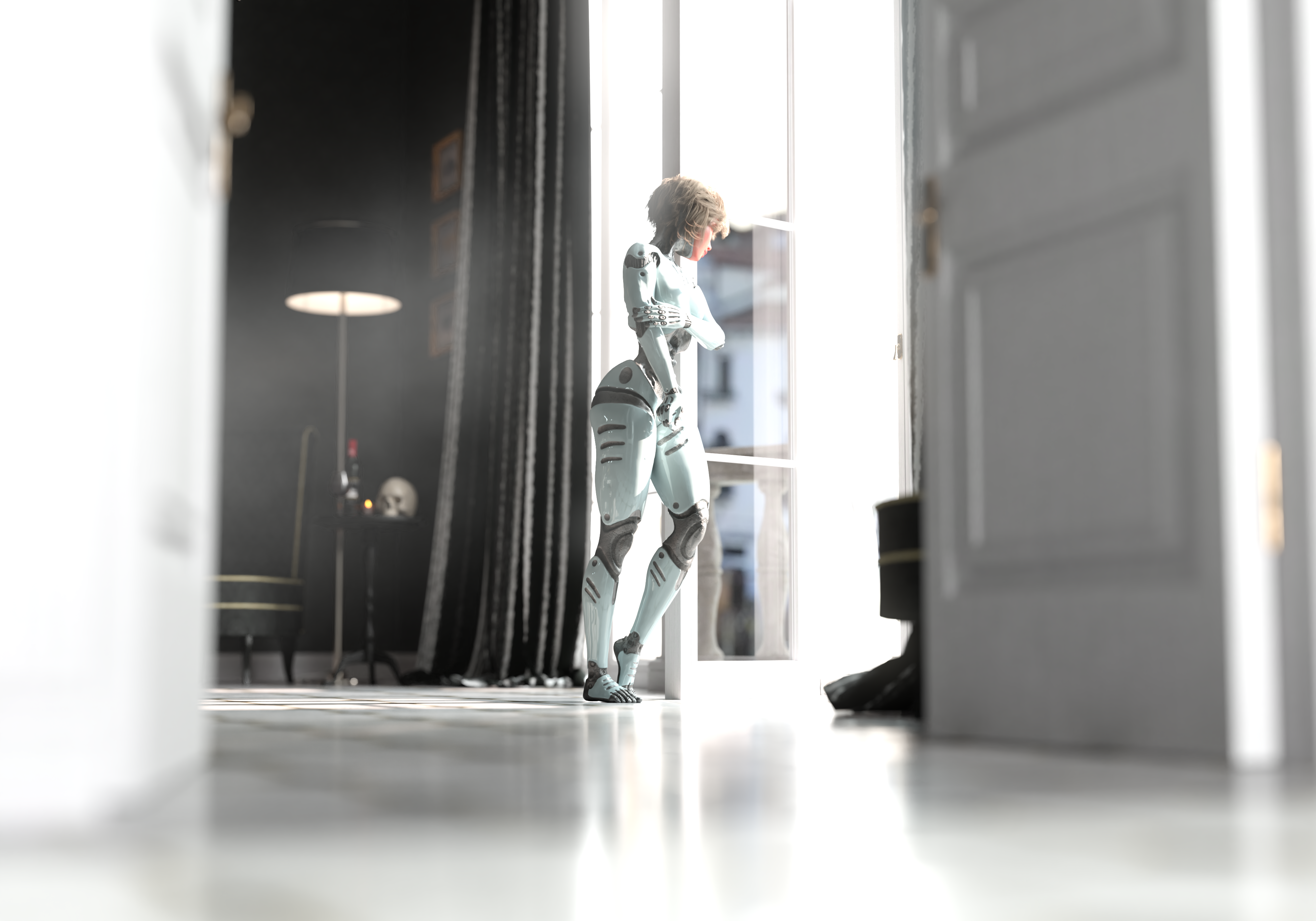
OriginalSamhain
Atmosphere Final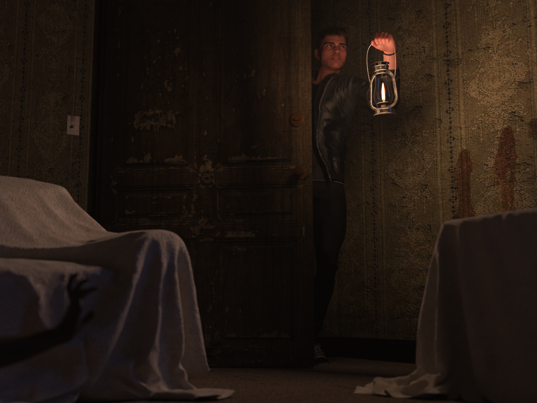
October, 2020 New User Intermediate Challenge – Ghosts and Special Effects
Stargazey
In the Moonlight with fog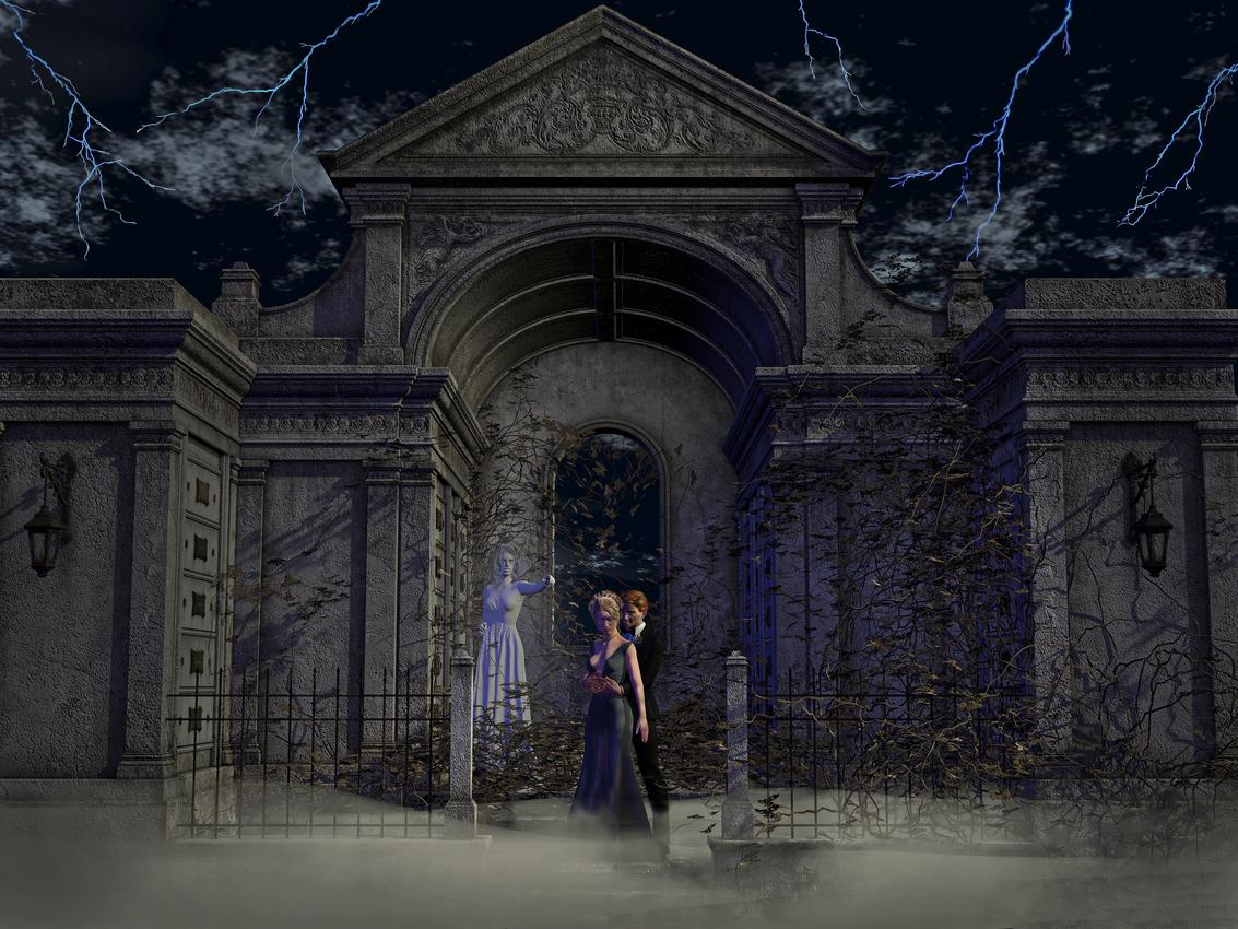
Haunted Graveyard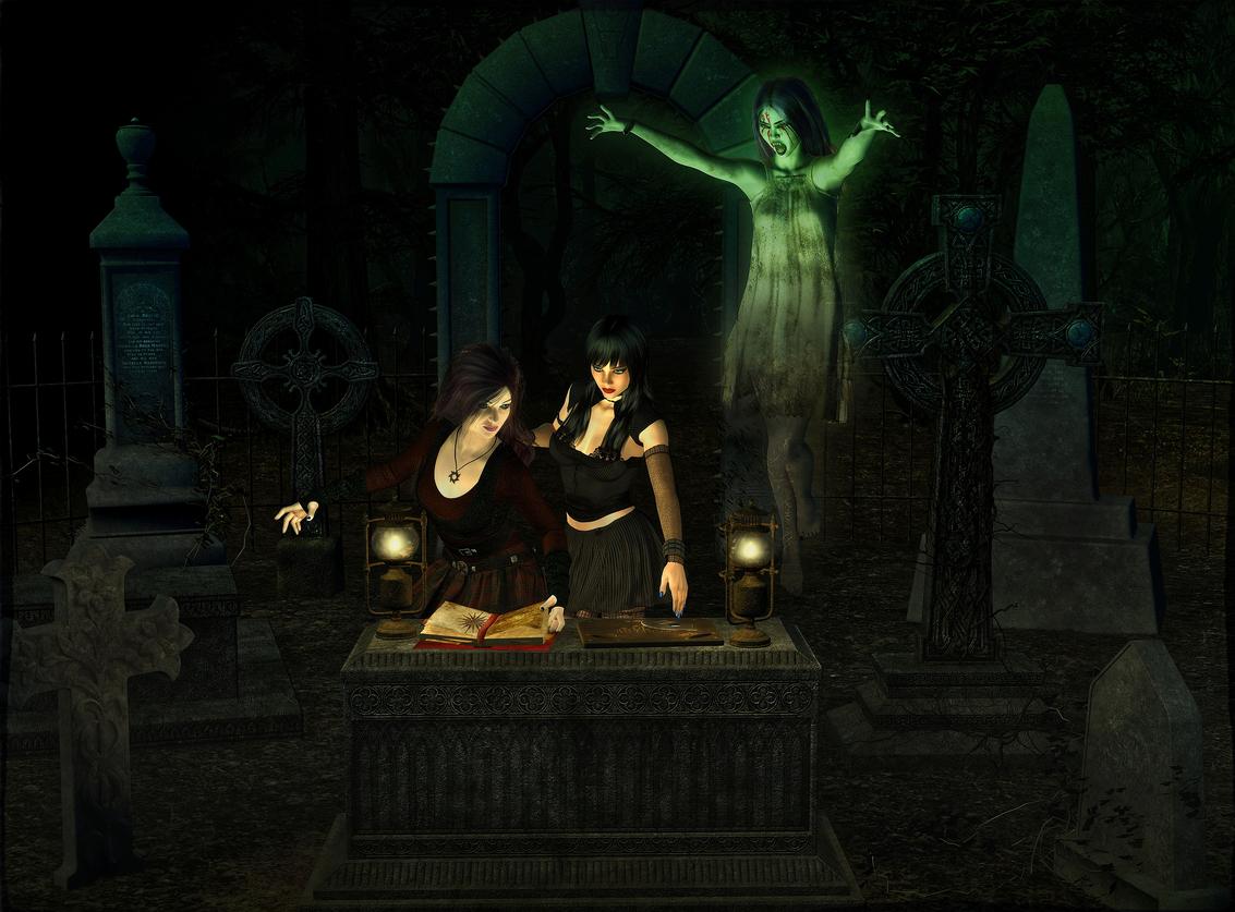
Shack
Urban Witchcraft
Smoerebroet
Collector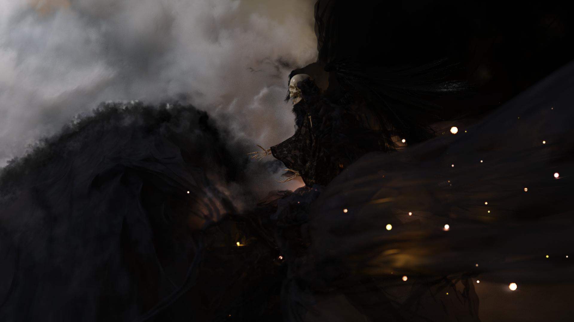
Well done, folks. Some lovely work there.
Congrats to everyone showcased!
Well done to everyone who was showcased.
Congrats to the winners! Beautiful renders from everyone... On a side note, just wanted to point out that you've posted my image instead of Meraki's under the beginner challenge.
Thank you @aprilshowers2065. I am so sorry for that gaff.
So many amazing images. Everyone did a great job.
Oh wow thank you! Such beautiful renders. =) Great work everyone!
Congratulations to all the winners!
Oh wow, thank you! I haven't checked back here for a while but this a lovely surprise! Well done everyone
Now i have a little bit time. Very busy chrismas.
And i think about to do a visual reactive Version for the wallpaper engine. Lets see.So thank you all for being selected. :)
I used it wisely.