Skies of Gaia V2-blurry images?
 Daventaki
Posts: 1,624
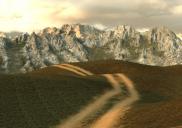
In the promos for the Skies of Gaia V2 the mountains look sharp. I know they are high quality but this noob does not know how to make them look sharper in my image. I tried a couple of the presets and the mountains always look blurry.....


blurryimage.jpg
2500 x 1760 - 3M


Comments
I see what you are saying. The product description even touts the details. I don't have it but it looks like there is a slight DOF and/or atmospheric effect, either with your camera or with the presets you tried. If not, is it possible you tried an interior preset by mistake? Those promos show blurred mountains.
Thanks for trying to help. The Indoor settings are in a different folder and I haven't added any DOF or anything all I did was click the preset and rendered.
Ive attached three files. First is default out of the box Sky 07 camera set straight on with perspective view. Second is added a camera same position of the perspective view only turned of the headlight. Third is with focal length set to 1000 (No i have no Idea what I am doing just trying to get a clearer shot.....LOL)
If you open them in new tabs and flip between them there are no differences in them.....
@Daventaki, my computer is tied up right now, just saw your post. Did you try adjusting the horizon height? There are 10 variations available.
I was trying for a Rocky Mountain feeling, so the peaks actually worked well for my purposes.
Mary
More notes from what I wrote in Novica's thread.
I played with the height settings a bit, the different terrains, and sky/clouds, and tone mapping before I did anything. (I think this was the first time I actually tried to figure out all these things 'Before' I went to use them in a render.) Laptop available now. The different skies, seem to be the same scene, but the colors change the emphasis a bit. Then using the Rotation option, it moves you to a different view. I need to copy this to your thread now.
With that render, and on the ones I did with UltraScenery, I was working blind.
May I suggest a blank screen, a notepad to the side & pen, and run through the colors, rotations, heights until you find the combination that fits your scene?
Mary
Tried multiple settings over several of the presets and they all look blurry like above. Ended up using one of the basics for the image I posted in the Ultrascenery thread because I couldn't get the mountains to look crisp. Maybe I should try to uninstall and reinstall... Will do that and check in later.
Thank you!
I played with it and got it a little sharper. Didn't have much time today but wanted to follow up. I used one of the blue Gaia skies.
Start with a small render size, just the HDRI. Change filter to Mitchell 1.0. Turn off Render Quality, set Max Time to zero and set Max Samples to 5,000 - 10,000. Your render won't stop until it reaches Max Samples (iterations) . Since you won't have any instances in your scene set Optimization to Speed or Auto.
Render and see how it looks. Increase Max Samples 1,000 at a time. You could also decrease Mitchell filter to .8 or smaller, but your render time will start to increase.
I've also read that others have doubled the render size and then exported it at 50% in Photoshop.
Hope this helps.
Errr... no. The HDRI has a 2:1 aspect ratio, but it is stretched into a sphere around your camera position - the aspect ratio of the pictures you make isn't really all that relevant.
But the size of the images could be. According to this calculator, the default Daz Studio focal length of 65mm is equivalent to a 30 degree angle of view. You're seeing just one twelfth of the 360 degree horizon in your finished picture. One twelfth of 8192 pixels is approximately 683. If your render is more than 683 pixels wide, you could see some blurriness as each pixel in the HDRI image is stretched to more than one in your render.
@Daventaki, I opened the file up, the sky used was DTSG2_Gaia_Sky_16 and I had used the 'mitchell' filter (my default) and for the shot the camera that came with the Highway set, 'Cam BadPlace for Breakdown' but I had moved it a bit for the shot lineup. Frame width was 35mm and Focal length was 65mm, but my Focal Distance was at 396.01. Other than having 'Ray Tracing Low Memory' set to 'Memory' I pretty much left the default render settings alone. The render ran for around two hours. And looking at what @chris-2599934 wrote just above, I am not sure what to think, my pixel size was 2500 by 1854.
I have played with so many differnet settings. At this point im not 100% decided that I want to keep this set, I understand that somethings need tweaking but I should be able to get clearer renders than I feel like I am getting. These images are rendered out at max samples 10000, Aspect Ratio 2:1, filtering Lanczos 0.5, firefly filter off, enviroment map set at 1.5 this decreased some of the brightness causing the atmospheric effect-everthing else is default. Camera settings Frame width 35, Focal length 40, Focal distance 396.01. Second image is dome rotated with preset E-it is somewhat clearer i believe because there is not as much of the atmospheric effect from the light but to me its still not crisp. I did try smaller sizes and of course it does make a somewhat sharper image but to small. I could render 2x the size I wanted with these settings then resize and sharpen in an image editor and add in to the image but thats a lot of work. Thier promos show clear sharp images. memcneil70's image looks clearer to me then what im getting so I don't know what is going on. I tried removing and reinstalling and it did not make any difference.
@Daventaki, I am going to upload my render for comparison, because to me, your renders look sharper. My mountains in the background look like there is a haze obscuring them, which would be natural in the real world as light obscures what we see. The foreground is completely a part of First Bastion's Long Highway set.
Thanks for that memcneil70 now that I take a second look I see what you mean, maybe I was more focused on the foreground and didn't realize how hazy the back looked.
Thanks! Interesting calculator! I removed that part from my post so as not to be confusing. Even at 683 or less pixels wide though, the image isn't anywhere near as sharp as the promos.