
Daz 3D is part of 
Connect
DAZ Productions, Inc.
7533 S Center View Ct #4664
West Jordan, UT 84084
Licensing Agreement | Terms of Service | Privacy Policy | EULA
© 2025 Daz Productions Inc. All Rights Reserved.
Comments
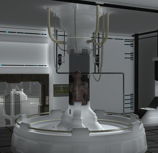
My guess here is because you did not apply the texture maps to a set that loads un-textured.
EDIT: In truth I kind of like that clean plastic look right there.
I like the plastic as well. A light inside the "tube" at the very top might give you an interesting effect on your person. Try a point light or spot light (angle the spot light down onto the top of the character and be sure to narrow the beam so it stays inside the tube if you go that rout). And some additional lighting that casts shadows might give you a more finished feel.
are you refering to your render or your thread titles and sentences?
In all honesty, I also like the render.
Sometimes you want the clean sterile look, Other times you need the fingerprint smudges and filth on the door handles and such. - Adam Savage.
He has a great few vids about making movie props on youtube, or use to a year back.
Try something like adding a clipboard with non-uniform (ruffled and folded up a bit on the edges) papers on it, or a test tube with a smudge on the glass from finger oil. The light in the room may also be to-uniform tho not for this one lab setting.
To Quote Adam, make it look used a bit.
I second lighting your creature up. There is room for a mad scientist or two to pass threw or make notes on a clip board behind the creature so the creature is still bigger. Or once you light up your creature, getting closer to the tube so the creature and tube appear larger. Kinda zoom in on them. I'd try to keep some of the top of the tube in the scene but not worry about chopping off some of large round base on the sides. Think of it like a painting that needs to capture the creature details. Sometimes less is more. If you want the whole scene intact, adding some people in space suits walking by or something might help. Its a large scene, light up the tube and creature and make him have details. Strategically place other characters to move the eyes around the largeness of the space. Think of how you want the eyes to move around the picture. All the white draws your eyes to the room which is just space. Coloring the light in the tube would draw your eyes to it, as it could provide the only real splash of color. If you only want the creature in it, he has to be proportionally larger and showing more details to be the main focus of the piece. Its basically composition that leaves it looking more like a transitional frame in a movie rather than as powerful an image as you'd want for a still shot. Find something on art composition like from an art textbook that goes over ways to set up a scene and tricks to draw the eyes around the canvas. It may give you some great ideas on where to place the camera or light or colors in a scene to get more bang in the finished piece. What is happening here is the creature is not large enough in proportion to the scene and the grey tube is obscuring him and making the viewers eyes travel to the room instead. They just pass over him ignoring him.
I love the plastic look so much I am going to do this myself. Very cool
also the head being partially submerged hides some detail on the creature. Its breaking up what everyone want to see, the details on that monster face. Choose a lighter fluid maybe a light light aqua to go with lights sprinkled around the room. Is there a way to raise the water level in the tube to either cover the head or be below the neck? I agree the room looks fantastic white.
thank you to everyone for your complements but something seems unpolished about the render is what I mean. What texture maps?
I have advanced spotlight but I don't know how to use it lol.
the first one is just an example scene I want to do a how space thing but in this one they look too polished. I don't know.
I mean its just an environment I haven't placed anything in it yet. I want to make a comic so I just want to make good environments I can re light.
thank you to everyone for your complements but something seems unpolished about the render is what I mean. What texture maps?
Well I just guessed.
Okay here is a few quick tips, Composition first off. Dead center is a bad Idea for a finished render. That gives a image a plan look every time. Look up the Golden rules of Photography and Art. Or check my Free tool on ShareCG. Golden Rules
The next would be lighting, for this it would be Mood Lighting. A Flat over all lighting works in some uses but in others its just flat. Different areas of a scene lit differently in intensity and even colors can often add some real Pop to a scene. If it is still around the Free DreamLight lighting Tut is a very good general tutorial on the subject.
And last the message, or story. The best images give the impression that they have a full story to them or are part of a bigger story. When you capture the viewers mind half your battle is over.
I hope you find this useful.
thank you it must be my lighting work. I have been dodging lighting for some time. I have the advanced spotlight but I don't really know how to use it.
I have been at this a pretty good time now, lighting is still my major issue as well. 3D lighting is a bugger to learn AND do well.
Yea I think I should place lights where the lights are and then try to add lighting.
The only way to get better with lighting is to keep doing it and do hundreds of tests. It is a pain to do lights in Poser. DS is much more user friendly when it come to that. On an average light of mine, I'll do 100-200 test renders to get it all finalized. This new pack I'm on has 60 lights in it. Do the math on that and it will tell you how many render went into making these lights.
wow! Well it be easier if I could just pick the spot I want it to go to.
I agree. In DS you can set up a camera to be far enough away so you can see your lights, then grab one or more and drag them where you want them. In Poser I never can see them in the workspace, so I usually depend on some light vendors packs to get my render lit properly.
In Poser it is much easier to work in Top view and in wireframe mode. You can easily see the lights but they are still a pain to get into place properly. In DS I use the Aux camera and add the lights and you can see them and move them into the proper place pointed int eh right direction in the time it takes me to adjust all the setting in Poser
AUX camera?
Tip For placing a Light, Swap to Perspective View. Move your view to the spot you want the light, (this does not apply to distant lights) and by spot you want the light move the camera there exactly no matter how weird it looks. Now do the Create Light, one of the Options will be Copy Perspective set that to on and accept. Pop light right where you need it.
EDIT: A spot light will match the Perspective View for where it is aimed.
ok thanks a lot.
I use the same method, Apply Active Viewport Transforms, for adding cameras for top, back, left and right views when necessary.