January 2020 - Daz 3D New User Challenge - Composition, Instancing, & Duplication
 DAZ_ann0314
Posts: 2,861
New User's Challenge - January 2020
Sponsored by DAZ 3D
Are you new to the 3D World? Are you at the beginning stages of learning 3D rendering? Have you been around for a little bit but feel you could benefit from some feedback or instruction? Have you been around awhile and would like to help other members start their creative journey? Well then come and join the fun as we host our newest render challenge!
New this year, we are breaking down each month into 2 different challenges. A Beginner Challenge and then also an Intermediate Challenge.
So which "Challenge" should you choose?
Follow the Beginner Challenge if you are:
- New to the New User Challenges
- New to Daz Studio
- Newer to 3D Rendering in General
- Or if you have not participated in the January Composition Challenge
Follow the Intermediate Challenge if you have:
- Participated in the New User Challenge for awhile
- Know the basics of Daz Studioand would like to learn more in depth topics
- Been using 3D Rendering Applications for awhile and feel comfortable with learning Intermediate Topics
- Or if you have all ready participated in the January Composition Challenge
*Please be sure to list in your post which Challenge you are participating in*


Comments
Beginner Challenge:
"Composition"
This is a general render challenge with the focus on how you compose your image. We are providing you with lots of great links on Composition from a variety of sources. Composition is key to pulling a viewer into your image and leading their eye to where you want them to see things. It is a fundamental skill that we, as artists, not only need to learn, but will continue to hone over the years. Read about and look at the examples, in these articles, for how composition works and how artists, from the Masters to people like you and me, put these compositional guidelines to use to make our pieces more appealing and invite the viewer to look around your image as you intended.
General Composition Rules:
http://design.tutsplus.com/articles/5-fundamental-skills-every-artist-should-master--psd-28054
The Golden Ratio:
https://holycrop.wordpress.com/tag/golden-spiral/
https://designschool.canva.com/blog/what-is-the-golden-ratio/
http://www.hongkiat.com/blog/golden-ratio-in-moden-designs/
https://www.youtube.com/watch?v=8A3JnWzgXGk
Some Tools for DS and Bryce:
Golden Rules Camera Prop v1.5 by Jaderail
Golden Rules Composition Helpers for Bryce by David Brinnen and Horo
Artists, filmmakers and photographers share similar traits in how we present our work, so you will find that a study of the art of photography will help, which is why you see various links to photographic articles included.
Photography Composition:
http://digital-photography-school.com/5-elements-of-composition-in-photography/
http://digital-photography-school.com/5-more-elements-of-composition-in-photography/
Color can be used as a compositional element, especially when you have color contrast. Here are some fundamentals on color:
Color Fundamentals:
http://www.tigercolor.com/color-lab/color-theory/color-theory-intro.htm
Other Types of Contrast:
http://www.neilblevins.com/cg_education/composition_contrasts/composition_contrasts.htm
http://photoinf.com/General/NAVY/Contrast_and_Framing.htm
Examples of Composition:
http://www.cybercollege.com/comp_ex.htm
http://www.cybercollege.com/comp_ex2.htm
http://www.pinterest.com/dawnshiree/rules-of-composition/
This is a bit of a long read but offers excellent examples of different kinds of composition and camera angles.
The Cinematography of "The Incredibles"
Prior Composition Challenges:
January, 2019
January, 2018
January, 2017
January, 2016
January, 2015
Daz Tutorials
Scene Set Up Tips
I will be checking in as will the rest of the Community Volunteers to try and help with anything you all may need.
For a list of the current challenge rules, please see this thread : Challenge Rules
Closing Date: January 31st 2020
Intermediate Challenge:
"Instancing and Creating Duplicates"
This is a general render challenge with the focus on using Instancing and Duplication within a scene. We are providing you with some links on the topics from a variety of sources. Utilizinging Instancing and Duplication well is key to creating intricate scenes while saving on file sizes and processing power. It is a fundamental skill for those wishing to do large battle scenes, those wishing to create their own worlds, or those wishing to create an environment that seems full and complex.
*If participating in this Challenge, please be sure to list what item(s) within your scene you have instanced or duplicated*
General Instancing and Duplicate Creation Information:
Node Instances
1. Click on the item in the scene you wish to Instance
2. Go to Create - New Node Instance (Good for Singular Instances)
or
1. Click on the item in the scene you wish to Instance
2. Go to Create - New Node Instances (Good for adding Multiple Instances at once)
Pluses:
Doesn't use as many computer resources as loading in the items again (So it won't show as more Geometry Loaded in if you look at the Scene Info Tab)
Great for filling in a scene with items that are going to look identical while keeping the computer strain down.
Can Populate a scene fairly quickly
Minuses:
All the items will share the textures of the original item.
Node Instances are an exact copy of the original, they cannot be morphed or posed separately
Duplicate Nodes
1. Click on the Item in the Scene you with to Duplicate
2. Go to Edit - Duplicate - Duplicate Node(s)
Pluses:
Creates a copy of the Selected Item
You are able to change textures, manipulate, repose etc as if you added in a new copy
Minuses:
Doesn't Save on Computer Resources since it is basically the same as loading in a second exact copy (Rig, Bones, and All)
*Duplicate Node Hierarchies *
(Duplicates the entire node tree below the Selected Node)
Example: If you select Genesis 8 that has clothing and hair attached then it will Duplicate Genesis 8 as well as the attached hair and clothing.
1. Click on the Item in the Scene you wish to Duplicate
2. Go to Edit - Duplicate - Duplicate Node Hierarchies
Pluses:
Creates a copy of the Selected Item and all items attached to it. (Great for creating a copy of a Figure with included clothing, accessories etc)
You are able to change textures, manipulate, repose etc as if you added in a new copy
Minuses:
Doesn't Save on Computer Resources since it is basically the same as loading in a second exact copy (Rig, Bones, and All)
Generally you want to use Duplicates or regular full figures with varying poses etc in the forground of the scene and then use the instances more in the background or as scene filler where it will be less likely to notice they are the same (especially useful when using Depth of Field etc) It can also be used to help cut down computer load when you actually want or need to identical things (props etc) in the scene..such as two chairs in a livingroom, two tanks (or 20 tanks) on a battlefield, multiple candles in a scene that are all the same color, books placed on shelves, potion bottles that can be moved to various places across the scene, or things like trees and grass.
Examples of Using Instances and/or Duplication within Daz Studio:
Instances used for the Spectres that are Attacking Ater Eterwood
(Special Thanks to Totte - Code 66 for the Example)
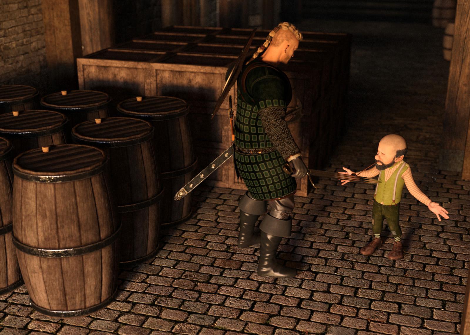
Instances used for the Crates and Barrels. Barrels were rotated to avoid the repeated look.
(Special Thanks to Totte - Code 66 for the Example)
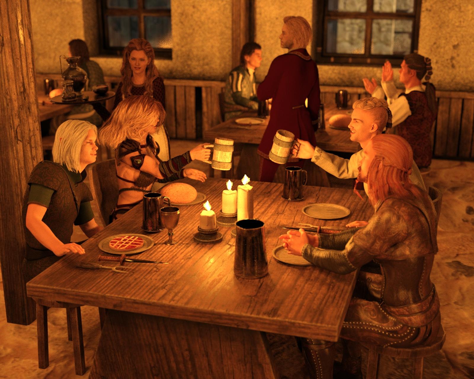
Instances used to add more Patrons to the tavern
(Special Thanks to Totte - Code 66 for the Example)
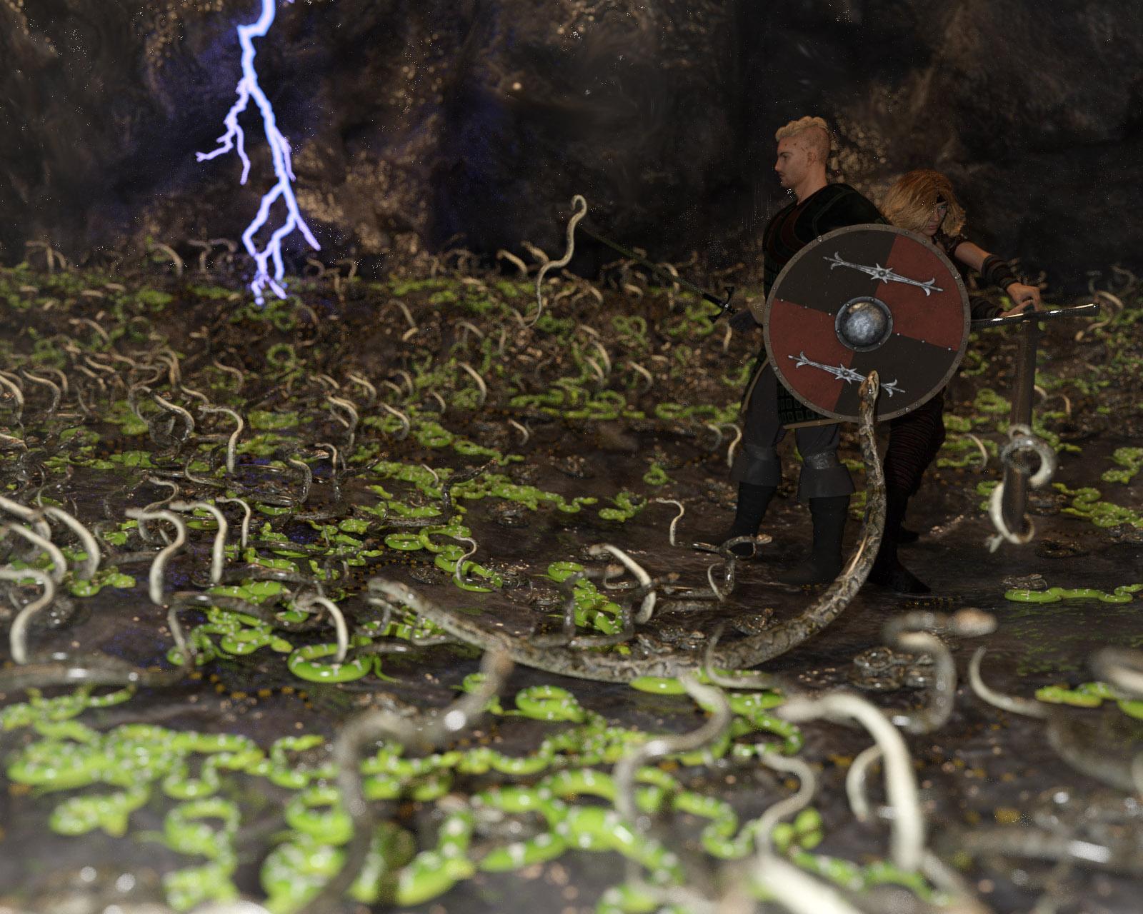
Instances used to add more snakes to the image
(Special Thanks to Totte - Code 66 for the Example)
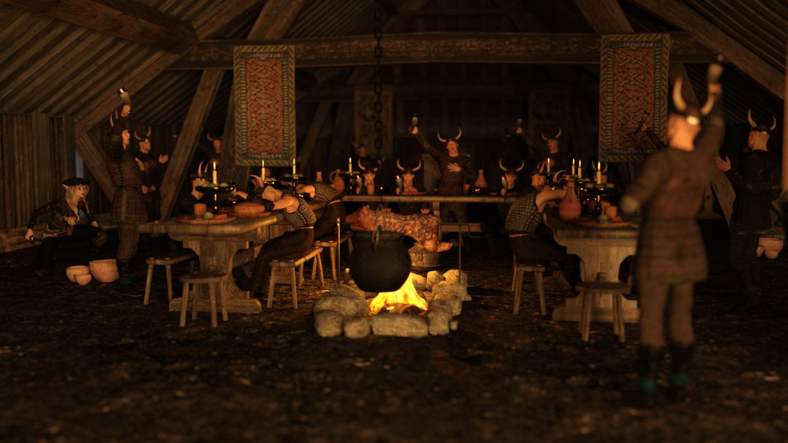
Instances used to add more Vikings at the feast
(Special Thanks to Totte - Code 66 for the Example)
Instances created Using UltraScatter on the to create a ball of Skeletons as a trap in the tunnel
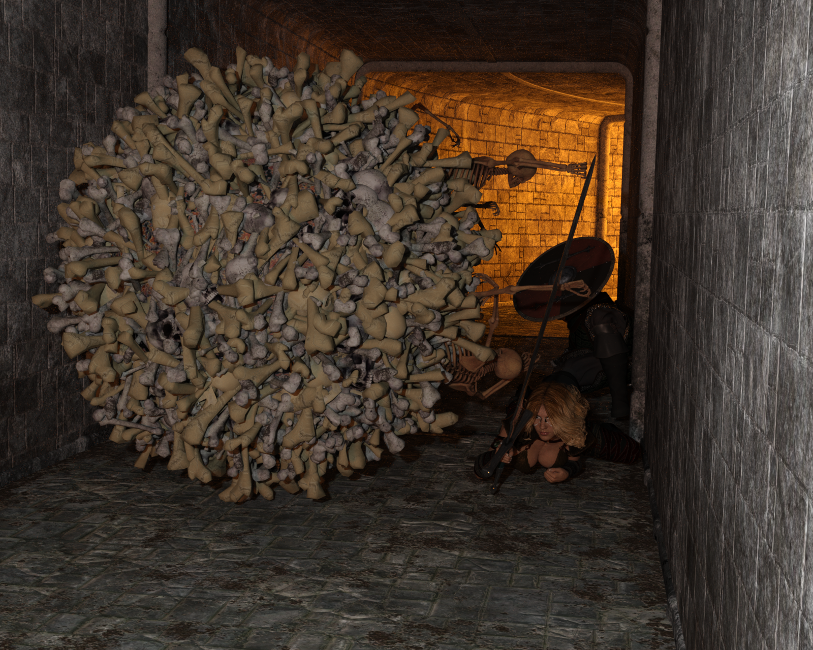
(Special Thanks to Totte - Code 66 for the Example)
Instances created Using Stack'Em Up on the Containers
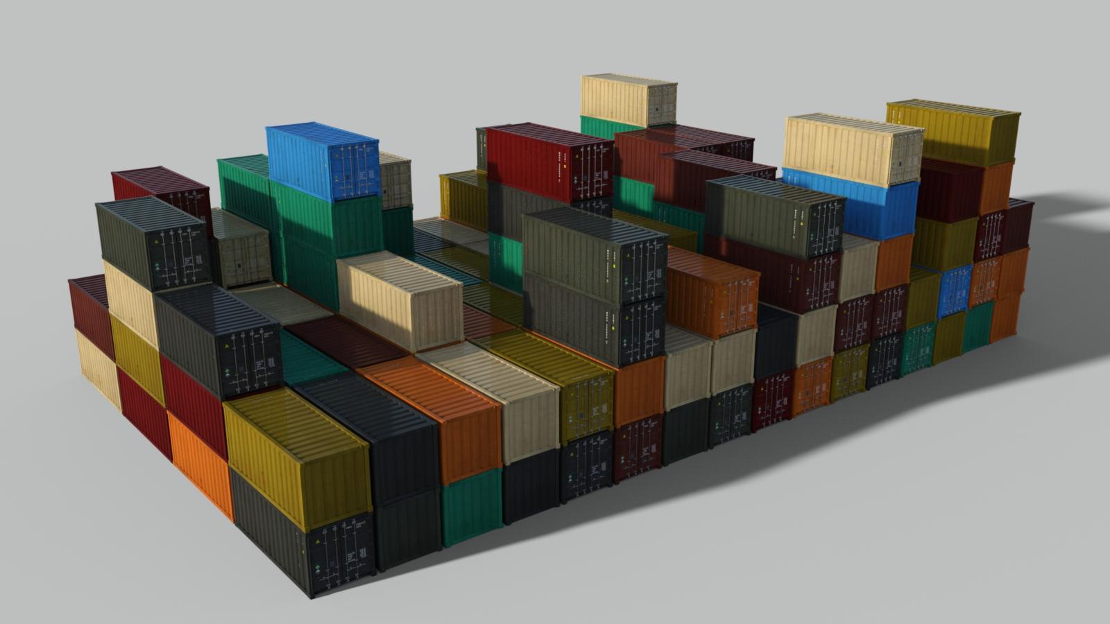

(Special Thanks to Totte - Code 66 for the Example)
Instances used to add more walls, lights, books, and bookshelves
(Special Thanks to L'Adair for the Example - Click here for more information on how this image was made!)
Instances created using UltraScatter Pro to create more Butterflies


(Special Thanks to L'Adair for the Example)
Instances used to Create more homes, cars, and trees
(Special Thanks to L'Adair for the Example)
Instances used to add more tanks, krill, and bubbles


(Special Thanks to Linwelly for the Example)
Instances used to add more Champaign Glasses
(Special Thanks to Linwelly for the Example)
Handy Products to Use while Instancing:
Stack'Em Up
UltraScatter Advanced Instancing for Daz Studio
UltraScatter Pro
Instances Plus+ for Daz Studio
Prior Composition Challenges:
January, 2019
January, 2018
January, 2017
January, 2016
January, 2015
I will be checking in as will the rest of the Community Volunteers to try and help with anything you all may need.
For a list of the current challenge rules, please see this thread : Challenge Rules
Closing Date: January 31st 2020
I'll just stick to the Beginner's Challenge - Composition
Title: Hand-to-Hand PTSD
Daz Studio 4.12.1 Public Build
Sure am glad I bought a bunch of low-res figures recently.
Cool idea with the two challenges.
I'm not a real beginner anymore, but there are still so many things where I don't know what to do.
So I will join in the Intermediate Challenge and see what I will reach with all the things I learned in this forum.
I'm not the best in DAZ and my english is not so good, but this time I would try something new and post some attachments (only if it is ok for the moderators), so anyone can see step by step how I try to reach my goal.
My idea for a new Scene was born, as I downloaded the Ivana char (emotionaldreams2) from the freebie section here in DAZ. It seems there are some issues with her and she seems not longer available, but for me she works fine and her tanline skin gave me the inspiration for a strand or swim scene.
I also used the https://www.deviantart.com/amyaimei/art/Beach-Volleyball-Bikini-for-Genesis-8-Female-704816788 as swimwear
the wonderfull free HDRI https://www.deviantart.com/namtaar/art/Underwater-Hdri-805776729 as Environment Map
last but not least I can finally use the great https://www.daz3d.com/rigged-water-iray-2
Ok, that should be a good start, let us look.
Pic 1: prepare figure
Pic 2: choose Background
Pic 3: choose posing and format (always activate Rules of Third in your settings, that make it so much easier to bring the figure in a good position.)
So thats all for now. I'm not so pleased with the brightness and the swim pose, also the hair is not exact what I had in mind. So I will tweak the things a little and than post an update.
Here's my start with the enviroment I'm thinking of using. I made use of instances in setting up the space, (3 instances of the 4 way intersection to form the center of the space, an instance of the elevator door down the right hall to have one at the end of the left hall, and finaly 2 instances of the null prop that I paranted the 2 corners that I used to close off the far left side of the space to be able to close off the sides off screen to the right and behind (the null prop was helpful once I had the corners lined up for keeping them togeather))
An idea for a character to add to my scene.
On Your Mark
The stones making up the starting line are instances of three different stones from the Desert Depression set, all rotated and randomly placed.
Hi! I'm Carolyn and I'm new to this forum and new in general. So I'm taking the Beginners challenge. Looking around it looks like I am joining the watery folk. I'm not delighted with the lighting but I like the spooky quality of Chtulhu under the sea. My husband is writing a Chtulhu adventure for an RPG, which is where the inspiration for this came from.
Image Title: Watery Chtulhu
Software: I used Daz 3D and a bit of minor postwork in PhotoShop (specifically I cropped it and adjusted the hue and brightness/contrast.) When you ask for software are you asking for the elements used from Daz as well? Like the figures and props and so forth?
Here is my go at compostion, I have an idea for another that includes instancing and duplicates and will see if I can get it done. I still have some work to do on this.
"Responding to the Alarm"
Version B here, adding in the character that I was thinking about, disabling the bloom filter for now, and some tweeking of the character from the preview I posted of them in reguards to the head and some texture work adding the glowing scar he has.
@CarolynIvyStein, Welcome to the forums and the New User Challenges.
In general, it isn't necessary to list the program you rendered with, or the products used. Specific challenges may ask for more details. But the challenges are about getting comfortable with your tools to create 3D art, to learn new skills or improve on existing ones, show off what you've learned, and have some fun along the way.
You're off to really good start with "Watery Chtulhu". Very nice.
Man, these renders are looking really good. My light setup is usually crap so it's making me very self-conscious about doing one for this challenge.
Thank you! I'm looking forward to trying to learn more this year and this year's challenge seems like a great place to start. I appreciate all the information provided at the top on composition.
@carolynivystein I find it a little difficult to tell what’s happening in your render. Part of that is because of the water effect, and that is a matter of how realistically you want to portray the water. For my render, I chose to prioritize details and color over realism, and I would encourage you to at least try a render with the water effects toned down slightly. Aside from that, the posing doesn’t convey the action as effectively as it could. What exactly is Chthulhu doing? It’s a little hard to tell where his limbs are, or even the general shape of him. Is the woman stabbing him with that spear? Maybe pose her so that she’s a little further into the action, make her expression more extreme, involve her limbs more in the pose, etc. As it is, she’s just kind of holding a spear where Chthulhu happens to be.
Post it. The whole point of these challenges is to get criticism that improves your renders. You can learn a lot by participating, and even though lighting isn’t explicitly the point of this challenge, it’s an important component of composition.
Hi,
 ) Also be sure to list what it is you have instanced.

Just to double check, you had said you were joining the Intermediate Challenge. That Challenge is actually on a different topic which is "Instancing" so be sure to instance some things in your image (If you need help on understanding what instancing is or how to do it let me know and also if it is easier to get the instructions in a different language let me know as we do have people who can put the instructions into other languages for us
All that said, I really love the composition of the image and the water so far. For me it isnt too bright..especially for pool water. Though if she is meant to be swimming in a lake or pond then you probably want a touch greener/murkier look but really nice thus far!
Very nice job so far and I think the character should work well in the scene
Very fun! Reminds me of Finding Dory with the Sea Shells. I really like it and nice job on moving them around so its not obvious its the same so many objects. That is one of those tricks that is really important when instancing
Welcome to the Challenge and very nice job! On the image, composition wise its showing rule of 3rds very well. If you wanted to play some more you could play with camera angles some and see if you get any other angles you like better but that is more just if you feel like exploring it some more. Overall, very nice work

As to your question, you dont need to list out everything you used though I admit people do tend to like it when people do in case something strikes their eye they may want to pick up but its not a requirement
Love all the details in this! The color and clarity is really nicely done as well. I definitely think you should try for the Instancing Challenge if you have the time. I'd be interested to see what you come up with or even how you could expand this scene or change it with the addition of instancing
So far so good here. You could play with instancing some more with all the corners and nooks and crannies where people could be hiding or engaging him (or preparing to) Love the way the environment looks. Kinda reminds me of Halo a bit or like Doom (did I just age myself with that last reference heh). You could have some fun with monsters, aliens, or other combatants "looming"
Please don't feel discouraged. Give it a go.
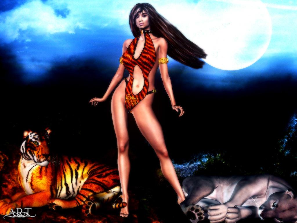
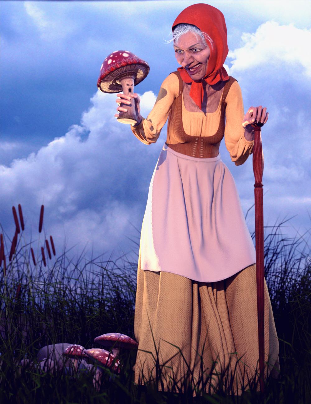

You will find that with 3D Art each person comes into it with certain strengths and certain weaknesses/challenges they have to work on. Some of those challenges can take a fair bit of practice to overcome but we all have them. For me, when I first started out, it was lighting as well (and I admit I still struggle with it here and there depending on the scene) but over the years it's gotten better and better. The Challenges will help you with that (and you'll probably master it far faster and better than I did by participating) as people will give you tips and tricks as you participate. There is also a challenge specifically for lighting a bit further down the road that should also help you in that area. For this challenge, just focus on the overall composition and the tips given in the first post and over time, as we introduce new topics each month, you will become more and more comfortable and confident.
Just to give you an idea...here was one of my very first renders (As we can see the lightning is well too dark in tons of places and then completely overblown in others - how did I even manage both in one image hehe and then obviously I struggled with composition as well since she is just sort of dead center LOL) That said, at the time when I did this, I was really happy with it. There were other things I did accomplish that were new to me at that time like posing the two cats, putting multiple figures in one image, and painting in hair rather than rendering it):
And this is a more recent one (after 15 years of practicing LOL):
Everyone starts out rough around the edges in some way. Try to go easy on yourself and allow yourself to have fun and experiment and play with concepts and lightings and you'll get where you want to be in no time
We do the challenges monthly so be sure to come back and check out the new ones each month!
 We try to cover the most asked about or necessary topics in an order we hope is best for learning and advancing your artwork as you go along. And now that we introduced the Intermediate topics there is enough here to learn something new every month for two years
First renders with overworked scene (I keeped it small to get fast results)
I lowered down the environment intensity a little changed Ivanas pose and expression.( balloon pucker cheeks )
Than I added some fishes, bubbles and the cliff made a few instances from them all and set them around her.
It still not what I'm looking for, but now I have a scene to work with.
The fishes have low poligon and look not so good, I have to see if I can find a better position for them.
Also the color from the cliff seem to intense for a underwater scene.
Dawn of summer :) !
Character : https://www.daz3d.com/genesis-8-starter-essentials
Hair : https://www.daz3d.com/vertigo-ponytail-for-genesis-8-female-s
Clothes : https://www.daz3d.com/dforce-clothing-set-01-for-genesis-8-females
Antique Lanterns : https://www.daz3d.com/antique-lanterns
Here is my first go at instances and duplicate nodes. The Nails characters moving away from the Cyborg head are instances, four separate to accomodate different poses. One of the Pix characters is a duplicate of the other, but done so I could use some different materials on her. I still have to think about this one a bit more, it just is not quite how I visualized it. I think the details of the poses for the Nails characters are just lost due to shrinking them down in size. Maybe I need to refame and crop it differently to show more of those details.
"The Escape"
I'm kind of thinking Shadowrun meets Doom, and plan to do something like that eventualy. Version C here is adding a second shadowrunner who is a close quarters fighter and dressed for stealth (if you look closely you should be able to see one of his blades.)
Edit-Moving on I'll be seeing what I can do with hostiles and use some instancing to get some extras in.
Thanks to everyone for the kind welcome. It's a lot of fun to see everyone else's renders!
I really appreciate the advice.
Originally I planned to have Cthulhu tied to a sunk ship's rigging but the render time was crazy and I had trouble manipulating the ship to do what I wanted. So when I did the first image, I just removed the ship.
This time I've played around a bit more with the figures and the image. Also I added blood in PhotoShop to make it clearer what is going on. And somehow in the process of playing around, my character acquired a friendly water dragon, who came to help her in the fight, much to her surprise (and mine). So here is the new image. I've taken down a lot of the watery distortion, but I think it is still clear that it's occuring underwater.
So I always wanted to try to do a big cityscape scene and here is my first go at it. I used instancing of two of the base city block sets, one from Contemporary Buildings Hyper Kit and one from Urban Sprawl 2 The Big City. I reduced the building size to about 25% and then just moved them around and lined them up. To fit the scene onto my GPU, I used Scene Optimizer and reduced the texture maps by quite a bit. This along with the instancing, got this scene under 1GB total. I used the Maui HDRI as the backdrop and placed a couple of helicopters into the scene. I still need to do some other work on this, but the only postwork was placing the logo. I had set crush blacks and burn highlights to 0, increased the saturation and changed the white point along with dome rotation in the render settings.