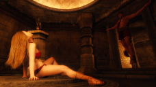
First render in some time...Honest feedback appreciated
 Swan
Posts: 134
Tried out some new post work techniques on this (my first render in over a year). Please let me know what you think...good, bad, or indifferent. :)
Final version is here:


all_lights_post_work_1920x1080.png
1920 x 1080 - 2M
Post edited by Swan on


Comments
I like the light a lot. Should he fly?
Maybe some dust in the Air so it's more like a dungeon...
Hearing the light is good means the world to me, especially since I sucked at lighting for a long while. Recently, I've been studying up on how to do better lighting (in DAZ and Photoshop), so it's great to hear that studying has paid off. :)
He's not exactly flying, just levitating. He (like she) is a demigod made to look human by the gods. That's pretty much where the similarities end, though.
Mmm, like the idea of some dust and light particles. Will add those via Photoshop. Ron's brushes should do the trick there. Early on in this render, I tried to get dust and particles with DAZ using the Godray product, but I couldn't get it to work well and ended up removing them.
The light is really good! The girl's not looking at her spiritly date, though. She's staring at the ceiling instead. I think she should have her face turned towards him as if she's making eye-contact. "Hi there, darling..." *wink-wink-etc* And maybe have her fingers more flat against the floor? Her hair looks really great, BTW.
Oh, he's no sprit. He's very much flesh and blood. :)
I think this image will only truly make sense to the people who read the story that inspired this scene. The gods have forbidden demigods from reproducing and blocked their ability to physically copulate, so the demigods make love telepathically. She's on the verge of...gratification, shall we say?
Thank you re the light and the hair! Hair's a tricky business with 3D renders. I used dForce Classic Long Hair (really good product, btw) and set the cutout opacity to .75 (looked too thick otherwise). The sheen is curteousy of the glow effect and some brush treatment.
In my opinion, I see a lot of females sitting by themselves posed in weird ways like that in the DAZ Gallery and it makes me think, "What? Are they having cramps?" I didn't even notice the guy are first because there is no contrast hardly between him and the room he's in.
While you posed them like that because it's part of an established story, I would put him on the floor with the foot she has extended instead raised up into his hand while she gets a foot massage. That would explain her pose then to me.
I'd try and dForce her hair because it's slightly levitating too. However as fellow DAZ renderer I am used to having and seeing levitating hair in my renders because most hair won't dForce drape so well.
If you leave the poses as is, I'd create a beam of light to the right site of the image that strikes across the levitating man's head & one shoulder. From the right so you don't have to reveal whether or not that light is coming through a window or some other light source since it looks like there are no other windows or light sources even available. Something to draw attention to the interaction of the two people in a natural looking way since that's what the render's story is about.
I copied her pose directly from a real woman's (which is how I remembered to tweak her thigh and calf muscles). :P But yeah, I know what you're saying. lol
Great idea regarding the beam of light. While I want her to remain the point of focus, I definitely agree wtih you that he's too subtle and the visual connection between them could be strengthened.
Terrific catch, too, on the hair. I'll try and fill in that gap via post work first to see if that helps decrease the impression of it not draping correctly.
In the end, this scene will be recreated by hand by a commissioned artist with various modifications. What I've done here is pretty much a boilerplate example, but I'd like to approach the end result as much as possible. Point is, if I can't manage the corrections myself, I have something to fall back on. (I'm not the most talented person at 3D nor post work) :)
Oh, it's good, but I think you need that beam of light & the hair on the lady draped.
Some modifciations after using some of ShibaShake's techniques...
Would love to get your opinions on what I ended up with on the final version thanks in large part to your earlier feedback!
https://www.daz3d.com/gallery/#images/869391/
One other suggestion might be to add some suggestion of "magic" , like subtle light swirls or sparkles or something to show he's "magically" suspended.
Love that a lot now
i like the grab of the Right Hand also... it's dramatic and shows passion
Sorry, I don't have email notices on for forum messages.
I like your 2nd image. It's much better. i felt if would of been more dramatic with just a bean of light accross the fellow's head & shoulder but that would likely require special lighting skills in 3D or purchase of a lighting product.
Awesome! Thank you for the help!
Thank you! I tried that, but the overall impression didn't really pop. Still, your suggestion led me to looking at other options, which was MOST helpful.
Your suggestion led in large part to the magic effect I put in. Thank you!