Afterglow--attempt at photorealism
 acecombs_b317c01b8d
Posts: 100
in Art Studio
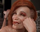
This is a render I did this afternoon with the Bridget 8 HD figure, with morphs added to make her older and also add imperfections. The render was in Iray with 2 point lights, and a little environmental lighting. I spent about three hours in post work in Photoshop, mostly adding hair, one strand at a time. The lip-biting was an attempt to add character that maybe was a little too wierd looking in the final render. I'm new to posting images in the forums and I'd really like to hear from the community with feedback, criticisms, and suggestions for improving the work.


LipbiterPS.jpg
1453 x 1162 - 1M


Comments
1) Not enough wrinkles at the corners of the eyes (to be fair I don't think you can do that without sculpting or making your own displacement maps). Can't really see the eyes to comment there.
2) The hair is too thick & too stiff
3) The lip biting shouldn't contort the lower lip on that manner
Just me opinions though. Otherwise looks realistic.
Thanks nonesuch00. Very good points. The lip-biting is going to be hard to get right. I'm going to see if I can make the hair work--I'll repost this when I get it done.
Perhaps instead of trying to find little things to prescribe to fix the image, go and find a photo that inspires you and does a little bit of what you want. Then use it as a point of reference. Film makers do this and refer to past compositions or lighting of others. Then we are criticizing from a point of success and then learning something from the techniques we use to emulate. Otherwise, we may be shooting in the dark.
when discussing the lip biting, don’t necessarily do it because you seek to try some unknown factor in the hopes that it may chance character. Instead a viable idea may be to work from a discreete emothon and work towards it.
The hair is funny - I don't think it is a problem, it's like she slept (or something!) on hair full of hair product. :-) Stiff, and a little grungy is the result.
The only problem I see with the render is that her face is the whole picture - a face that is 'in your face', so to speak. Perhaps if the camera was backed off, a little, and maybe a different angle? It sounds like realistic imperfection was the goal, so I get that picking a flattering angle wasn't the goal, but... maybe give her a little breathing room... the lighting is not kind ;-)
Thanks for the suggestions, Misselthwaite. The hair is, I think, overworked and too straight--the hair product reference fits, so I'll try for some variation in the next piece and maybe go with more of a portrait lighting.
I've been reworking the "Afterglow" image and I'll post it a little later. In the interim, I did another render using some of the input I received. This is a street scene with Xanthe 8 and Mabel 8 HD using an HDR for the background and lighting. In addition, there are 3 spotlights to add more fill and back lighting. Please let me know what you think.
This the "Afterglow" pic revised after the input I got from this forum. Changing the expression, lighting the face with an IBL, adding some key and fill, going with a simpler hair, backing the camera up from the face a little, and using less postwork all helped the image, IMO. I hope you will continue to offer suggestions--it's been really helpful. One thing that bothered me about the previous image was the "orange peel" look of the skin--it just didn't look right. I added a product from Linday, a wet geoshell, which obscured most of the skin texture. Obviously, this is not a solution that works in very many instances and I wonder if anyone can offer some suggestions for dealing with that?