Vanguard's corner of the virtual world
 Vanguard
Posts: 486
Since this site doesn't have a gallery, yet, or the ability to credit the wonderful products the talented PAs and vendors provide, without which this user would be still twiddling his thumbs in front of some renders of cubes and spheres, I wish to share how I have used content I have bought at this fine store and community.
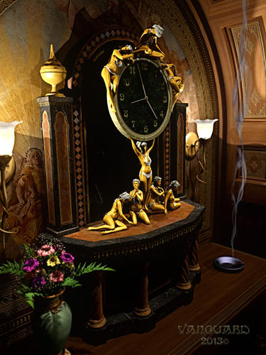
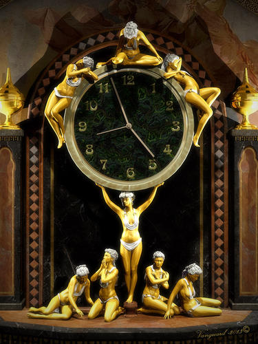
To start I will share one I have had a few questions about. I call it "Art Nouveau Gilt Clock" although I am sure it is about as far from "Art Nouveau" as you can get. Probably more like the decorative and 'heavy' art of the Victorian age, which Art Nouveau sought to pull away from.
The piece uses the following content available here
Genesis 2 Female, the base figure for the ladies.
DAZ Studio Pro 4.6
Poses and figure shapes from
Art Nouveau Fun Kit
Outfits
Grecian Goddess Outfit
The clock from this set. The face and textures where modified in Photoshop. the face background is a pattern derived from Filter Forge pluginfor Photoshop
West Par kDay Room Recreation
The matte gold surface for the figures, the gold on the censers, the mother of pear for the outfits and hair, the bronze for the sconce bases are from
Gemologica
The niche and table are from
Baroque Grandeur
The wall sconces are from
Dream Home: Dressing Room Furniture
The cigar smoke is from
Fire and Smoke for DAZ studio
The base and back of the clock were made from the "Refuge" set by DM from Rendo
The flowers and vase are from Lisa Botanicals



Comments
That is a very unusual composition- I know you had fun putting it all together! I really like the different poses, particularly the one on the top in the middle, looking down toward the face of the clock. The dark background behind the timepiece really makes the figures pop. Very creative!
Now there's a clock! Nicely put together. I do feel a bit sorry for the lady carrying the full weight. She doesn't seen to be bothered by it much, though.. ;)
I think that is why there are so many "tired" looking ones at her feet. Perhaps they each take turns? :)
After I did this I thought to myself these types of pieces, in the real world, usually have some meaning behind each figure, an allegory. I guess the time to think of that is before you start on something :P
I really like it Vanguard. I liked seeing it in the festival thread, and I like seeing it again and especially with another view here! The lighting and skin tones and just the sense of old world texture in the environment is all very lovely.
Thanks for sharing how you put this together. I too was impressed with this in the festival thread, and my reaction was that a lot of work must have gone into it. Very interesting to have this behind-the-scenes peek.