Raindrop's studio
 raindrop_1ff71f4538
Posts: 0
Welcome to my WIP / messing up thread!
I'll dive straight in with my current project: an historical render for Llona Lane's monthly challenge. My goal: doing something that isn't from the Victorian era. So medieval it is, just because -- specifically, the battle of Hastings.
I searched through my runtime for medieval outfits, but a lot of the stuff that looks medieval is really fantasy. The only armor I have is for Genesis, but it's definitely a female armor. Not what I'm looking for at the moment. I might be able to do something with the Cheyenne tunic for M4, and kit-bash it with pants from another outfit.
Thankfully I found the Lourde's Normans outfit for M3 on ShareCG, and textures by Kethaere (sorry, no link - the site is down for me at the moment). I haven't played with M3 much yet; should be fun. After doing a test render of the textures (which are good, btw... I just wanted more shine!) I also grabbed Syndaril's chainmail shaders, which require Georgehazel's ultimate shaders, both also on ShareCG. The shaders work in DAZ 4.6.
The chainmail shaders are fantastic. Only trouble is, it's got holes in it, as it should be, and the skin of my dude showed through... I tried putting another tunic underneath the chainmail tunic, then simply replaced the skin texture with something more bodysuity-like (I used Marauders), but neither quite worked for me. So in the end, I applied UberSurface to the lot, used the chainmail and a cotton texture for the tunic, and composited them with the LIE.
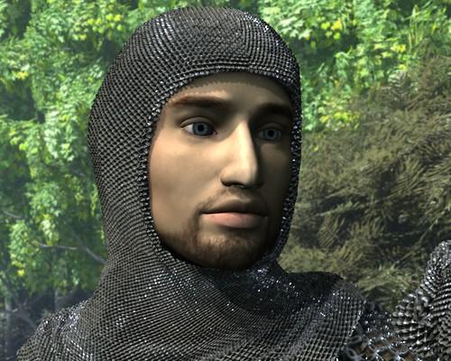
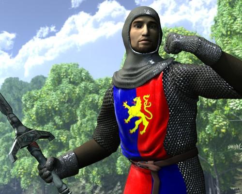
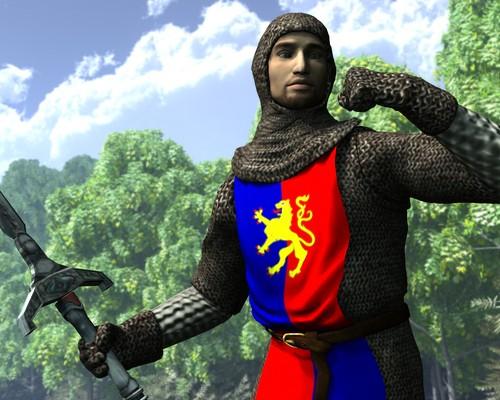
The three pictures show:
- the default Kethaere materials for the Normans and Griffin for M3
- tweaked materials, including Fisty's velvet shaders on the tabbard. The crappy shading rate I used makes the gloves and hood look like plastic
- so I zoomed in closer. It's all right for now!
I'm not concerned about the pose. The dude will be riding a horse, if all goes to plans, so that's going to change anyway. I'll need to fix the belt (back to the original material, I think) and the tabbard (not sure if I'll choose this pattern or not -- I'll have to do some research). And I'll probably have to tweak a couple of things again, but so far, so good.




Comments
Looks like it won't be that easy to pose this particular soldier. The tabbard and the tunic have a good selection of movement morphs, but not enough to let him ride a horse. Sniff.
Anyway, I've worked on the horse. First the skin. I was disappointed to find there wasn't any bump map included with the DAZ Horse 2. I used the black map for the bump, it's a bit so-so but it's better than nothing. I adjusted the specular (why are default mats always so bright???) and turned on subsurface and velvet (after converting to UberSurface).
I also put an armor on the horse, and tweaked the materials. I basically removed the diffuse map from the metallic parts, tweaked the reflection / specularity, and upped the displacement map to 200%.
First pic: default horse + armor materials
Second one: tweaked horse + armor mats
Deformers and creative Camera angles can do wonders for getting those images you thought were not possible. Good work so far. I'm liking.
I prefer the second tweaked horse pic., its got more definition in the armor.;-P
Thank you, Jaderail and None!
I actually realised last night that the Norman tunic and tabbard had EZ pose bones set up. I just had to select the hip bone (and individual child bones after that, as needed)! Duh!
I also scaled M3 up a bit, which made him easier to sit on that big bulky horse.
So, getting there. I know need another dude (working on it... but he's naked, hence no pictures!) and a non-fantasy sword for the knight.
I've decided to make the sword myself. Of all the things I thought I'd ever make in Blender, a sword was the last in my mind. I have lots of swords and weapons in my library. Very nice ones, even. And all of them, either the wrong time period, or straight out of fantasy world! It's a conspiracy, I swear. Anyway, early WIP.
I added the second dude (Michael 4, wearing the Cheyenne tunic, Slicer pants, Gabriel skin, and Cuffed Hair tail + a warhammer from Valandar, I think). I worked on him and his materials in a separate scene, saved as a subset, and added it to the main scene.
Posed him, lost my mouse pointer, tweaked the pose, lost my pointer, adjusted the knight's expression, lost my mouse pointer... It's driving me batty.
Anyway. First "full scene" draft render, with a horrible shading rate and resolution. Next on the list: finish the sword; try adding reins or what'sitcalled to the horse (failing that, paint them afterwards); finish posing the horse (facial expression, eyes...); and, I think, render.
Seeing your sword in progress pic reminded me of a freebie I had with a cover disc ImageFX issue81.
http://www.daz3d.com/build-your-own-sword-kit
I've had a dabble at modelling in Silo, Hexagon and now Wings3D. The more I'm playing with Wing3D the more I like it.
Nice to see the evolution of a project.
Just cobbled together a sword from the kit. Quick 3Delight render.
Nice! Much nicer than mine, but never mind. Well, I've learned a lot from the process, so I'll keep mine for now :-) I've even managed to bring it into DAZ Studio, and almost at the right scale from the get go.
I haven't worked on the mats yet. I'll use shaders, but the sword is UV mapped, so if I ever feel like it, I can texture it instead of just using procedurals.
Very nicely done! Must be nice to be able to do modeling of any kind, I'm jealous :)
Quick tip- that rein hand. If the rider is only using one hand for reins, that is "neck reining" and the reins have to be in close contact with the neck for quick turns, etc. In other words, by pulling the reins across the neck, the horse would turn. It's best to keep your rein hand close to the base of the horse's neck and not too far out in the air/to the side.
I like what you're doing with this and again, doing your own sword is awesome! Can't wait to see the finished scene.
Thank you for the tip, tha'ts very useful! I'll move the rein hand closer to the neck; that should help a lot with the reins, too.
Anyway, give modelling a try, if you haven't already. It's a lot of fun, even if you end up with lots of misshapen cubes to start with! My modelling software of choice is Blender, but Hexagon is good too, and Carrara if you have it. I'm tempted to try Wings3D, it seems to be fantastic for making "noodles" (David Brinnen has nice video tutorials on abstract, interlocking shapes created in Wings3D). But I'm also busy playing with Bryce now... so much to learn, so little time!
There's a thread on modelling in the Carrara sub-forum, with very nice examples, if you want to be tempted. :-)
Getting there... Proof render, plus a close-up of the sword. I'll now sit on it for a day, and then... time to do a proper render.
Don't hate me for saying this- but reins are too loose.
And iIf he is charging forward, it's okay to have the horse's head straight. If that dude were swinging that at a horse I was riding, I might be pulling his head to my left to get it out of the way (so I would also have a clear swing at my opponent.) What I said earlier about having the hand and reins closer in to the neck still applies because you'd want a sharper turn. The further out to the side the less control you have, unless you move the reins up higher on the neck, but even then the rule about the closer to the neck your hand is, the more control you have due to less time it takes for the reins to make contact. Hope I'm making sense here.
Try this- and don't laugh- sit on the couch. Then get a chair, put it where your opponent would be, out in front and to the right side of you- but leaving enough room for your horse's front half. (About another two chairs) Imagine that chair with a weapon swinging toward your mount. Would you keep the head straight, with the neck exposed (and if the horse goes down, so do you) or would you pull it away from the chair/opponent?
Now YOU swing at your opponent The Chair. Do you have a clear shot going forward? You wouldn't with this setup. The horse's neck could be struck if you swung that blade down and hit that opponent's weapon- as that weapon could continue with the downward swing. I think you might want to turn that horse AWAY from the opponent. Although the forward motion could take the horse past the opponent. Tis up to you, I'm just your devil's advocate (wicked cackle.)
I am getting the giggles imagining someone walking in on you, sitting on the couch with a chair on your right, with you swinging your arm toward it. Yeehaw!
One other thing- is that opponent going for the guy or the horse? He's looking at the horse- wouldn't he be looking at the rider since the rider has his weapon in action?
Hmm... Good points. I'm sure glad I waited until the final render!
I'm not sure I can fix the reins, the controls are very iffy (morphs only, no bones... whyyyyyyyyy?). I'll try.
As for the horse's head, you're definitely right. I'll have to find a way to fix the horse's pose without destroying the composition and the places where the highlights fall. Same for the footsoldier, although it won't be as difficult.
I'll have a look next week-end!
Jot down the coordinates for the horse's head, and the placement of your lights for the head. However much you move the head, do the same adjustment for the light. Been there done that, thought I had the pose exactly the way I wanted it, lit it, then "darn it." It's the easiest way to keep your lighting the same/ almost the same.
Didn't jot things down this time -- I just turned the lights on/off as needed while I moved them around. Anyway... I'm glad you pitched in, because I think the composition is much better now! I'm not 100% happy with the reins, but it'll have to do. The posing morphs are all right, to be honest -- I just feel more comfortable with proper bones.
I changed the colour of the horse to fit with the hair of the footsoldier and the skin of the knight. Proof render, with a slightly better shading rate, just for fun... it makes a huge difference in the chainmail.
This is getting real close to very good in my eyes. The only thing I would think of from this point on is a better power pose for the mounted knight. To me the current pose is off balanced and says he was not ready to defend himself. That simply would not be true, mounted forces in the past spent many hours on the training fields, so much in fact that proper attack and defense from horseback almost became a reflex action. The Mounted Knight would be is a response pose that shows power, skill and strength all in one fluid action. That includes his legs/feet for proper bracing/power, hip sitting for the same reasons and the upper body in a my strike may miss but will do damage. Because he would be trained to do so.
Oh my gosh, that horse's head looks a THOUSAND times better! He's looking right at the camera and that draws you in so much more with the head pulling away. FANTASTIC job on that! The reins are fine- they won't be perfect when you're swinging a sword and doing a million other things with your body (as Jaderail said, his seat, his arm, his concentration.) I really like the rider's face too- better lit and not so much shadow.
So far as the power in the swing, my son has a sword and we just put him in the "swing toward your opponent" mode. That arm is actually correct for mid-swing. (I was surprised.) The arm straightens as it continues forward with a slight bend in the elbow. The shoulder would be slightly up (as would the forearm) for the beginning of the swing.
One thing- and I have to laugh- the way this is posed, the rider appears to have no foot.
Thank you both!!! Very helpful advice again, and it's very encouraging! I used lots of reference pictures for the sword arm -- so I knew that was relatively correct, but I stupidly forgot to look at the legs. Duh. I've tweaked that -- the knight isn't spread-eagled anymore. I'll have to rework the tunic, but with the wonderful pose-morphs available it shouldn't be too difficult.
Novica, the knight has small, dainty feet! That's why he's not a footsoldier. xD
I've also worked on his expression. I may need to work on that thumb next. Sticks out a bit much. Michael3 is new territory to me. Interesting challenge!
The thumb would bend down, wouldn't it? It folds over the second and third fingers when gripping?
Your dude certainly looks intense- glad I'm not on the receiving end.
In my above post I was not addressing the arm pose so much as the body pose. Remember that in single image renders you only have the one chance to convey the meaning of the image to the viewer. A pose a little bit over the top is better than a average one as the viewer sees the action and does not need text of any sort to understand the image. That was one thing that all my teachers stressed in Class. Never expect anyone to read a title or other text, so grab them with the image. Then they might read.
Nowadays, you can't assume people CAN read. :(