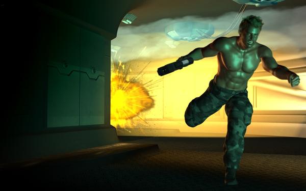
Boom Today
 TobiasG
Posts: 447
Boom Today
Any thoughts? What's missing? The explosion is still a bit tame.
Thanks for your time!


Boom_Today.jpg
800 x 500 - 210K
You currently have no notifications.
 TobiasG
Posts: 447
Boom Today
Any thoughts? What's missing? The explosion is still a bit tame.
Thanks for your time!


Licensing Agreement | Terms of Service | Privacy Policy | EULA
© 2025 Daz Productions Inc. All Rights Reserved.
Comments
Going by first impressions- I like the expression, it's determination mixed with being ticked off that he can't do more (at the moment.)
What I might tweak just to play around- the alienship directly above his head. I think I would offset it just a tad to give it more emphasis. I like that it's partially out of the scene, makes it more realistic. I'm wondering how it would look for it to go further to our right, with those lines extending behind his head as they stretch out to link the ships.
I haven't done explosions so not any help there :)
Maybe erm.. blow up the explosion? As in making it larger, more threatening. The character doesn't look like the kind of guy to run away from a small blast :)
LOL- One gun vs 4 ships.... I think he's smart.
OP- do you want to introduce any reds into it? That would increase the "intensity" I think.
One thing, too much smoke for the explosion to have just happened.
I'm not sure the smoke is coming from that one is it? There's no trailing upwards- it seems to be more of a drifting smoke to me.
I'm just going on the one render, a back story might explain the smoke.
Hey Tobias, I like the action scene! I made a quick mock-up of what I would do.
One thing I would do with explosions is to make the center more white, and then gradient out to yellow (or whatever color) just to show that it's extremely powerful at the center.
Then I'd add a dominant yellow cast to the whole thing (the light from this explosion is going everywhere!)
For the figure, I'd try to darken up the side facing away from the explosion. I'd really get some harsh contrast going in there. This is a severe, extreme moment. No room for subtlety. He should probably even have more glare on his back side but I just did this quick.
Unlike my quick work, the wall would be partially blocking the explosion, so it wouldn't come out looking like this, but you get the idea. Other things are to have some debris flying through the air, or even have him losing his grip on gun in the blast - anything to convey some motion and the power of the explosion.
Very cool, lots of input! Thank you!
First, the things on the ceiling aren't really ships. They're some sort of gadget included in the hallway prop, and not removable (that I can tell). Probably air conditioning, or gravity stabilizers, or whatever.
I was assuming that the dude is running while behind him, consecutive explosions are catching up, coming nearer all the time. Like in all those movies, where in the final frame, there's only flames behind him and nothing else (which would be boringly easy to render, so I'm cutting in earlier). I'd like smoke billowing out, but I'm not certain how to get there. On the other hand, smoke might be too much. A forceful blast in a spaceship likely wouldn't produce much smoke at first, so, maybe not.
In any case, I added more red to the boom, darkened the side of the character, and got more red and yellow lights on him from the other side.m I'd love to add flying debris, or grit, but I'm totally at a loss how to do that. There's probably some way in Photoshop (something with extra layers?); I don't have debris props (aside from heaps of bricks, which won't do here). Any hints on that one?
I like this. I rather like the smoke in the first one. It is possible the character is in a burning area or a warzone where other exposions have occurred.
Suggestions:
1. Tilt the camera. A camera pan will make this really pop. CTRL Right mouse button Then use the camera orbit button to change your viewport so the character is really action-
2.Experiment with having him look back in fear, or at least have his eyes glancing towards the explosion. It is always a good idea whenever possible to have the character looking at something to add drama.
3. Add some falling debris, and perhaps blacken the impact area.
4. If there have been more explosions, blacken the wall with little fires where previous bombs/artillery/whatnot has hit or bullet holes or whatever.
Tilt the camera in what way? Do you think an even lower camera angle would work better?
As to #2, point taken. I'll try that.
Debris: well, yes - but how do I add flying debris? :)
There's a couple of ways you might do this. As you surmised, one way is to use a Photoshop layer and a debris brush. Doing a search for "debris" on the Daz store came up with this:
http://www.daz3d.com/catalogsearch/result/?q=debris&x=-1221&y=-43
The only issue with this is that the debris obviously will not react to the lights in your scene since it will be applied later. A google search for "debris brushes" will yield some free options, too.
Another way to add debris is to use something like this 'Blowin' in the Wind' Tool. You can add in debris right into your scene and get the benefit of shadows and such. You'll have to create your own image of what you consider to be debris add use it instead of snow or leaves.
Failing that, you could add some primitives to the scene, or even use your brick debris, but change the texture to something else and reduce the size and see if you can get it to work that way.
Thanks a lot!
The Blowing in the Wind thing looks pretty tempting; and it's eligible for the PC coupon. I'll get it in August.
I think I'll spend some time both with brushes, and with Primitives. Worst case is I learn something :)
I think yawing the camera so the character so the floor is not horizontal but so the scene is tilted one way adds drama to action scenes
You can see that daz does this a lot in promo art. Rarely is a character face on straight on the ground. The camera is often tilted so the character's feet are often close to the corner of the shot. I would try tilting to the right.
Like here:
http://www.daz3d.com/uniforms-costumes/tech-soldier-special-forces
http://www.daz3d.com/shadow-warrior-textures
Tilting the camera is a very useful tip - I'm astonished I didn't think of this earlier. It's really simple, and works great!
As to debris: I created a Plane, put a simple debris-brushed jpg in the Diffuse Color, and an inverted version in the Opacity setting. This was way simpler than fiddling around with layers in Photoshop!
I'll play around some more with smoke, but this version is already making me quite happy. Thanks to the advice I'm getting here :)
Wonderful. I think tilting the camera always makes a nice look, and this picture really pops now! Also the lines of your image direct the eye from the running man, down the gun arm straight into your explosion creating visual interest and directs the eye. Turning his head to look back creates a sense of drama! Great job.
Yeah, I gave GREAT advice- about two spaceships that WEREN'T- lol. Well, at least I contributed red to the mix. :) :) :)
Well, not your fault! Either my fault, for not lighting things correctly, or the fault of the model, for not being more accessible ;)
I put together another explodey render, with Satsuki (got her this morning), and more tilted camera fun. I might work on this one some more - or not. :)
Cool. You are getting the hang of the camera tilt. It really makes a difference!