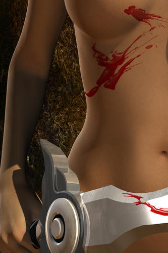
splattered
 TobiasG
Posts: 447
Hi!
First, I'm hoping this render passes the No Nudity rule; but as there's no nipples visible, I hope it's OK. If it's not, please tell me.
I was testing out how to work with Photoshop brushes and displacement maps. While this is not yet perfect, it's not bad either I think.
Any criticism, or suggestions what to improve? I'm trying to learn :)


Blutschwert.jpg
840 x 1260 - 669K


Comments
looks like paint - you need some dots and what not
Yes, I'd agree with bigh. You need to add some dots and misty blood. Also if she's been cut the blood might be running down. You might want to google blood splatters for some examples.
I didn't really want her cut, just spattered with her victims blood. There's huge amounts of blood spatter examples on google, makes you dizzy :) So I picked some with smaller dots - an improvement?
(Edit: I see the finger needs adjusting)
Looks good. I like it. The sword needs like a drip or two to give that fresh look.
The only suggestion I have is breasts without a foundation garment are going to hang down a bit more rather than up like that.
Like it much better :)
Agree with getting more drip on the blade. Also, how did blood get THERE without getting further up on the blade? Not that I've cut that many people RECENTLY...
Kudos to jumping in to this- I'm not there yet, not enough hours in the day- so you can teach me when you're a pro, lol. I'll be saying, "Yo, help!"
I'm changing the breasts right now - but I didn't want the areolae/nipples visible, so too much droop would make camera adjustment necessary. That aside, I've considered looking into some sort of gravity mod anyway.
Novica: I'm just trying to get a grip on a few basic techniques, but I'm afraid I don't have enough spare time to ever become a pro! :) Also, weirdly, my wife objects to me spending the whole time in front of the computer... ;)
We have the latest version of Photoshop and my two sons are working with it- so if you get stuck, they can probably help eventually :) We have all of Ron's brushes- they are going to start using those in the next month or so. I'll have to jump in sometime. And your wife is right! You need to get to those honey-do's, out to dinners...not necessarily in that order. Dinner first and the honey-do list shrinks.
Liking these a lot. On the last one you might want to tweak the angle of the blood around the waist because the dripping part looks a bit gravity defying.
Breasts look good.
Two products might be of use to you if you don't already own.
Ron's war elements which includes some great blood spatter overlays
and Ron's blood.
With ron's blood you get a great color and transparency which would look nice on your sword. I didn't spend any time with this, but you can see the great color will add some realism, and drop looks.
Ron's brushes look pretty good, which is one reason why I started to work with brushes in the first place. Something to put on the budget :)