Need some opinions...
Hi guys, I've decided I'm going to create a cover my book, The Chronicles of Autumn: Tala'har's Story, instead of my current one, which uses a stock photo of a real girl holding a katana. Any who, I'm looking for opinions about this temp render. A few things to keep in mind:
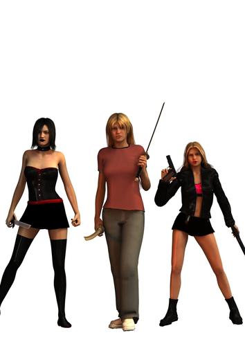
A three ladies are Genesis 2
Characters (from left to right): Carry (goth), Autumn (Tall blonde), Cristy (short blonde)
If you think Autumn and Cristy look a bit too similar, it's by design, they are the daughters of twin sisters.
Carry's unfortunately not wearing thigh high boots, for I have yet to find a pair that work with G2F, so I've used amy amei's pointy toe shoes found on share cg and a leg 2nd skin leather texture to simulate this.
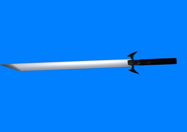
Carry's sword is a weapon by my own design, I've looked for others, but this one is the basic shape I want, but I might go back to another one,
Poses still need some tweaking, especially Cristy's right hand.
Carry's sword used to be held in front of her, but I can't get over my obsession with getting it just right and I keep trying to use my own model, so for this picture I've made it a little less evident. The second picture is of the weapon on it's own, using some fantasy shaders. It was made in blender, and I know it's kinda sloppy, but the shape is almost right. Can't get textures to look right on it, just ends up solid colors.
My budget is zero. The only pay for items used in the picture is the V4 to G2F plugin and the Mitsu hair that I got for free along with a purchase. So I do have access to V4 items, but anything will likely have to be free.
Autumn's supposed to look miserable, although I'm afraid the expression is making her look too old. All three ladies are 16ish.
Lighting is temporary and I haven't chosen a background yet, so I used the Firey Genesis preset for this pic so everything is visible.
Any suggestions would be great, thanks in advance. Oh and as a thank you, I'll be running the book free on Amazon Kindle for a few days once the cover is complete and I've made some additional edits to the book (it's there now if you want to look), so send me your email if you like a notice via email. Thanks in advance.




Comments
I know you left the Dead space for the Title. At this point is is very hard to judge anything other than the figures. To me it looks good but until it has a background image and maybe a MOCK title the composition is hard to judge. If you want the viewers eyes to be pulled to a main area of the image composition is key.
Yeah I'm mostly concerned for the figures, the rest I have someone who is good with this kind of thing to help me (my fiance) but she doesn't know Daz. Thanks for your input.
Create a 3 section background like columns and the middle column is the widest of the three which will emphasize the main character. Have that background show an important event within the story with main character standing in front of it. The two supporting characters can be standing next to the main character with their backs against the facing the main character and their view is going outward. So for example, the Goth character on the left facing outward left with her background, emphasizing something she is doing in the story which describes something about her as a character. Her background can have a sense of darkness showing her licking her blade as she her foot pins down a subdued victim looking helplessly up to her for mercy. Arrange the twin sister is the same format on the main character's right side.
The story should be about the main character. The story has to solve a problem where the main character goes through trials and evolves to a point where either she remains steadfast in her position about the problem or changes. Otherwise you will just be telling a tale opposed to a story. Another character can be the protagonist who will move the story's plot forward trying to achieve the story's goal only to be opposed by the antagonist who constantly trying thwart the protagonist. This is known as the impact character who opposes the story's goal and prevents the main character from solving her problem by also posing alternatives and reconsiderations.
The guardian arch-type character provides the means to help the protagonist in difficult times. Think of the captain who just flies the ship in the movie Prometheus. He is always there to give warnings, advice on what to do, and at times of difficulty played a role to get the characters out of trouble; he gives his life at the end of the story by ramming the Prometheus into the alien ship thus preventing it from travelling to earth to carry out is plan of human genocide. The contagonist is the opposite of the guardian and she will find ways slow down, delay or put obstacles in the way of the protagonist but not necessarily out right oppose the protagonist.
There are other archtypes too
The sidekick who is always loyal and never doubts that story's goal will be accomplished.
The skeptic who does not believe that ideas of the protagonist or main character will not come to fruition. Think of Vickers in Prometheus as she constantly doubts Dr. Shaw and Holloway.
The emotional character who resolves problems with subjectively and has very little control over circumstances. Think of Fifield in Prometheus, who is only on the mission for the money and studies only rocks not dead things .
The rational character who resolves problems by looking at things from a rational and logical point of view.
It is possible for your main character to be the protagonist too as opposed to having a separate character. Dr. Shaw played this role in Prometheus. Her role as the main character was to resolve the problem of where did mankind come from? Her upbringing taught her that God created all things and is the point of origin. The cross she wears is symbolic of this and at the end of the movie we see that she remains steadfast in her views by asking David for her cross back. She is also the protagonist who moves the story's plot forward where as David is the impact character and plays the role of the contagonist who is always delaying things and placing obstacles in Dr. Shaw's way.
The anatognist are the engineers in the most subtle way in that all human life must die which is discovered as the story unfolds.
So who is your main character?
What problems must she resolve?
Who will move the plot forward?
Who will oppose goal to move the plot forward?
Who will delay the goal?
Who will support the protagonist with unending faith?
Who will be skeptical?
Who will be emotional and out of control?
Who will be rational and approach things from a logical perspective?
Who be there during tough times to say the right thing when it needs to be said or do something that get everyone out of trouble providing the way so that plot and move forward.
All things must be considered and from that you can create a book cover that conveys a meaningful and powerful visual that compels the viewer to say, "Hey, I want read that book".
Anyway food for thought. and I wish you the best on your story and cover.
Hi there, my quick suggestions:
1 keep all the figures wholly framed, don't cut off any part of them.
2 when you have 'figures extensions' depicted (like the swords), pose them in a way so they point back to the focus center of the picture, otherwise their lines will pull the eye out of the picture, causing confusion and distracting the viewer. This is most important for border figures, since the central one is ideally framed by them and thus more free to assume a less 'eye drawing' pose.
Ideally the scheme of the picture should look like a central figure surrounded by 'arrows' that point to it or lines that converge towards it.
3 use an additional point light at the camera position, and set its falloff in order to have the closer figure a bit lighter than the others.
4 maintain a common style! Either by using similar colors or similar style objects, make it so all blends together. You can have a goth character near a casual one, but you should match better the clothes tones then, otherwise you get a *cough* JC-pe.sky... *cough* catalogue style, that you don't really want ^^ - for example your secondary characters are using black and red clothes, while the main char is err... uhmm... ^^ - retexture her clothes so the t-shirt is black and red too! Can be anything... a rock-band groupie t-shirt, one with some text on, whatever... also the pants, black denim? even dark grey. And the shoes, some red sneakers (or black and white) would do better as well.
5 use any possible mean to 'contain' your scene into a visual outline (without overdoing it): flowing hair also can be posed to make the watcher eyes follow their lines and send the view back towards the center of the scene...
Thanks for the advice. I likely won't picture all three girls on the cover at once, I've got a better scene I'm working on. They may make an awesome team, but they visually don't work too well together. Also I've decided I don't want to get too specific about how my characters look so Carry (the goth) will have her back to the camera in the new scene. Also, good eye on Autumn's clothes, black denim might be a good idea as for a band t, or some phoney game t shirt (she can be a bit of a nerd). Her clothes are also supposed to be in terrible condition, so I'll work on that when I get a chance.
this is just a quick photoshopped postwork, for the clothes (also highlighted all characters'faces)
So yes, postwork in this kind of GC can be your friend :)
For your sword blade download these reflections maps (you will have to be member):
http://www.renderosity.com/mod/freestuff/details.php?item_id=22020
http://www.renderosity.com/mod/freestuff/details.php?item_id=22021
http://www.renderosity.com/mod/freestuff/details.php?item_id=22022
In your surfaces tab for the blade remove diffusion map if you have any, set diffuse and ambient color to black (0 0 0), , strength 100%, put reflection map in reflection color field, reflection strength 100%. Specular color white or light blue-ish, glossiness around 85%, strength 100%. In render settings set shading rate to 0.2 and render. You can also put the same map into both reflection color and reflection strength for a different look. Also you can use Layered Image Editor to rotate maps 90 degrees to get different orientation of lines or pattern in reflections.
You should get something like (1 and 3 just reflection map, 2 and 4 both reflection and reflection strength map)
I forgot to ask, that tip of the blade, do you want it to be like that, darker than the rest of the blade?
Autumn does look older than the others, but I'm not sure if that's (entirely) due to the expression. For what it's worth I do like the expression. Crissy's head seems disproportionately small, but maybe that's just me...
Aside from those things, I think they look great! And I agree with a lot of the above advice from others...especially what kesh said about postwork being your friend when it comes to book covers.
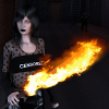
Thanks for all the help guys. That post work looks awesome, especially Autumn's shirt. I have Gimp so I should be able to work on it. I knew I'd have to do some, but I never thought to add details in that way. Like I've mentioned before, I'm likely going with a different concept for the cover, here is a very quick mock up of it. The bad guy isn't really supposed to have any details be viable and I need to add his claws and mask on to him, which were created on a separate machine (anyone know any good tutorials about what to include when packaging content? I'd appreciate it). I know the shot really isn't framed right but this is a general gist of what I'm going to do. I might also try to add a fire effect to the sword, and I've done this with lights and it looks awesome, but it never coexists with the other necessary lights in the scene. Any ideas? Also any post work tutorials would be good too, cause I'm extremely impressed with the way the design on Autumn's shirt conforms with her body. Sadly I've taken an entire class on Photoshop and I have no idea how that was done lol.
Oh and Ben, that's just an effect of Daz's default lighting. Unfortunately, putting shaders on the thing doesn't work too well. It may look like I'm not using any on it, but I am. There is just something with the way Blender is exporting the thing. If I export in Collada, I get a texture of lines all over it whenever a texture image is used. If I don't, you get what you see here, a weapon with no texture and changes with the shader make little or no difference. I'll give your suggestions a shot, but it's just something to do with the object itself that makes it look like that and it's driving me nuts.
I've decided I'm gonna make the obj file for the sword available, cause I've tried Ben's suggestion and all I get is a gray blade. https://docs.google.com/file/d/0B6xQlXHQXviESmRaeldjdHJta0U/edit?usp=sharing
Here is a pic of the result. Good luck for anyone who tries to mess with that sword. Oh on a side note, it's a slightly different blade than the one in the pic. I made the blade longer and thinner, but still made from the same blender file so still has the same problems.
Theres a option in surface tab, smooth (angle). Pic 1 is default angle value (89.90) and it makes that black edges. It can make all sorts of darker/lighter "artefacts" on sharp edged objects. Pic 2 is angle value 0, pic 3 is value 63.47. So, perhaps changing smooth angle value removes that black tip on your sword.
To be honest, most of the 'work' was already there, since the lights and shadows on her t-shirt were good and they already gave the figure the 'volume' impression needed.
I selected it with the color range selector and used a hue/saturation regulation on it to turn it red,
then i applied the 'sample' text: used stencil character, text alteration, to give it a curved form, and when i liked how it looked i confirmed the changes,
finally i looked at the personal shapes tool, and found a grungy 'dirt' syimbol, which again deformed pulling and pushing boundaries until it got a convincing contour shape.
If you look closer, you'll see that those 'curves' are indeed not perfect, but the trick is that if you make em close enough to the object shape, the viewer's eye will do the rest of the trick, accepting the composition as a whole and then 'seeing' the added shapes and drawings as if they are part of the object and not something painted on the picture. I guess Gimp has most of the needed tools to achieve an equivalent result.
As the 'best' basic suggestion for postworking, always create a new layer as a copy of the original picture and work on this layer: this way you can easily switch it on and off to compare the original with the postworked one and also if something doesn't appeal you, it's easier to mask it off letting the original show through than erase or correct it after it's applied on the original.
You can then create new layered copies for different things to modify, so every 'small step' is on a separate layer and can be then changed or eliminated without loosing other parts of the already done work.
Something is causing that grayness at your end. Perhaps diffuse texture is not removed or reflection color is gray. Look for anything gray in surfaces tab.
Been trying to get mine to look like yours, and I can't. what reflect image are you using? As for the grey edge, i've tried a bunch of different angles and I have no grey surfaces or diffuse textures... no idea whats going on.
Just figured out the problem with the edge... i'm rendering a different side of the sword. One side has the edge, the other doesn't
You'll need to uvmap the .obj file so it can hold textures. That would be done in the modeler.
Thanks patience, kinda forgot about that. I did a quick uv and texture job and it worked.
bices_ref09.jpg
Thanks all for your help and your opinions.
Thank you from me too :-)