Adding to Cart…

Licensing Agreement | Terms of Service | Privacy Policy | EULA
© 2025 Daz Productions Inc. All Rights Reserved.You currently have no notifications.

Licensing Agreement | Terms of Service | Privacy Policy | EULA
© 2025 Daz Productions Inc. All Rights Reserved.
Comments
Thx Shinji, but that are just a lot of random props I put simply together. As you can see in the attachment, from the outside it looks not half as nice, how from the camera angle.
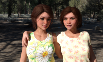
@TigerAnne It's a little more dynamic which is good. The girl on the right is clipping into the girl on the left so you might want to see if you can adjust the pose a little. You might be able to do it fairly easily by adjusting each girl's shoulders, moving one forward a little and the other one back. If you isolate them to just that one joint you might be able to get by without readjusting their whole pose. Looks good.
@daybird Looks good! I like the adjustments you've made to the girl's pose and expression.
@rcbcgreenpanzer I admit, I haven't had a lot of luck subdividing some geometries. Especially, flat planes some vendors use for ground and other props. There should be a way to do it but I'm the last person to ask. However, you are right, if you want to use dFormers, you need to give it enough geometry to work with. Your image is coming along nicely. Have you tried playing with Tone Mapping inside DS to try to bring out some of the richer tones in your image and give it a little more constrast?
I've kinda been avoiding all the moving pieces under the 'Tone Mapping' label, as it's difficult to know where to start. Since you suggested it, I decided to give it a whirl:
Changes:
Thoughts on this direction?
Double posting
Big improvement!
The light is so much better now and give the whole scene much more the sunny strand feeling.
Maybe you could lighten it even a little more up.
One thing you should look at, is the right arm from the girl at the rock. He intersects in him.
@rcbcgreenpanzer It looks much better. One thing you might try is bumping up the Crush Blacks. It will deepen some of the shadows while keeping most of your lighting. Increase the numbers in small increments until you get shadows you like. The range is 0.0 to 1.0. You could also play with the Burn Highlights. The smaller the number the lower any glares will be. So, if you have any lighting that is too bright, try lowering the number. I hardly ever use the defaults. Playing with these two settings can really deepen the textures of your image.
I think it's looking really nice. The new image isn't as flat looking or one dimensional as the first one. Tone mapping can really help to bring out the life in an image and I highly suggest people play with all the settings and figure out what they do. You can get some really incredible looks by adjusting those settings.
Oh, as just for more information, if you want to add a tint of color to your overall image to either warm it up or cool it down, play with the White Point setting. Adding some very pale colors can make a huge difference to an image. If the colors you choose are pale enough, it can add some warmth to an image without casting that particular color. I love playing with all three of those Tone Mapping settings. Play with them. I think you will be surprised at what you can do with them with a little experimentation.
Just a reminder folks. Today is that last day to finish up your images. Get them rendered and get them posted.
@rcbcgreenpanzer Oh, I forgot. I agree with @daybird. I hadn't noticed the arm before but it does look sunk into the rock a little. Take a look at it since you can look at it from multiple angles and double check it. It might just be the angle we see it from or it could actually be sunk into the rock a touch.
Which brings up a good point when people are getting to a crunch time senario. Does everyone know that you can spot render a small area into a new window? It makes it easier if you just have on problem area you need to adjust and don't want to render the whole thing.
Go under the Tools Settings tab and choose the tool you want to change. In this case, Spot Render. Choose New Window. Use your mouse to draw a box around the area you want to render and it will render in a window with just that spot with the rest of the window transparent. Make sure to save as .png so you can keep the transparency and combine it with your original in Gimp or Photoshop, making sure the spot render is on top.
This doesn't work if you have made major lighting changes or tone mapping changes. This is only when everything else is set and you have pesky poke-thru or something you need to fix. It works great for last minute adjustments so you don't have to render the whole image again. Spot render images usually take very little time.
placeholder
Edit - 12:30 AM Daz-time. I forgot to add text to go with my images before the deadline, so I guess they'll just have to stand on their own. Thank you for the help, @Fishtales - the tone-mapping advice was totally beyond me but lowering the environment intensity seems to be taking care of the issue.
Thank you, everyone, for participating.
The challenge is now officially closed!
See you soon for the September Challenge - Focus/DOF
August 2018
Showcased Participants for the August Free Month Challenge
Hole in One
For this Showcase we looked at the artist who we felt best portrayed an overall understanding of methods/skills covered in the previous New User Challenges.
For those reasons we have selected SmR to showcase


Detailing is Fun
For this Showcase we took a look at who we felt created an image that was complex and contained many details which added to the story the artwork was telling.
The New User we felt best showed that this month was Shinji Ikari 9th
Lost in Emotion


For this Showcase we took a look at who we felt created an image that encompassed a feeling or emotion and conveyed it well to the viewer.
The New User we felt best showcased those things this month was Cat_Dancing
New User - Welcome
TigerAnne
CONGRATULATIONS to all those showcased and to all the participants! You all did an Amazing Job and we look forward to seeing what all of you can do in the Depth of Field Challenge!
Congrads to winners. Shinji probably wouldn’t want me singling him out, but he and Daybird only ones left from when I blundered in around October 17. Always there for advice or just encouragement. So it’s nice to see new names along with a familiar one. ; )
Happy rendering!
--Bruce
Congrats to everyone!
Congrats to all the winner! :)
Awwww, thanks for the welcome, guys! Congrats to the winners!
Thanks and congrats to my fellow showcased.
Edit-Just realised that I'd posted twice after a month.