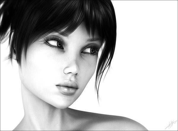
Gaze
 FWDesign
Posts: 46
So I decided to keep my best foot forward, and to have another character/postwork study, and try come to grips with DazStudio a bit more (still learning having been a long time PoserPro user). Hope you like
Mike


Gaze.jpg
1000 x 735 - 162K


Comments
"What'd you do that for?" is the first thought I had. Designed to make the second party feel guilty- and doing a great job of it! Very expressive- I really like it!
That looks incredible. We'd love to see more work. I hope you find that the skills you learned using PoserPro transfer over to DAZ Studio. The interface may be different, but the basic principles of lighting, surfaces, posing remain the same. Once again, great work.
Thanks Novica, I strongly believe expressions really make an image stand out and tell a story
Nice work! The gray scale works really well for this.
Thanks Jared,
I'm going to be working on some more for sure, it's turning out to be good practise for me helping me dip my toes again in the 3D world. And as much I am still coming to grips with DazStudio, it does appear to be very straight forward to use, and once you figure out the interface and menus, life becomes a lot easier. So far I am very happy with the switch, I may still switch back to Poser when it comes to rigging my 3D models (once I get back into that) as that is in my comfort zone at the moment until I learn how to rig in Studio.
But keep up the good work guys with Studio :)
Thanks Mori, It just didn't work in colour at all. The monochrome pallete just made it speak :)