Frank's Fantasy Renders
 franktuttle
Posts: 67
in Art Studio
Hello, everyone!
These are a few of my renders and works-in-progress. I hope you enjoy seeing them.
I have an extensive background in photography and graphic design -- on Opposite Day. I did see a camera once. Could have been a turtle. And my graphic design skills have been banned in 37 states as being unsuitably clumsy for any primate.
Still, I love creating images. It's fun.
So, here we go. Thanks for looking.
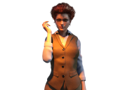

Mercove9.png
985 x 751 - 384K
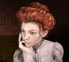

Merportrait1.png
882 x 791 - 1M


Mermagic closeup.png
1080 x 1920 - 1M
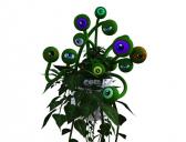

Mug1.jpg
985 x 751 - 99K


Comments
Welcome to the Art Studio!
Really love the lighting in the first one and the expression on her face in the second one is excellent. and well, I love anything fantasy, or sci fi so the other two are right up my alley. Nicely done!
Thanks! I appreciate it. Here are a couple more...
I agree with Ice, the lighting is really nice in the first picture. I also like the detail of her nail between her lips in the second picture, as well as the expression :) The little mug, plant.. thingie is really cute!
Thanks, Carola! I'm still working on Mug. He has 29 eyes and can use his vines as limbs. Mer carries him around in a birdcage at times. I'll get the image right one day.
Here's an updated image of my Mer character. I didn't include any of the background -- but I finally managed to get some face shadow that I was happy with.
I'd been using spotlights, but until I came across a thread here on the forums I didn't know that you could get softer shadows by changing the light emitter shape from a point to a rectangle. This was done using a square emitter 110 by 110. I put two such spotlights in -- one set at 120K lumens to light up the bright side of her face, and tother at 30K for the darker side. I also learned about F-stops and shutter speeds and exposure values while making this image. It didn't really come together until I changed the default render ISO from 100 to 200 and used an F5.2.
It was fun working on -- I think this is actually the 27th try at this shadow effect.
I have no skills being a photographer, but love to view photography, specially scenic. What type of photography you do ? Share some with us Your off to a great start, like your character creations. Being a musician, Merengineerroom caught my attention, your light work is marvelous.
A little late to post this perhaps, but welcome to the Art Studio!
Some nice renders and the shadows are looking good in that last render.
Thanks, all.
I've got another image to share. I wasn't sure posting it was a good idea until I found the thread entitled 'Book Covers' in another part of the forum. I'm a writer, and I'm cautious about posting anything about that might smack as self-promotion. That's not why I'm here -- I really enjoy working with DAZ, and watching what you folks do with it.
I'm not famous. You've never heard of me, and that's fine. Anyway, here's the whole story.
I had seven books with Samhain Publishing up until late 2016. when Samhain suddenly shut down. The whole Markhat Files series was left in limbo, and although I did get the rights back, I lost a year of sales and the experience made me reconsider my stance on self-publishing. Placing the books with another publisher proved far more difficult than I thought -- even with decent sales for a small press, no one wanted a series that might have already peaked.
So hired a graphic design firm to remake all the covers. Cover rights don't revert with book rights --that's an entirely different beast, and renegotiating all that would probably have taken another year. I put the books back out myself. In the meantime, I got familiar with the process of creating book cover art.
Unless you can afford to hire an artist and have your cover image painted from scratch (which starts at about $2,000 and goes up, up, and away), you are left with stock images and Photoshop. And that's fine; there are tens of thousands of stock images, and odds are a few of them fit the needs of your cover. All the new Markhat covers use stock images, and I was pleased with the work the cover people produced.
In addition to my Markhat Files books, I have a young adult trilogy aimed at a younger audience. I just finished the third book, and I'm going to self-pub it.
Which means I need a cover. I looked under my couch cushions and found $1.82, which a team of mathematicians assures me is slightly less than two thousand dollars. This time, I'm providing the cover art.
Why? Aside from the money, I can't find a stock image that fits the protagonist. Here's my shopping list for the model:
1) Young, with a bookish vibe. Brown hair, brown eyes.
2) It's a fantasy setting, with a Victorian feel (just a feel -- it's not set on Earth, or in any terrestrial historical period). So the clothes should reflect her world -- no leather miniskirts, no thigh-high boots, no unlaced corset tops.
3) No guns wielded, no swords drawn. She's brilliant and brave, but more likely to be holding a pencil and a notepad.
There's no shortage of attractive women in steampunk or pseudo-Victorian outfits on any of the stock photo sites. But none of them worked. Now, I did pay for a cover which features an expressionless young lady wearing a long dress. The cover guy stuck her in a spooky castle alcove and threw some magical glow around her. It's not a *bad* cover. But it's -- boring. What's the book about? Winsom young ladies emitting questionable radiation?
I've been playing with DAZ for a while now, and I built a character that fits the protag physically, and I found a few outfits that work. I learned to pose figures, and light them. I'm no expert, but cramming a stock photo model onto a stock background isn't a perfect solution either.
So, as an experiment, I'm going to use the cover I made, which is posted here.
My author friends are universally opposed to this. "Never use a digital character," they say. Some have tried it themselves, only to receive negative comments and poor sales until the cover was changed. "You'll regret this," my friends add. "It doesn't matter how good the digital model is. Readers won't buy books with this cover." They may be right.
I've seen some truly awful digital-based covers. But they were awful not because a digital model was used --the cover text was terrible, the composition was off, the backgrounds were poorly executed, and the whole thing was just bad.
I'm hoping this isn't the case with this image.
The background was purchased from Dreamstime. The font is Optimus Princeps, also purchased for commercial use. I did all the processing in Corel Paintshop 2018, because I've been using Paintshop for years and the Photoshop learning curve is so steep I just haven't mastered it yet.
That's the backstory. If this cover is well-received, I'll make others too. If sales are poor and the cover winds up on Lousybookcovers dot com, I'll slap myself with a frozen trout and revert to the boring paid image.
For anyone curious, I'll post the results here.
Thanks!
Fingers crossed. I'm not at the stage where I can do my own covers yet, but yours looks pretty good to me. (Skin is a bit shiny, and the composition doesn't stand out in thumbnail, but the character is charming and you did a really good job on the typography, which always kills me.) Looking forward to see how this works out for you.
I feel like the Lousy Book Covers crowd are too doctrinaire about "pseudohumans." The problem usually isn't cgi characters per se, it's people who don't understand posing, surface settings and lighting well enough to come up with something that can pass as an agressively photoshopped human, and aren't good enough at postwork to turn a flat, basic render into something that looks like a cover painting.
Honestly, its way better than a lot of book covers I have seen. I am hoping to get started making book covers as well and I will most certainly be using Daz Studio along with Photoshop. The problem with using digital characters is that there are a lot of people out there making bad digital renders and its tainted the whole thing.
Ooda -- Thanks! I'll see if I can dial the shininess back a bit. I check Lousy Book Covers every day, mainly as a primer in what not to do. I do think they're overzealous in dismissing all cgi art -- yes, a quick look through Amazon's listings will reveal dozens of horrendous covers, but that's also true of stock-image covers and illustrations and every other format. The bad cgi covers just tend to stick out.
A cover artist named Derek Murphy compiled charts of the most-used fonts, broken down by genre. I found that helpful. His point that readers grow familiar with certain fonts and associate them with certain genres is a good one, I think. Here's a link: https://bit.ly/1c0XugR
I've also toyed with software that converts photos to simulated paintings. The results are pretty convincing. If I lose my nerve at the last moment, I might wind up running this image through the paint-ify software and using that.
IceDragonArt -- Thank you! I agree that a slew of poor digital overs has tainted the practice. I'm pretty sure that will change, over time. I've seen cgi models that could easily pass for real people.
That cover looks pretty good to me, I certainly wouldn't feel there was anything amiss with it if I saw it on a book.
Thanks, Noswen. That makes me feel better. As a reader, I keep telling myself I wouldn't be put off by the cover -- quite the opposite. But I also know what a shady character I am, so my impressions are suspect.
It was so much easier just filling out the publisher's cover art form. They'd let me make suggestions, which they did try to accommodate (but of course they had the last word). Once I got to know everyone, I'd usually attach a hilariously bad 'suggested' cover of my own, with notes ('The heroine should have the body of a spider! Also, use trademarked Disney characters in the background, no one will notice. Cover must portray an actual tank battle from the siege at Leningrad, but with legs on the tanks').
Those were the days.
After this one is done, I'm going to try making Markhat and Darla for the other series. It's got a film noir feel, with 1940s clothes. I'm looking forward to that!
Here's a new one. It isn't complete -- the pose is all wrong, for one thing. Here's what I hope to wind up with in the final image:
1) Smoke. Just a few wisps here and there, to suggest some kind of vapor emission from the machinery.
2) A tool in her hand, and more grease smudges. The one on her right cheek is barely visible in this render.
3) Better lighting and shadows. Want a work spot-light visible somewhere.
But it's a start!