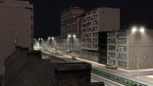
Approaching Eastgate (scifi)
 Sci Fi Funk
Posts: 1,198
Hi,
My WIP of the Eastgate approach. I've been working on making the buildings look lived in.
Need to add more shanty buildings in the foreground and people. However this demos my grunging up and editing / adding to some well known Stonemason models.
In the background will be a 20 storey city wall with 200 storey sci fi buildings. We are on the edge of the "New City" here.


Lived_in_v3.jpg
1920 x 1080 - 993K


Comments
Nice...looking really good
Many thanks.
I will say more when I see the progress on this but I am liking the street lighting though maybe a bit bright for setting a mood but I don't know what your intent is so that isn't a critque more of a presonal preference. :- ) I also like the plants in the central (central reservation as well them over here) part of the road. Nice touch that.
Thanks man,
You are right. It's too bright.
It's because close up the colours are ok. More and more I am learning I need several lighting set ups in a complex scene depending on where the camera is at any one point in time.
I'll correct this and post again.
This scene is based on a real life location. I've just sci fi'd it - added in semi-futuristic buildings and I am making the whole thing look crowded and run down. I'll be able to show you in a future update.
Cheers!
Now you have my interest peeked. Yeah I will look forward to seeing this grow. I was doing a very complex scene last year before my PC went snap, crackle and pop and haven't got a desent enough PC to finish it. But I hope the get a new PC at xmas time. http://www.daz3d.com/forums/discussion/19223/#285067 the one in Portrait, the second pic.
Very nice work sir!
I recognize 95% of those buildings from my own run time. I like taking the middle eastern set and adding a sci fi setting around it. Nice use of z-planeing in the background, also with the sun poking through.
I'm guessing the next step is adding the people, as and when a new machine comes along right? I have a 4 part series on youtube on how to get 132 characters (approx) into one scene using a low res version of lorenzo lo res and some de and re-boning. Starts here https://www.youtube.com/watch?v=cG55S3Lir4Q&list=PL511383E90B92CC0E
p.s. The love bots - excellent! (I checked the rest of that thread)
Cheers and for the ps.
Yes I having been slowly gathering props and figures to go in to the scene. I just picked up Cyborb for M4 in Fast Grab which will go in to that scene. I have the LoRez figures to gte and I was going to use Instancing to make some crowrd of LoRez figures for a crowd moving in the background on a foot bridge that is in mid scene. This will be a big render for printing purposes so detail is everything with this project.
As for your YouTube series yep watched them al; and I have developed the same sort of system but you did give me other ideas thanks.
Interesting, very interesting.
Please message me when you finish that scene - we have similar ideals in mind.
Hopefully I will remember if I do I will do indeed.
I like the lighting .
Thanks Bigh
I've now added the Shanty elements and tided the scene up a bit.
Re: lighting
A different extreme.
Here I am playing without Global Illumination, so It's back to a quick render. 2x 1.5 mins (roughly) one pass is IES lights only (the street lights), one is the scene lighting. I've then mixed them in Sony vegas and boosted the white a little on the IES lights.
It's now moody, but too dark for my liking. (esp as I've put in over a year into creating just this scene! - Older vids in the last year are pieces of the scene).
However I like whats happend to the IES lights - the breakup of the lighting looks like insects flying around (in the middle).
still a WIP
Render time reduced from 35 mins per frame to 1 mins 30 sec (avoiding Global Illumination - using 3x tube lights and some bulbs to compensate for the dark bits)
Still a WIP but after an exercise in reducing the scene size, and adding a few little bits I am ready to add the people, then it's done.
Very nice this one. Makes me think of a warzone where people still try to live their life, despite the dangers they face
Thanks - that's great to hear. I've tried hard to come up with a look and feel of "the rejected" - a place just outside the main city walls where the level 4 citizens live (level 4 is the lowest of the low).
now you're cooking .
yeah. GI teases the animator - "ooh look at me - look at how I reveal hidden detail" - but the reality is its out of reach *sigh*.
Good old tube lighting eh?
Thanks Szark.
I'm uploading tutorials on how I did the washing line with clothes, and the window lighting. Adding lots of little bulb lights right now. Would welcome any thoughts on how to subdue the bright spot on a bulb light (if it shines on something up close).
Are yiu using Carrara for this project?
If I have that issue in Daz Studio or Vue I decrease the Diffuse Strength, darken the gloss/spec colour and/or reduce the spec strength.
Hi
Yes Carrara. Ok so perhaps I can't do it on the light but I can change the windows reflective properties (shinyness, highlight).
hmm - thanks I'll try it that way round.
Thanks Szark - that did it! Taking the shininess out of the target object took away the mini spot. On some occasions the sopt would be desirable.
I think I'm done now apart from adding the most important ingredient - people!
Would have loved to have done this today, but will have to wait until next week now.
Today I, added the rest of the window lights. Made scene slightly more sinister (darker with more light/dark contrasts). Added a bit of life via shanty town lights.
Nice, glad I helped. And good things come to those that wait my ole pa used to say...amoung many unmeantionables. Anyway great mood now. Oh and add a dog or cat or two. :)
yeah looking really good.
Thanks man - good point. a Low res Dog/cat to be added at some point.
I just finsihed finding the links for my next character in the morphing ocntest here in the Art Studio... so here is the links to Millenium Dog LE and Millenium Puppy LE (in case you don't have them I mean) The dog ocmes with only red skin, so if you want the normal black/red doberman skin, you have to use the skin that comes with the puppy (it works, I promise)
Millenium Puppy LE - http://www.daz3d.com/millennium-puppy-le
Millenium Dog LE - http://www.daz3d.com/millennium-dog-le
Very nice! I bought the Lo Rez Dog and cat in a package and I'm well over budget! However If I hadn't that millennium puppy looks just great!