How it all begins with a cube... [WARNING: LONG]
 sura_tc
Posts: 174
It may be hard to believe and I didn’t believe, either, when I was diving into 3D modelling.
But it was true.
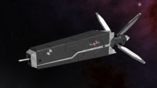
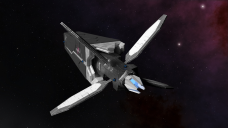
Most of my 3D models began with a single cube and here I’d like to show the progress of one of my spaceship model, Blackfly.
The reason I am going with this model is that this is a really simple mesh in essence and won’t need to cover a lot.

Once I load up a cube, the first thing I always do is add loop cuts (Ctrl R in Blender) or exclude. This is how it always begins for me when it comes to spaceship modelling.


Now I am evening Z coordinates of bottom side to make it flat on bottom.

Then exclude the mesh more & more… It’s like playing with clay dough.


At this point, I add “Bevel” modifier. What this does is that he adds tiny bit of roundness on corners of all mesh.
You may be able to see that edge of the mesh reflect some light now which makes it easier to see the whole object.


At this point, the basic shape of header part is done.
Now I do body part which is even easier.
The body is essentially a cube excluded backwards to add its shape.


Aaaand that is how it is done.
Place them together and what I now have is the basic shape of the ship.
It is now time to add “greeble” to make it more believable.

Now, I originally learned the basis of this trick from Dan Brown CGI (Google him). I refined the trick over the years to make it my own. What I am doing here is that making a copy of the basic shape of the header part. This is what I am going to work on so that I won’t mess the core mesh.
The core meshes are there to provide me back up should I mess up or go back to designing point again.
I generally make copies of the core meshes and move them to layer 10 in Blender.


I am making the copied mesh bigger and adding solidify modifier which basically makes it thicker. And, by removing some faces of the mesh, I am making it look “better”.

Now this part is what takes most of time. I am making “plating”. Using the header copy as basis, I am copying its parts and making them independent mesh pieces. And, by playing with them, shrinking them, making them bigger in some cases, I am tricking your eyes to see armor plating. The bevel modifier is a crucial piece that makes the whole process work. Without it, you just cannot see edges well.


Now I am un-hiding the header pieces (3 total). With all together, now it suddenly looks much better.


Now, the antennae bits.
This one’s really simple. It begins with a plane.


And then add my usual modifiers, bevel and solidify.


Aaaand that is pretty much it. Of course, I am not covering UV mapping and creating material shaders for the ship here. Those will make this way too long.
I’ve written this to show how it all begins with a cube. Almost everything I model begin with either a cube or a plane.
I'd like to call @Wanderer to see this thread since he was the one who wondered about how it begins with a cube.


Comments
That's a really cool walkthrough @sura_tc I really enjoyed it.
That was very interesting and informative! Really appreciate your sharing your process! Makes it look a lot less intimidating!
This post is about materials.
Now, before I begin, I am not going to claim that I am a guru at Blender. My current level in Blender is Novice. I am not a newbie but not that skilled, either. If you visit sites like Blender Artists, you can see breahtaking renders.
I prepared this entry while I was modelling a small space station. It's in WIP and you won't see the final result here. What you will see is my attempt at setting up one of materials.
This modelling begins with a circle instead of a cube.
Something to note here is Blender gives an option to how many vertices the circle can begin with. Default is 32. I am making it 64 due to a fact that this is a station and it's going to be large. The more vertices it has, the better looking overall at expanse of CPU progressing power required.
You may notice that it's kind of dark on the outer mesh. That is because its normal orientation is flipped. This isn't na issue when working with a cube, but with a plane or a circle, it can happen. Blender has an option to trigger normal orientation and I activated it to show you.
Normal oritentation can be important if you are using modifiers and it's important to keep track of normal oritentations.
And then my usual actions begin, explude, loop cuts, and so on.
Before I proceed to add more details (greeble), I am going to work on one of materials I need for the station. This is going to be one of core materials I am going to be using for this model and I want to get it sorted out before mesh gets too complex.
You may notice that the windows are a little too big, making the station look like it's really small. A trick I learned while playing around in Blender was below.
By making its UV map larger, I can make the overall scale of texture smaller. Now, with windows much smaller, the scale of the station is much bigger.
Above material node has a normal and a light map applied. It's a simple node set up that works. Emission node is in charge of brightness of windows and the diffuse node is in charge of color of station hull.
Once I set up light level in the scene and add a sun, you can see something's wrong here. That is because my mesh is flat. This can be solved in two ways. Either make the mesh "smooth" or sub-div it. Subdiv is not recommended here because it increates vertices count unnecessarily.
So, I make the mesh "smooth".
Now, I run into another problem. The way the light is reflecting indicates that the mesh is smooth when, in fact, it's not. It's got windows, bumps, and other stuff via normal map. The light should not be reflecting like that. So, what I do at this point is add a spec map which will dictate how light is reflected.
Now, the texture map I have doesn't come with a spec map, but spec map is awfully smilar to light map, so I am going to use light map in place of a spec map node.
This is how it should be. Window is reflecting the light while the station hull isn't. Still, the station hull would reflect some light. So, I swap the diffuse node to a glossy node and adjust its reflectiveness far less than the windows.
Now this is more like it. Reflectiveness is different from windows and station hull. It's time to add back the light map.
As you can see, the way light reflects now say the mesh is no longer flat. If you have questions, ask.
And that's it for me today, folks. See you around.
You shock me!
Hey @sura_tc! Thank you so much! This is so awesomely helpful. I'm sorry I've been out of the loop a few days, but just now seeing this. I'm sorry it took me so long. Very generous of you to share it. I will be coming back to it several times, and I'm going to link to it in my own thread.
@themidget
My skills and know-how in Blender is limited to what I do... which is sci-fi elements. When it comes down to humanoids as well as human body topology, I am still a newbie. I rely on Daz products as well as Blender plugins (Manuel Bastioni LAB) to create more complex humanoids.
And I can create basic clothes but nothing complex and my rigging skill is meh. But I started to learn Blender to create spaceships, planets, and stations, so I have little complaints.
Anyhow, I've been working on the space station. I think the basic shape and materials are done. Greebles are needed to make it look "cooler".
thanks for sharing your work! you make it look easy enough to try
I agree. @themidget has already started in fact.
3rd lesson post: Basics of UV mapping with Blender.
Hello those who are interested. I am going to cover basics of UV mapping with Blender. I won't go deep because, quite frankly, I am not that good at it, either. Besides, it's best that you do it on your own. Trial and error is the best form of learning when it comes with Blender.
Now, even if you don't use Blender, UV mapping is something you should have heard frequently when using Daz. UV mapping and texture images are two very common terms in 3D.
UV map is, in short, a map of coordinates that tells a 3D application how to coat a mesh with a texture image.
By default, Blender offers crap load of UV mapping options, but I will cover the most common three methods.
The most common three UV mapping options are ...
1. Unwrap: This is unguided UV mapping. Blender is not going to assist you in anything and it will simply attempt to create a UV map based on the mesh faces only. In order to make this work, you need to use Seams. Seam will be covered here.
2. Smart UV project: An assisted UV mapping. Blender will attempt to understand the mesh topology and create a UV map accordingly. This is what I use most of time.
3. Lightmap pack: This option is different from the two above. It ignores mesh topology and creates a UV map for... Err, let me rephrase. This option will give each face of the mesh an equal estate. It's hard to explain until I show you an example.
Above is the first option, simple UV mapping. Apparently, it's not working out due to lack of seams and it having too many faces.
Above is Smart UV project. You can see it's doing its job. Still, in reality you can hardly make a use of that. You are still going to need seams.
Lightmap UV mapping. It may seem as useless as the basic UV mapping, but this is what I use most for using greeble-type texture images. Will explain more shortly.
Now, what is "Seam"?
When I asked this on a Blender forum, a lot of people gave me a lot of different explanations which made be confused as hell. Years passed since and I have two explanations for it.
1. Image you holding an apple and a knife. You want to peel it which means you begin by making a cut on the surface of the apple. That cut is seam, sort of. It's actually the opposite. The "cut" will be a point where meshes will be together.
2. Perhaps a better explanation is that "Seam" is stitches.
It's probably better to show you examples.
A single line of seam has changed a lot, especially in unguided UV mapping option. I won't go further at this point except for the lightmap pack option.
Why lightmap option?
The 3rd option, while it may look pointless, is the best option for greeble textures. Google greeble texture and you will see images that are made of repeated patterns. To use greeble textures effectively, you need a UV map that gives the same estate to each mesh face.
Allow me to show you.
Lightmap UV mapping gives the best resultl because it is giving each mesh surface the same estate. There are probably better explanations about this option, but, since I never asked, this is all I know from experience.
See you later.
Fantastic - just what I need to start my UV mapping. Thank you.
Thank you from me as well. This is super! Your lessons have encouraged me to actually take on learning Blender, after banging my head against the keyboard many times in the past. Please keep going!
4th post: Texture mask
Texture mask is a fancy term. The most common usage, for me at least, of texture mask is applying rust & wear/tear on a model.
Texture mask goes on top of an ordinary texture. The concept is exactly the same with layers in Photoshop. (Or GIMP in my case)
Let's begin with a plane.
By default, blender does not give you a sun (a light source). So, make sure to add one in this case.
SmartUV is what I used here and Blender did a good job figuring things out. Blender also gives you a choice of UV map size. 1024 x 1024 is default. I normally use 2048 x 2048.
I am using GIMP here. And before I go on, let's make sure which side we need to manipulate.
Okay.
Use magic tool to quickly select the edges of the area. Then add yellow. I am going to add blue as background image.
At this point, it's important to make Blender room completely dark so that only the sun light will have any effect. Go to World tap and turn environmental light off. (AKA Ambient Occlusion)
Now, we are going to work on the rust texture mask. Remember Ron's textures? He sells Ron's rust. That is what I am using here. Once I apply the texture, I hide all other layers.
Look carefully at the node set up. This is a material node (or shader, whatever you wish to call it.) Glossy node is in charge of the texture mask. Only the rust part will be glossy. The concept here is that the paint is matte and, once paint is peeled off, the metal underneath is glossy.
You can play with the node and see how it changes. This is how I learned things.
See ya.
Very informative and extremely helpful. Thank you. Ron's got a lot of goodies. I've held off purchasing since I'm not much at post work yet, but this gives me a reason at least to consider them again.