Annoying borders, how do I get rid of them
 Retro Lad
Posts: 471
I attached two snaps of what I get on my laptop, and desktop, computer screens when I enter the the Material and Light Lab rooms. Why are the Labs so small and encompased by an inky raven colored border. I find it annoying, and would like to zoom in on the labs and make them full screen. I hope this is not another "can't be fixed" thing.
Thanks
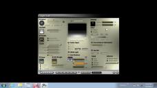

bryce light lab.JPG
1366 x 768 - 86K
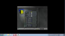

bryce material room.JPG
1366 x 768 - 74K


Comments
As far as I know it is a "can't be fixed" thing.
Just like you cant shrink Bryce's main window, thats either full screen or nothing.
Yes all of the labs are a fixed resolution. It has always been this way.
The only lab with more options is the Terrain Lab.
It wasn't a problem for me when I was still using the out-dated TV style 1 ton monitors, but now with larger flat screens it has become an annoyance.
Yeah, the inability to reduce the size of the Bryce's Main window is a pain too.
The fixed size of the labs was great on small screens, 640, 800 and 1280 or so wide. Now with displays 2000 wide or wider and the way the eyesight improves over time it isn't ideal anymore. On the bright side, the controls and options don't clutter the workspace so that you can't see what you're working on anymore as we notice on some other programs.
It seems certain now that the Daz3D company is not going to upgrade Bryce ever. My next favorite CG program is Carrara, so I am moving over there for most things CG, and dumping Bryce sadly.
However, I will still use Bryce's Terrain Editor which is a lot better than Carrara's as well Bryce's superior landscape modeling which Carrara can't even come close to.
But, Carrara looks like yet another quality CG program that Daz3D is going to let die, too. What the heck is going on behind closed doors at Daz3D headquarters.