The Good Life
 Three Wishes
Posts: 471
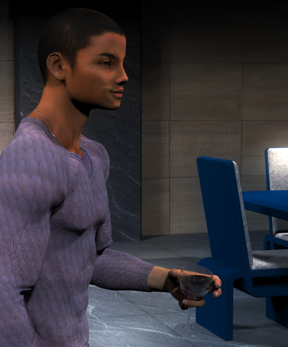
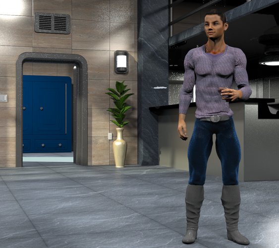
Let's see, what went into this:
- Apartment 1337 from R'osity
- DAZ Genesis
- Renderosity "Muchacho" M4 texture assigned to swapped UVs
- Shirt - Real Feel Genesis Pullover from DAZ 3D & 4blueyes
- Pants and Boots - Wolf King from DAZ 3D and Ravenhair
- a couple of XFrog houseplant freebies dropped into stock MODO vases
- wine glass and contents modeled in MODO
All surfaces retextured and/or gamma-corrected @ 0.4546 (1/2.2).
16 ceiling area lights. Wall lights are luminous polygons. No global illumination.
No post work on the front shot. Side shot has a light "dream" filter glaze.
Only the wine has SSS. The model's skin could stand a little subsurface experimenting, but I'm pretty happy with the shots overall. Any tips, thoughts, or criticisms welcome.



Comments
Your artwork looks good to me. I like to see some more.
ty Frits12 :-)
Aaaaallll this time with Pozer and Studio, and I'm just getting to the point where I'm not completely embarrassed to show a few things.
I haven't lit an indoor apartment scene yet, I'm sure it's quite complicated if you're dealing with a lot of light sources! It's obvious you've worked hard in the scenes. I like the variety of shadows too. I'm not knowledgeable enough to go into the lighting, hopefully someone with indoor lighting expertise can comment. I do wonder about the really bright light in the upper left corner on the first render though- it seems overly bright? I do like the overall lighting- very balanced IMO and showcases the other lights well.
His dark hair does go up into darkness, might have tipped the camera angle down a bit to get a lighter color behind his hair. But you don't have anything coming out of his head at least! LOL! EDIT: Well, you can't tip it- it's dark under the gray beam too. Unless that got lit a bit.
I like the lighting in the second one that hits the front of his face (his nose) and his shoulder. Very nice highlights!
Being nitpicky- Several things that you may want to look at- second image:
1. the face seems like it is not a natural color, it appears a bit orange
2. the back of the chair may have too much light. To me, it's glaring. It pulls the eye away from the person.
3. he doesn't have a good grip on that glass- it would be falling. Wrap the fingers around it a bit more. It worked okay from the other angle, but this angle shows the fingers do not have a firm grasp.
Hmmm, hope I don't come across like the Simon Cowell of reviewers! I like the renders, just giving you ideas. You're lighting is way above my head, as I said! *smile*
Cathie
No, I appreciate the feedback! I noticed the wine glass error after I'd uploaded it. *blush* And I try to be so careful with those.
Here's a slightly better version. I was really annoyed by all the noise around the doorframes and the big glare on the wall, so I cranked up the number of rays and lowered the shading rate substantially. Oh, and added an area rug. Hard to tell what this guy's favorite colors are, isn't it? :D
The skin...I just don't know what to make of the skin. Part of me isn't *that* interested in photorealistic work, so much as, and I'm probably making up a term here, photo-suggestive. Another part of me doesn't really know how to get it with all my library textures. So naturally, my First Part things my Second Part is is being a nag, and my Second Part thinks my First Part is just a slacker hiding his lack of technique behind artistic license.
Okay, so where's some more? I keep checking in and I am being deprived of some really nice renders!!!!! I need an artistic fix- so post! LOL.
Ha! I'd planned to do a couple this weekend, but life kept getting in the way :-( I'll get something else cranked out soon, hopefully even worth glancing at :D
Thanks for the encouragement!
Cross-posted from http://www.daz3d.com/forums/discussion/28060/ - please see that thread for backstory.