Anika's Deviations
 anikad
Posts: 1,919
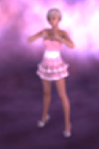
I've been bumbling around for a year or so. I've done a few renders but I don't think I really know anything. Case in point the following render is blurry. I have no idea why. The piece was for a 30 day challenge I've decided to take part in. The music that inspired the render was Cotton Candy by Bonnie pink. So the render does sort of fit because cotton candy is kinda fuzzy. Still I would like to know what I did so that I can fix it.


cottonc.jpg
800 x 1200 - 323K
Post edited by anikad on


Comments
These are my 3delight settings.
Uber Environment settings
Camera settings - although I have the same issue from a perspective render so I don't know that the camera settings are the problem.
It's the Depth of Field on setting, and the focal distance isn't the distance to the figure so the figure is blurred. If you look through another view, with the camera selected, there are little widgets to set the focal point and f-stop if you want the effect.
This is going to be delightful when you get it fixed!
I asked a LOT of questions on a thread about DOF- basically what I'd recommend is creating a camera called DOF so you know that is the one you want to render from- then go to TOP VIEW- put the white ball on top of the character's head, and there will be two planes visible. Put the first one in front of the character, and the second one behind the character. Adjust your settings (focal length, etc) to where you want it, but keep your character in between those two planes. EDIT: Just explaining this just in case- not assuming that you don't know it. I DID read that you said you were having the same problem throught the perspective view. I haven't done DOF in a month, but that sounds whacky?
Cathie
Thank you both for the info. If I understand correctly I need to make sure my focal distance is the same as my Z translate? Changing that seems to have fixed the problem in this case but know if that is a one off solution.
So this render was done for Day one of the 30 songs, 30 works challenge:
http://30songs-30works-30days.tumblr.com/
I've decided to call it Candy because it was inspired by the song Cotton Candy:
http://www.youtube.com/watch?v=j8Nu2_Hbzs0
Items used in the Candy render.
Aiko 5
http://www.daz3d.com/aiko-5
Pure Hair Bubblegum
http://www.daz3d.com/pure-hair-bubblegum
Cute Bow Heels
http://www.daz3d.com/pure-hair-bubblegum
Bottom Ruffle Skirt
http://www.daz3d.com/br-skirt-for-genesis
Not so much that focal length = z translate but that what you want to be in focus is within the boundaries of the depth of field as was mentioned above. In the screenshot you want to make sure that what you want in focus is between the 2 light blue lines anything outside of those lines will be fuzzy.
Basically, DoF is determined by the focal length of the lens (Focal Length (mm) setting in the camera settings of the parameters tab) and the F/Stop. Adjusting either of these settings will alter your depth of field.
It's fun to play around with as you can get some really interesting effects when you learn how to use it.
Thank you for that explanation. I'm going to make sure I play with this ... now my pc has stopped crashing while rendering.
Managed to render something again. Far too dark. Is there a way to tell if something will render dark, even though it has lights included?
I re-rendered adding a distant light this time and amazingly my pc still didn't crash. I didn't want it too light so turn the intensity down to about 50%. It still might be a bit too dark though. Also I think the shadow is too sharp, will have to play with this some more.
How many lights do you have in the scene?
It may take adding another light or two to act as fill lights though these don't need to actually cast shadows
To soften the shadows you can adjust the shadow softness on your main light. I usually adjust it up to about 20% and tweak from there.
While you're working on getting the lighting right you might want to make smaller, lower quality renders until you get what you're looking for and then render out the quality and size you want.
http://www.daz3d.com/forums/discussion/19756/P1155/#407972
You always pop in and support my thread, so for my new series that I was planning for this next week, I figured I'd use a similar pose like your figure, dark clothes like yours, and a night setting to show you what a spot light, distant light, and a linear point light can do. I took each one by one (as planned, as I'll be showing the combinations of lights) so that might help you pick one or two you can even add to your scene.
It's better to use a combination of lights at lower settings (IMO) than rely on one or two lights at higher settings. You'll see the difference as each is added- I'll be turning DOWN the intensities of some when others are added.
Skim through the 1-4 sets and see if there's anything you like. I've given you the coordinates of my own personal light sets that appear in my art studio. :) Shown with and without masks on the figure.
Below is TTATT 1 with higher intensity setting, from the series, and then the series progresses to show the combination that will yield a brighter figure using three lights, all different. All coordinates are given for you. It's designed to be a learning series- see where lights can be effectively placed, then tweak. (Novica's lights TO TRY AND TO TWEAK (TTATT)
Not trying to hijack your thread- I did this with you in mind when I chose the first series subject.
After a week off work I've finally got around to doing some rendering. Thankfully my pc didn't explode. This is a test render
Used
Amber for Aiko 5: http://www.daz3d.com/amber-for-aiko-5
PH Darling: http://www.daz3d.com/pure-hair-darling
Lacy Dress: http://www.daz3d.com/lacy-dress
The Ant Farms Base Camp: http://www.daz3d.com/base-camp-vol-1-3-bundle
Lighting: the barefoot lighting set in genesis essentials
Looks nice.
Now, just for learning purpose, create a small plane underneath the base, so the base rests on something.
With a nice reflection.
Then turn on the shadow of your light.
Render again and watch the difference.
Thanks for the suggestion tjeb.
I've added a plane to the bottom. I need to play with this some more to get longer shadows.
Today I've been playing with Weapons of Beauty: Kunai for V5: http://www.daz3d.com/new-releases/weapons-of-beauty-kunai-for-victoria-5
I'm not really and expert in these things but I think she looks quite Korean.
Dogz 3 in 1 skinny outfit
http://www.daz3d.com/3-in-1-skinny-outfit (trousers & top)
xTreme heels
Eva1's urban shaders
http://www.daz3d.com/urban-environment-shaders-for-daz-studio
I'm using Chablis lights and the first time I did the render this happened. I quite like the effect. i'm guessing it's too bright. Chalis is a darker character.
No lights, Mavka's leaf dress (http://www.daz3d.com/mavka-starter-bundle) and hair plus Michael 5. What can I say? I decided to try out all my female outfits on male characters. Michael looks pretty good, no?
*grins*
Said it before: ther's no joy like trying dresses on your guys.
There is a whole thread in the commons dedicated to doing just this. http://www.daz3d.com/forums/discussion/13326/
Yep, this is probably why I like Genesis so much. Nothing to do with the technological advancements. All about dressing boys in dresses. On that note Michael has moved on to Adventure Outfit (http://www.daz3d.com/adventure-outfit).
Thanks. I'd forgotten about that thread.
Michael has gone all Vogue with All that Jazz for V4 (http://www.daz3d.com/all-that-jazz-for-v4). I'm really impressed with autofit.
Oh now that one is cracking.
Anikad, you crack me up! :)
thanks ladies. Will probably do a proper render of M5 in the Jazz outfit. I still have an old dell box with 4gb, so rendering can be a bit of chore.
Today Michael strikes a pose in Dogz's 3 in 1 skinny outfit http://www.daz3d.com/3-in-1-skinny-outfit
Interesting historical titbit - at the turn of the 20th century boys were associated with pink and girls blue. Not until the 40s did that change.
http://www.theguardian.com/science/2007/aug/25/genderissues
I like how the color of the shoes match the color of the shirt.