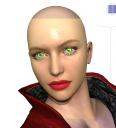
Help, please....
I'm trying to do a close-up (okay, I know it's only Genesis, but she's all I got right now), and through some trial and error and trying some lighting that Blackbirdwake used, I actually got her to look okay. But I tried to adjust the specular settings, and some others, like glossiness, and I got this. A girl that looks like you'd peel her face off like an orange, :gulp: I know, the eyes are messed up too, and I think I might be able to fix that, but...
What did I do wrong?
These are the settings I altered, and what I changed them to:
Bump strength: 158% (The face bump is V4LanaRRFaceM1)
Displacement strength: 151%
Trace Displacements: On
Diffuse color: 255, 255, 255
Diffuse strength: 77.7%
Diffuse Roughness: 4.25
Specular color: 143, 176, 186
Specular strength: 72.6%
Glossiness: 32.8%
Specular Sharpness: 42.3%
Ambient color: 255, 255, 128
Ambient Strength: 11.6%


Comments
What I did with the corneas:
Diffuse color: 255,255,255
Diffuse Strength: 100%
Specular color: 128,206,255
specular strength: 50.7%
Glossiness: 36%
Specular sharpness: 60%
Specular color 2: 255,255,82
Specular2 strength: 100%
Ambient color: 170,255,238
Ambient strength: 100%
Reflection: Active
Reflection mode: Raytrace
Reflection strength: 100%
Your bump and displacement strengths seem very high - what are your Min/Max values?
The Glossiness is also lowish - that makes the highlights larger (the way a rough surface, with low glossiness, spreads out the areas that catch the light) which combined with the high strength is making the highlights obvious.
Okay, for the bump, the min / max values are set on defaults of -0.010 / 0.010. Displacement values are the same.
I sort of re-did this a bit so you could see what I had before I messed with the specular settings, changed bumps and stuff. The lighting is the same as in the first image. Maybe it's my lack of experience with Daz, but this one (to me) looks far better than the one above. But then, I also know that it can be made to look even more realistic. I just need to figure out what I did wrong with that first one.
This is what I do in DS3 or 4:
Bump strength: between 20% and 50% at standard min and max.
Displacement strength: 35% with min at -0.15 and max at .15
Trace Displacements: On
Diffuse color: 253, 240, 233
Diffuse strength: 100%
Specular color: 47, 43, 39
Specular strength: 100%
Glossiness: 75%
Ambient color: 9, 0, 0
Ambient Strength: 100%
Lighting Model - Matte
Don't forget that what you do to the SkinFace surface, you must also do to the lips, or else you end up with weirdness.
I never particularly like the eyes on my characters, but here's my standard settings.
Diffuse color: 255,255,255
Diffuse Strength: 100%
Specular color: 0,0,0
specular strength: 100%
Glossiness: 50%
Ambient color: 0,0,0
Ambient strength: 100%
Reflection strength: 0%
I applied the settings you listed to skin face, head, neck, lips and torso. I also used your eye settings, but I don't know what to say about the eyes. I guess this looks better than previous examples.
that is weird. Did you apply it to the corneas or the iris?
BTW, my skin settings are based off this tut:
http://afina79.deviantart.com/art/Sugar-Skin-In-Daz-Studio-159087559?q=favby:narehdawn/45067968&qo=1
And some eye settings that will be better than mine :-) are here:
http://forumarchive.daz3d.com/viewtopic.php?t=23797&postdays=0&postorder=asc&start=0
Questor says:
I applied the settings to the cornea. I think I need to go in again and tweak the eyes, but what are your thoughts on the rest? I think it definitely looks better than the first render, but what do I know?
It does look better than the first render. What lights are you using though? My favorite lights are a freebie by InnaneGlory. You can get them here if you like:
http://inaneglory.deviantart.com/art/Simple-Soft-Lighting-Freebie-193115008
The most beautiful, easy to use light set. The only thing you need to remember is to get rid of graineness,
Go to the surfaces tab
Select the UE
Go to the parameters tab
Click on lights
Bump the Occlusion Samples up to somewhere above 64.
I usually bump them all the way up when doing the final render, but leave it around 24 for the test renders. They are my go-to lights, and the ones I usually test everything with.
I copied a lighting setup that another member had described in another thread. The are three distant lights in various base colors placed at key points under and to the sides of the camera, a spotlight above the camera, and another kind of light if I recall. He said it worked well for him, so I tried it.
Fair enough. I can't get lights set up right unless I use a pre-made set. Still learning :)
I should maybe do that more often (use a preset), or even continue to copy the set up that's in these images. One problem that I run into is that my computer takes a long time in some cases to even do a spot render (which is why there is no hair in these, or it would take even longer), so a lot of times I have to wait a long time to see what the lighting will actually look like, and then if it's not right I gotta tweak it and do another lengthy spot render.
Speaking of hair, should I do the settings for it similarly to how the skin is done, or does hair have its own needs?
Okay, I know this isn't the closeup we've been discussing, but it shows the entire figure with the skin settings all the way down. I just wanted to do this to see how it all looked together. And to my point about rendering time, just this took ten minutes. But, I've got "Astronomy" to read in the meantime, LOL!
That looks 100% better....well done :coolsmile:
I always leave the hair "off" for the overall test renders as well ;-)
Thank you! I barely feel like I can take any kudos for this though, considering that with the lighting and the skin settings - I copied what others did. 8-/ But then, this was just an attempt to learn how to do something better than what I have been doing. I guess I can just take what I've gleaned from this and make things better with future renders.
Thank you! I barely feel like I can take any kudos for this though, considering that with the lighting and the skin settings - I copied what others did. 8-/ But then, this was just an attempt to learn how to do something better than what I have been doing. I guess I can just take what I've gleaned from this and make things better with future renders.
LOL.....................thats how we all do it, ..............see and read what other people do then go from there. I am always looking at other peoples artwork, then I copy it, :lol:
Then I guess I'm on the right track, then. :coolsmile:
The render looks great. I love the shadows created by your lights, but I would maybe reduce the light pointed at her forehead to 40% - 50% of what it currently is.
Hair has it's own specific needs too, but most are specific to product or at least vendor, from what I gather.
The lights I mentioned before don't take as long as other lights I've used (half the reason why I love them so much!) and if you leave the Occ Samples low enough, it only takes a few minutes for a spot render. The machine I'm using is about 7 years old, so I know what it's like not to have much processing power for renders.
Remember, displacement maps, transparency maps and hair, raytracing, shadows or using ambient occlusion are some of the things that will slow down and older machine. What I usually do for close ups or large scenes is set it to render over night, or through lunch or another time when I have three or so hours spare. Does wonder for your patience. I also use task-manager (running Windows) and turn off everything that's unnecessary before rendering - particularly with the multi figure scenes I'm pasting together.
Found an updated tut for Gen 4 figures/Eyes here: http://forumarchive.daz3d.com/viewtopic.php?t=51042
The pdf download is broken, but Nysalor goes through the settings he used as you scroll down.
Some interesting details about render settings here: http://forumarchive.daz3d.com/viewtopic.php?t=144303&postdays=0&postorder=asc&start=0
Can't find anything hair specific, but will look again after the kids have breakfast.
I'll look at lowering the intensity of the one light, and see how that helps (not tonight, though - no time, gotta work later).
I'll take a look at that lighting set you mentioned and try it for test renders of a project I'm currently working on, though I'm concerned about it rendering at all, given the number of figures and especially the number of props, regardless of what light I use. I ran into a situation once with something I was doing where I got a memory alert message during a render, though I think Daz and the system may have just been having an argument at the time. My system is about six years old and has a hard time running this thing.
Question - what is light occlusion? I've seen that setting, but I have no idea what occlusion sampling is, or what messing with it will do.
Here is some info on Occlusion. It's worth a look at, because it includes images so you can see what the difference between low and high sample rates are.
http://greywulf.net/2009/05/second-steps-with-daz-studio-uberenvironment/
Sorry about taking so long to reply, I occasionally have trouble where I'm not able to log into the forums at all. All I can do is wait till the next morning and try again.
No worries. I get in here when I can, and it's not always right away. Thank you for the info on occlusion! :coolsmile: