More Non-photorealisitic Renders (NPR II)
This discussion has been closed.
Adding to Cart…

Licensing Agreement | Terms of Service | Privacy Policy | EULA
© 2025 Daz Productions Inc. All Rights Reserved.You currently have no notifications.

Licensing Agreement | Terms of Service | Privacy Policy | EULA
© 2025 Daz Productions Inc. All Rights Reserved.
Comments
Looks great...
Yes, I have noticed your thread, but I am still waiting for someone, who bought your shader, to post some images.
That's why I have posted my question here, in this thread, to increase chances to see some images.
I'm working on an image but it's my youngest's sixth birthday so I'm a little busier than usual. With any luck I'll get around to filtering and compositing later tonight.
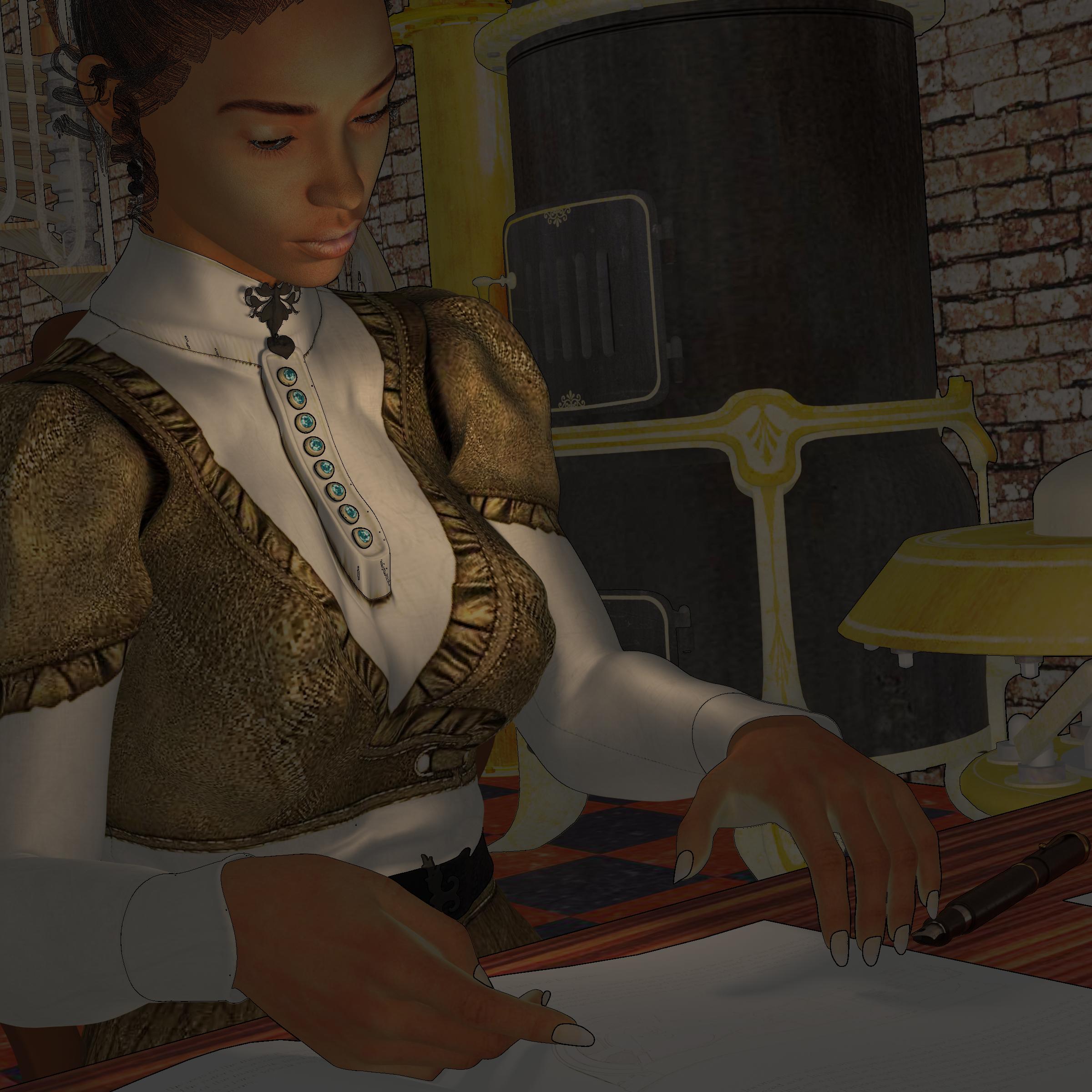
Here is an, uh, PR version of the image I re-rendered using the Oso Toon basic method.
Here is a basic composit of the Oso Toon basic three layers, using the organic approach on the shading pass. I created a line layer on the materialID pass via a Topaz Studio prebuilt recipe, and I duplicated it and have one as multiply and one as overlay (67%).

Here is the same composite, but I applied an artsy Topaz filter recipe to the Flat Color pass as well.
Thanks, dreamfarmer, for posting your images.
I have also bought Oso Toon shader, so will try it too.
I've just made some experiments with NPR trying to achieve pencil drawing feel.
One more:
Semi-happy with this one. I think his head needs to be looking the other way perhaps - I don't know, it just doesn't quite look right. The rest of it, I'm pleased with.
You have developed quite a distinguish style of your images, philebus, and I like it.
Looks interesting, Vyusur.
Thanks, Artini.
Layered filtered output from the Oso3d shader-renders, with some adjustment layers and a bit of manual brushwork.

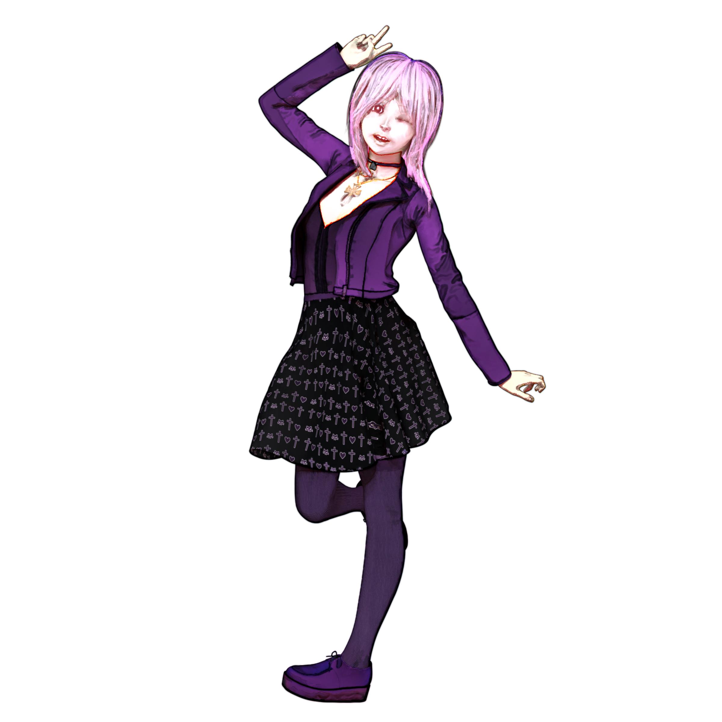
Still on an Anime trip:
Very nice! It reminds me of the artist Robert McGinnis and his work on the Milo March detective novels from the late 60s, early 70s. Very impressive.
-- Walt Sterdan
I really like the last two best, I think you've pretty much nailed it!
-- Walt Sterdan
Thank you so much!
Launch the Ravens
Love It! This would be a fantastic piece to put on the wall in an office i do not yet own :P
Thank you.
Gorgeous work -- as always -- but at a quick glance on a smaller screen the lighting makes the person in front look like they're not wearing any pants.
-- Walt Sterdan
LOL. I almost changed her paints to match the others. I wanted her to stand out, but not in that way. LOL
@tkdrobert - I didn't see the pants that way on first look, but now I can't see it any other way. LOL. Great image, whether she is wearing a work suit or flesh colored dancer's tights. The anime robot battle is also great, and I like that you so easily move between styles.
@Dreamfarmer. - Excellent KPop/JPop idol. The expression really comes through. I am considering buying the Oso3D shaders. Looks impressive, and I have loved Will's posts in this thread. Nice to see demonstrations because I don't know how much is the shader and how much is Will's skill. I can buy one, but the other is beyond me. Do you mind if I ask how much additional brushwork you had to do? Alternatively, could you post the raw render? Understand if that would be inconvenient or otherwise troublesome.
Love the end results you obtained from your experimenting....
Looks fantastic...
Cool work of art....
Superb....
I think this is my favorite piece you've done....
@Diomede LOL! It's a worksuit. It alows me to give different colors for the top and bottom. I was trying to emulate the colors of a reference photo of real carrier crew members, so the top: yellow, bottom tan. Of course, since this is sci-fi, I didn't want it exactly the same. Originally I had the same outfit on the two guys in front, but for some funky reason they didn't look right (lighting maybe), so I changed them to green cargo pants.
@kenmo Thanks for the compliments.
Rendered in iClone 7.
I did a thing, with Will's new Oso Toon Shaders. Sorry it is a few days.... week late, but hey, there should be a catch up sale too?
Took an existing scene I had an used the shaders on it. I will warn you that if you select a large number of objects and surfaces and apply a shader it can take a bit for it to load (not the fault of this shader set, just something to keep in mind).
Anyway, really like this. Would do some things differently in the future, like not start with a super complex scene already assembled, but add the shader and, more importantly, the material IDs as I go along so I can do things like have objects connected to a figure be more similar in colors, and more different from the background, to ensure even contrast with the lines. But, as long as you read the instructions (which are short to start with, but important!) it's easy to use and I like the results.
Did a few variations with the shading layer. Lots of possibilities with this.