Skin and Light Study
Here are some shots of my endless, ongoing light and skin setup.
I wanted a setup that doesn't have that typical Poser feel with reasonably quick render times and offer flexibility with various skin tones/textures.
So, what do you all think? Good, bad? Critiques and comments please.
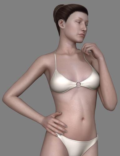

Render_13_(2).jpg
800 x 1040 - 237K
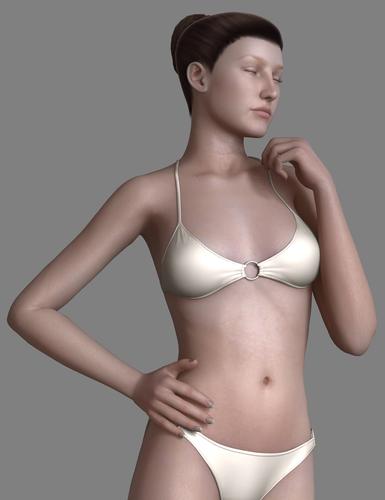

Render_12_(3).jpg
800 x 1040 - 236K
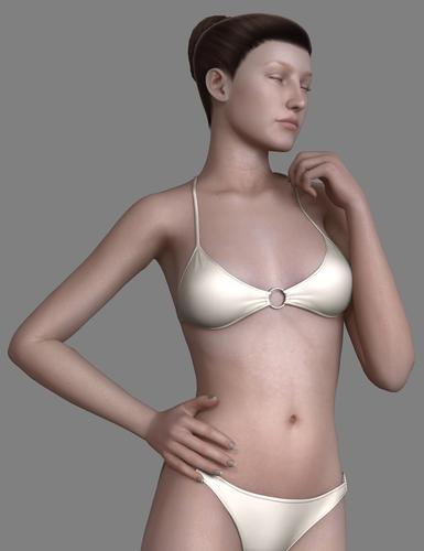

Render_14.jpg
800 x 1040 - 235K


Comments
I like those materials. What render engine are you using? It looks similar to what I've traditionally had with D|S and 3DL using UberSurf
I like the sheen/glow- the only suggestion I would have would be the nail color. It just doesn't appeal to me. But that may be part of the overall aura you are going for? In other words, its just a personal preference. I like more pink/beige in nails.
DS3A with 3Delight, UberEnvironment, UberAreaLight and HSS.
Ah yes, the nails. Haven't gotten round to tweaking them yet. :)
Still having trouble avoiding that kinda plastic sheen when zoomed out.
Made some tweaks and some changes to the nails and eye materials.
Made the nails slightly pink so it will fit better with the rest of the skin. For the lacrimals, I ended up tossing away any textures since they all have too much red baked in.
And here's a look with Angel for V4 and Elite Lana.